Your Daily Dose Is Here
 Friday · Sep 28 · 2007 | 2:06 PM PDT
  2 Comments
 You know what this is. I've got today's concept art right here and there's a lot of it! And it's gonna be good. Mostly.
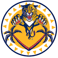
We'll start out with this Florida Panthers logo that caught my eye whilst I perused my inbox.
It's a sort of fusion between the primary and secondary logos that the designer said stemmed from an idea based off of the old Buffalo Sabres logo. But while that logo seemed to red "Buffalo Sabres" from top to bottom, this one seems to say "Panther Palm Trees."
No but seriously, it's very sharp. A little to detailed to ever see printed anywhere but here, but still nice.
What I'm concerned about is this logo. I'm certainly more a fan of the official VC logo introduced by the Vancouver Canucks last month. They introduced so many cool new logos, though. It's hard to like the orca on the crest anymore.
I got an email a while back, the source of which I cannot vouch for, that suggested the Canucks have planned to change their logo again in 2010 following the Olympics. This time they would feature Johnny Canuck as their primary symbol. I won't take a position on whether or not that has any validity, despite this logo just being introduced.
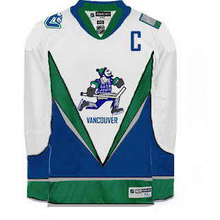
Anyway, perhaps a jersey may look something like this.
Although that V across the front of the jersey really scares me.
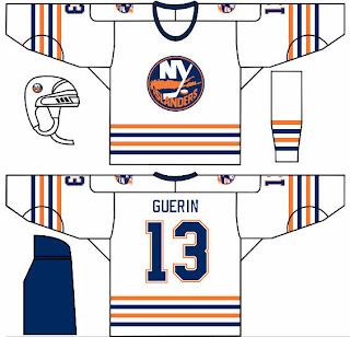
In other news, one of my things is that I feel like the New York Islander should make use of a lighthouse in their logo — if even just as a secondary. This concept borrows a recolored lighthouse logo from the mid-90s logo introduced as part of the "fish sticks" get up. That design wasn't all bad.
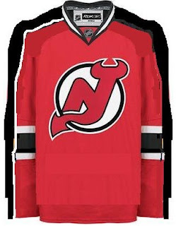
What I could live without is any changes to the New Jersey Devils' uniforms. I rated them a 5/5 in my review yesterday. Still, someone toyed with it a little.
That is something I feel would work for improving the Edmonton Oilers' sweaters, but not so much the Devils. Interesting as it is, I'd never want to see the Devils hit the ice in it.
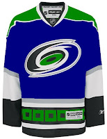
Along those same lines is this item. The Hurricanes are just one of those teams that I cannot possibly envision in any colors but black, red and silver. I just can't do it.
 So this whole Hartford Whalers thing has me thrown. It's just so unacceptable, you know? Or maybe it's just me. I often tend to go against the grain. You know this already if you're aware of my feelings regarding the Blackhawks' logo and uniforms.
And that about wraps things up. If you have any comments you'd like to share with the rest of the class, please do so by leaving a comment below. If you have any of your own artwork or have stumbled across someone else's that I haven't posted, feel free to email me.



Reader Comments (2)
The four stripes on the Islanders jersey representing the four Cups and replacing their current shoulder patch, I assume? Not bad. It'd kinda suck to have to keep adding stripes to your jersey every time you win, but I could think of much worse reasons!
Wait... just how many logos does Vancouver have this year?? The VC, Johnny Canuck, the Stick & Rink, AND the Orca? I don't get it.