What If The Jets Were Still Here?
 Monday · Sep 3 · 2007 | 9:44 AM PDT
  17 Comments
 Over the past week, I've been surprised at the number of concepts I've been sent featuring the Winnipeg Jets. Surprised because that team no longer exists. Still, all the work people put in made me think I should share some of what I received.
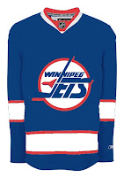 Here's what the Jets might look like in a new Rbk EDGE jersey. This concept is based off of the new Canucks jersey. Not bad at all.
But with all the modernizing of this league, I have a feeling the logo would be different today. The logo you see on this jersey has been around since 1990. Don't get me wrong, I think it's a great logo, but I just feel like it would've been changed somewhere along the way.
Maybe to something like this.
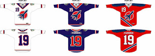
The diagonal stripe in the red jersey freaks me out a little bit. Too steep? The designer wanted me to let everyone know that the shoulder patch emanates from the city of Winnipeg's coat of arms. I know it's small, but it's there.
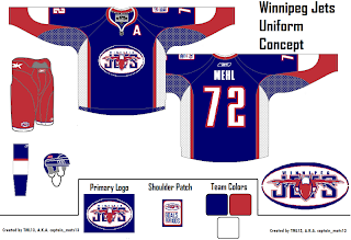
A different artists had a different idea for a new Jets logo and uniform set. It's also quite impressive.
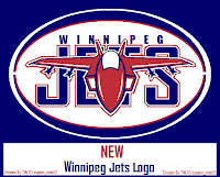 I wish I could tell you it was an original design, but it's based entirely off of the AHL's Houston Aeros' logo. I do like the jerseys, though. Not too much to complain about there. A simple and classic sort of feel.
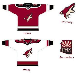
But despite all of this effort and toiling over Photoshop and Illustrator, the Winnipeg Jets moved to Phoenix in 1996 to become the Coyotes. So while I'm here, I also got emailed a great 'Yotes concept I can share.
One thing I don't like about the current Coyotes jerseys is the monochrome feel. Black is a big part of the logo so why doesn't it have any part of the uniform?
I like that a lot! Coyotes fans, do you have an opinion. Do you like these or are you more supportive of Wayne Gretzky's prescribed design which the team currently wears?



Reader Comments (17)
Not a Coyotes fan, but I like their current jerseys.
I am a huge Yotes fan, And I love what you have done. Screw WG.
To the previous anonymous poster, I, and I am sure many other fans, would appreciate it if you did not disrespect "The Great One."
The Coyotes jerseys are like, wannabe Detroit jerseys.
Their old logo and jerseys kicked so much ass
I like the Winnapeg jersey's, i just dont liek the fact that winnipeg did and would wear USA colours when they are a canadian team. Nothing against the american colours.
-Josh-
I think the current uniforms are fine and the logo works perfectly for the team. The old uniform/logo was way too busy. I hope they keep it the same.
"I like the Winnapeg jersey's, i just dont liek the fact that winnipeg did and would wear USA colours when they are a canadian team. Nothing against the american colours."
Red, white, and blue were Canada's colors until 1965, so I don't really see anything wrong with it.
Even though I am (usually) opposed to word marks in logos, I loved the Jets' crest and jerseys. The first logo, with the jet on the circle (which I think is the logo used by a Jets' advocacy website) is pretty sharp, but the logo prototype below it is way too busy.
The Montreal Canadiens' team colors are red, white and blue too.
Er, lots of countries have red, white, and blue as their nation's colours.
I am a coyotes fan, and I think those jerseys are awesome. I would like it if they went with a black home jersey.
It's not a question of 'What if the Jets were still here?' It's a question of 'When are the Jets coming back?'
It's not a question of 'What if the Jets were still here?' It's a question of 'When are the Jets coming back?'
I like your optimism!
I like the idea of the logo being just the silhouette of the jet. I hate logos that are just words, even if they try to incorporate symbols/pictures. I really loved the old Coyotes logo, but I am liking the new one more and more these days. I would love to see the original logo come back and the current main logo become the secondary shoulder patch.
"Do you like these or are you more supportive of Wayne Gretzky's prescribed design which the team currently wears?"
I am more supportive of what the team currently wears. I think pulling off a look that only uses two colors (white plus one more) is too rare. Look at how great the Leafs and Red Wings look using only blue and red, respectively. Or, to move away from hockey for a second, how good to the New Jersey Jets of the NFL look with just white and green.
Be thankful that the Great One personally interfered, and you don't have those Tex-Mex god awful Taco Bell concoctions you had when you first moved to Phx! You look like a real team now. Well, at least you look like one until you start skating.
It's not Gretzky's jersey nor the Red WIngs jersey they're wearing, it's the Soviet Union's jersey! Identical to the early 1970s style. I love it. One of the all-time classic jersey styles.
I'm more of a fan of the first concept Chris posted... simply the 1996 Jets logo and jersey design on a RBK Edge template (that's similar to Vancouver's).
At the same time, I have made a recommendation to Chris to have another concept shown soon that a Jets history site administrator created. It looks great, too. If the 1996 uniform doesn't return for the new Jets, then I'd go for what this concept will show.
The new Winnipeg Jets soon? And yes, I agree... it is not a matter of "if", it is WHEN.