Canadiens Unveil New Uniforms!
 Tuesday · Sep 4 · 2007 | 9:34 AM PDT
  44 Comments
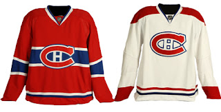
 This morning, the Montreal Canadiens unveiled their brand new Rbk EDGE uniforms to little fanfare. Overall, there were no major changes. The jerseys were merely adapted to the new style and cut, just as we'd expected. I have all the juicy details and photos below.
Before I go on though, I really need to send a huge thanks to the huge number of readers who emailed in links and photos. You guys are awesome! And you're the reason why I write this blog! I'm sorry I couldn't get stuff posted earlier, but I was amidst a live television show that begged my full attention. Moving along now.
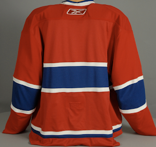
Here's a shot of the back of the home sweater.
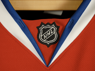
I also got an email with someone wondering whether the LNH logo would be used on the collar as opposed to NHL.
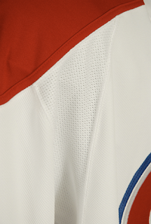
There's your answer. One last extreme close up photo and then I'll turn it over to you all for your comments.
I think these uniforms are great! Habs fans should be proud. Enjoy your big day!
 UPDATE (1:40 PM): It's always nice to see what these jerseys actually look like on players. Here you see Cristobal Huet and Maxim Lapierre donning the new duds.
Remember you can find these and many other photos of all the new sweaters in my official Rbk EDGE photo gallery.
And if you have other photos of the jerseys that I haven't posted, send them along and I'll add them to the gallery.


Reader Comments (44)
Wow Paul...that's a lot of loonies.
And to think they are going to ask that of Sabres fans who already payed good money for their jersey last year...
Jerseys look great hanging up. Look awkward on the players - and I f***ing hate the coat tails. This affects all 30 teams....super.
Good for Montreal to stick to a classic design rather than changing it to some vertically striped POS.
I kinda wish they had done the LNH thing on their jersey. That would have been that little touch of unique that would have been cool, but I guess standards apply, eh?
the away jersey sucks but the home ones r ok.
So basically, they've gone back to the '50s and '60s look, with the smaller cuff and the white collars? Yeah, I can live with that. It's been 95 years since the last design overhaul, I'm not seeing anything new coming out of Montreal at this point. I think there'd be riots and an emergency meeting of the Quebec legislature if such were to occur.
Having the "LNH" on the home jerseys would've been a nice touch, though.
as a habs fan im relieved'they didnt mess with the legendary bleu blanc rouge. nice to see
These jerseys completely dominate the league. Very few teams can claim to have a jersey approching these ones in terms of classiness and colors.
The collar on the red one (white lines) is maybe a little disturbing, but not that mutch. Overall one of the best jersey.
Yikes, those are ugly.
wow. really taking a leap of faith there with THAT choice, eh, habitants?
should have atleast gone with the old white jersey with the band across, not unlike the current home.
it's a shame the original 6 haven't the sack to change a little.
WonderBread
Oh man these jerseys would have been so much better of they put a Quebec and Canadian flag on the shoulders ... and then maybe if they added some laces. But then these unis would have really kicked ass if there was some piping on the front ... and maybe if the put some horizontal stripes on the sleeves. But I think what would have made the look complete would be numbers on the front. Then and only then would these sweaters rock.
i am very pleased.
the montreal canadiens are to hockey what the new york yankees and boston red sox are to baseball and what the notre dame fighting irish have been to collegiate football in the united states.
they are clubs with deep ties to their history, their social roots and the players themselves. it has to be a great feeling stepping out in a uniform such as those mentioned knowing that so many greats before you wore the same exact colours, designs and logos.
messing with the uniforms of any aforementioned team would, in my eyes, be on par with altering a national flag for reasons of trend and fashion.
A few people have commented about how Montreal got it right with their new jersey in keeping with tradition and not changing a classic look. How can you not agree. Don't get me wrong, I can't stand the Habs and they have become a fairly lousy hockey team, but they didn't mess with their classic look.
I only wish the Islanders had done the same thing. Maybe next year.
I've always liked how the Habs have two distinctly different jerseys, not just the same jersey for home and road with the colors reversed. One had shoulder bars, the other doesn't. One had the big stripe through the chest/crest, the other doesn't. I love tradition. I appreciate the original six all the more when I see the clown outfits some of the other teams are sporting!!!
Awesome looking. Glad they changed and did not mess with the Habs jerseys and logos.
No surprises here, thank god. Would have been nice to see the white jersey re-adopt the blue stripe around the middle, but as long as they've kept them as alteration-free as possible I'm glad. Really, kudos to all of the original 6 for not seeing the EDGE system as an essential need for change.
Love the jerseys did what I expected, but I would have liked the old school lace at the neck.
I'm a tradionnalist, I don't like change. Under the circumstances that there had to be a change for all 30 teams, I will accept it. Ever so glad that the jersey did not change all that much. Not a big fan of the collar, although I like the fact that they went back to a white collar on the red jersey. Laces at the neck would've add that little touch of nostalgia on both jerseys. And the LNH instead of NHL can easily be replaced. RBK Hockey is after all a company out of Quebec (formerly KOHO). As for the price tag, I will not fork out the $400 and some dollars for a new RBK EDGE jersey. I certaintly hope that CCM will continue to make the old style jerseys so I can spend my money on them instead of something that I don't approve of 100%. To me, it is a way for the league to make more money with the sale of these new jerseys. They will bring back the 3rd jersey in a few years once fans have bought all their jersey and they realize that the sales are down.
AWSOME
Stefan said...
Love the jerseys did what I expected, but I would have liked the old school lace at the neck.
What he said.