Canadiens Unveil New Uniforms!
 Tuesday · Sep 4 · 2007 | 9:34 AM PDT
  44 Comments
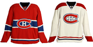
 This morning, the Montreal Canadiens unveiled their brand new Rbk EDGE uniforms to little fanfare. Overall, there were no major changes. The jerseys were merely adapted to the new style and cut, just as we'd expected. I have all the juicy details and photos below.
Before I go on though, I really need to send a huge thanks to the huge number of readers who emailed in links and photos. You guys are awesome! And you're the reason why I write this blog! I'm sorry I couldn't get stuff posted earlier, but I was amidst a live television show that begged my full attention. Moving along now.
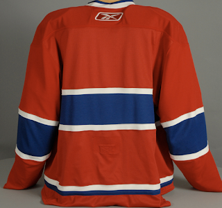
Here's a shot of the back of the home sweater.
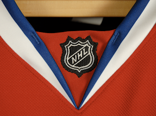
I also got an email with someone wondering whether the LNH logo would be used on the collar as opposed to NHL.
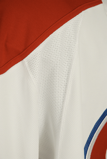
There's your answer. One last extreme close up photo and then I'll turn it over to you all for your comments.
I think these uniforms are great! Habs fans should be proud. Enjoy your big day!
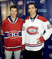 UPDATE (1:40 PM): It's always nice to see what these jerseys actually look like on players. Here you see Cristobal Huet and Maxim Lapierre donning the new duds.
Remember you can find these and many other photos of all the new sweaters in my official Rbk EDGE photo gallery.
And if you have other photos of the jerseys that I haven't posted, send them along and I'll add them to the gallery.



Reader Comments (44)
wow.... pretty UNDERwhelming.
I thought the concepts earlier were a bit more exciting...
-Kindred-
Sweet
Not bad. They could have done a little more, but at least they didn't add Montreal in huge letters above the crest.
Not much of a change so that's disappointing.
However, those sweaters were classics to begin with so I'm quite happy.
Couldn't have asked for anything better from the Habs... it maintains their classic look even with the new RBK Edge template. Hopefully the team kept the same nameplate lettering font and numbering fonts the same as before.
This begs the question now... why couldn't other teams with classy looking jerseys last season kept what they had? The Habs just proved (as well as the Red Wings) it can be done. The Islanders are the biggest example of a team that had a classy uniform and turned it into what they unveiled last month.
the flames did too:
http://flames.nhl.com/team/app/?service=page&page=MediaGalleryPlayer&galleryId=2255
Lucas, that link doesn't work. The Flames haven't unveiled theirs yet (expected later today).
Paul,
Your observation makes me melancholy. If the Sabres have (and soon had) the number one super duper selling jersey in the NHL, then why didn't every other team with an iconic tradition abandon and nuke their logo/uniforms?
Underwhelming is what you would expect from Montreal as they have a time tested iconic identity and would be fools to try to change that!
I'm glad they didn't mess with a good thing, but the horizontal stripes on the hemlines of the Edge jerseys really look bad on the ice.
They should just loop the stripes to make them match the shape of the jerseys.
i don't like it. On the home jersey if you look at the sleeves stripes, they have an angle. It's ugly. If you look at the Boston jersey, the have the angle to, but its bleck and the stripes are straight. This jersey sucks.
Buffalo was the best selling jersey last years because it was a new one, because they have lots of fan to buy de jersey and because they had a good season. It is not a winning recipe in long terms.
paul, it did work before. It was one of the flames galleries. i guess they took it down. It is exactly what we expected.
Flames are expected to unveil the new jerseys at 1pm Mountain Time, so I'd expect it to be 1:30
The horizontal stripes that some think make these new uniforms look strange are NOT the problem. The PROBLEM is these Reebok templates which have a circuliar hem line. Get rid of the stupid looking circuliar hem line and problem solved. These things have the hem line longer in the back and shorter in the front. What a Joke!!The NHL is looking like a bunch of clowns! Having said that Montreal has done a fine job under the Reebok/Bettman parameters.
I understand your viewpoint, Charlie. I do like teams that make some gutsy changes as long as they are good ones that actually improve their look, not just for the sake of change, ya know?
No doubt Montreal ranks in a different category than the high majority of teams. I agree that a radical change for the Habs would've caused an uproar beyond belief.
My bad, Lucas... I see that Chris posted what you saw. Good catch, by the way in finding it.
Can't say that I'm really surprised... it's nice to see some tradition sticking around. Even with the "new NHL," it's nice to see the old man of the group stays the same.
Simple, traditional, and perfect.
http://www.cyberpresse.ca/article/20070904/CPSPORTS01/70904073/5128/CPSPORTS01
They did what they could under the circumstances. Watching on TV, the difference will hardly be noticeable. No shoulder patch, different logo, or piping up the sides. The way it should be.
I'll miss the classic sweaters. Damn Buttman.
PERFECT. I am so relieved the habs stuck with the most classy jerseys in hockey. Along with the Bruins the Habs and all their fans should be proud. I know I am. AND to top it off, we kept the red shoulders on the whites (i have a strong liking for them) yepeeeeee
perfect!
For those of you wanting change in ALL of the NHL uniforms you are crazy. Change just for change's sake is misguided.
The Habs have and always will have tradition in these uniforms. Detroit and Montreal did this right and didnt change their uniforms so we can look at something different and edgy....
When you have something classic and traditional, something that really works - you keep it! Otherwise you end up like vancouver and change logos/colors/jersey style every 5 years because the fans get tired of the old one because, in reality, it never was that great to begin with.
They look good - I just wish they had stuck with the old-old school white jerseys (with the blue stripe along the middle). They look better to me than the red shouldered ones.... Ah well, WTG staying with tradition!
You know what I read from the Habs' news release here? Not that it is a shock to anyone, but look at how much the team is charging for a fully pro-customized authentic jersey? $329.95 + tax for a brand-new RBK Edge blank one and tack on an additional $100 for the customization?! Does the NHL think the average fan can afford to buy one at $430? That's nuts.
I wish people did not ask for blue band on the whites but hey, red shoulders won the day. The jerseys look baggy on the player photo or perhaps they picked size massive without the pads on. I have enjoyed 30 years of the best sweaters in hockey, heres to 30 more.
Tremendous. When I first heard of the new RBK jerseys I was pretty worried that the Habs uniforms would change. I'm very relieved they haven't. They done good.