Tuesday
Sep042007
Preview New Flames Threads
 Tuesday · Sep 4 · 2007 | 9:56 AM PDT
  57 Comments
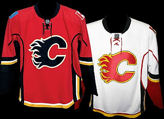
 The Calgary Flames won't make an official announcement until later today, but here's what their new Rbk EDGE uniforms look like. A couple of fans got their hands on the official online photo gallery this morning before it was taken down.
I'll obviously have more later today. Until then, notice the new shoulder patches. Canadian flag on one side. Albertan flag on the other. Very unique.


Reader Comments (57)
This is by far the ugliest jersey yet.
“Thats the problem, and I applaud the Flames advertant or inadvertant attempt to bring back a bit of regional indentity in their shirts.”
I think the adjective you're looking for there is "ham-fisted."
x3 - Why should I be pidgeonholed into liking a team just because it's in my region? I grew up in Calgary, but I grew up watching the Wings. Watching the likes of Stevey Y or Shanny lit something up inside me that I flat-out didn't get watching the Flames. I still get the same sensations now seeing Hasek pull off one of his crazy sprawled-on-his-back saves or Holmstrom smack a puck in midair into the back of the net, and for me I simply wouldn't get the same feeling watching it if it wasn't being done with a winged wheel on the chest. My dad, who grew up in Hamilton, was a Bruins fan because he got the same feelings watching Orr (who, it should be mentioned, was NOT 'local talent' from Boston).
People are far too quick to associate a team with a national orientation purely based on where the arena happens to be located. They forget that the players - you know, the guys who actually make the team what it is - are probably not all going to be from Calgary. And unless you're willing to sacrifice Kipper, Huselius, and any Canadian player who isn't a home-grown Alberta boy just to make that the case, throwing some provincial patch onto the shoulder is laughable purely because most of the lifeblood of the team - the players - aren't going to identify with it. Stop using the fastest game on ice as a soapbox for national/regional insecurities and support the people who actually make the game worth watching. I couldn't give a damn where Lidstrom or Zetterberg or Holmstrom or Stevey Y or Howe or Sawchuck come from, I just know that the Wings have had a history (a word you've stressed - never mind that the Wings have more history in their little finger than most teams have had in their existance) of players that have sent tingles up my spine in a way I've never identified with my supposed 'home' team. Why should I sacrifice that feeling for a team that leaves me feeling numb just because I don't happen to live within walking distance of Joe Louis Arena?
It's the mindset you promote that's really flushing hockey down the tubes. We can't admire players for players anymore, now you have to rally behind the arbitrary CANADIAN or AMERICAN banners (never mind that last season's Ducks were the most Canadian team in the league for players - certainly didn't stop the Canadians from frothing at the mouth, though).
The shoulder patches look terrible... Bright blue on red!?!?!?
And the lines.... Looks slimming like a damned blouse!!
http://i207.photobucket.com/albums/bb141/ramirez_inc/Ssssuper.jpg
AWFUL! Why do teams even need shoulder patches? These look ridiculos. Take off the patches and they're great jerseys.
Anonymous said...
This is by far the ugliest jersey yet.
Hey are you the same anonymous who says the same thing every time a new jersey is released? ...just wondering.
Who the hell do they think they are?? Putting the canada flag on their jerseys!