Atlantic Division Concepts
 Saturday · Sep 8 · 2007 | 1:49 PM PDT
  7 Comments
 I've been going through my email looking at all the concept art I've been sent in the past several weeks. Let the Concepts Gallery serve as a small indication. Anyway, I've grabbed a couple of designs for the Flyers and Devils I thought were interesting.
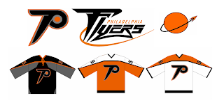
First off, one designer said, let's rebrand the Philadelphia Flyers a little. Here's what he came up with.
The designer had this to say about his creation.
The idea for the primary is just an updated Flying P - a little faster and sleeker looking than the current one. I've always been bothered that the current logo just doesn't evoke speed to me. As for the secondary, it's supposed to suggest something flying away from a planet or something.
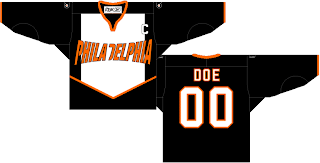
Just something interesting to share. There's also this design which has been floating around a little bit. I think the idea was to fit as many letters as possible horizontally across the front of the sweater. Mission accomplished.
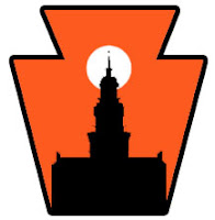
I can't see the Flyers ever wearing anything like that, though. However, something interesting that was sent to me was this concept for a secondary logo for the Flyers. Many who've suggested a secondary logo for Philly have simply gone with the Liberty Bell. What woudl you Flyers fans think of something like this?
 Pennsylvania's nickname is the Keystone State. That should explain the outer shape — a keystone. What I like is the white sun in the background because the first thing I thought of was the orange circle in the Flyers' primary logo. Very clever.
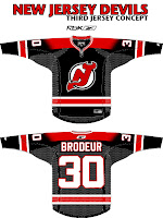
I was impressed with that. I was also impressed by a third jersey someone came up with for the New Jersey Devils.
 I know the league is abandoning those this year, but I think it could work just as well as a home sweater. I've always thought a black jersey would make the logo on the chest stand out more.
But I guess we'll never know. Devils brass have stated that the jerseys will be the same as the previous design, merely adapted to Reebok's new cut. Still, I figured this was worth a look.
Expect to see the Flyers' new sweaters on September 16, followed by the Devils' a day later in their first preseason game.


Reader Comments (7)
The new logo looks neat, but not for the Flyers. The current logo they've had the whole time the team has existed will never change. It'd be like changing the Canadiens's logo or the Bruins' logo. Also, the Keystone state thing wouldn't work because they are not the only team in the state. I'd be much better to have something represent the city instead of the state anyway.
I think the first thing is an awesome Flyers concept other than the inclusion of gray. The designer saying that he's been bothered that the current Flyers logo doesn't envoke speed I think is a good point. I doubt the Flyers will ever change it, but either way this is cool.
Keystone state thing is cool! I like the sunset and that appears to be Independence hall in silhoette. Cool so you get Philadelphia, Pennyslvania in one logo! If they used City hall with william penn statue it would be better. You could get a throwback to the first philly team Quackers. Founder of the city, broad street, the inner light from the quakers all in one logo as well as the Philly, Pa thing. That would be cool!
Not being a Flyers fan, I have to say that that concept is really nice. Perhaps some tweaking, but otherwise really a good concept. And best of all, the return of the orange sweater!
Starter used to sell those Devils jerseys years back. For whatever reason though, they stopped making them. Probably the same reason why you can't get the old red and green "Christmas warrior" sweaters at Mitchell & Ness anymore.
Pug Fugly. All of 'em.
-Johnny Griswold
all of them are messing with classic nice looking jerseys