On A Western Swing
 Saturday · Sep 8 · 2007 | 11:35 AM PDT
  6 Comments
 California is the running theme of today's concept art. We'll kick things off in the City of Angels. This first concept jersey for the Los Angeles Kings makes use of the original 1960s logo with silver replacing yellow.
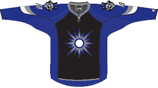
Not terrible, but my personal favorite was the king face logo used on the mid-'90s third jersey. While the jersey sucked, I thought the logo was the strongest in the team's history. Once again, the gold is changed to silver producing a jersey that might look something like this.
I'm not a Kings fan, but I'd buy that jersey or one like it in a heartbeat. As a great alternate to a set like this, there's this design.
I like the silver in the beard of the king face logo on the shoulders. I think that would work better on the purple jersey above. Maybe it could be one of those logos where the colors change depending whether the jersey is light or dark — like the Flames and Canucks.
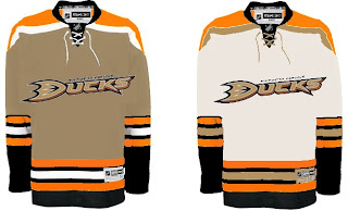
Moving along now to Anaheim, we have a Ducks jersey that isn't black.
Unfortunately, if it's gold, the logo (read wordmark) almost completely disappears. And I'm not sure it could be orange without looking like the Flyers. So black it is.
This concept might well turn out to be what the Ducks' new jerseys actually look like. I'd expect to see the team change the logo to the duck foot only, but that may just be wishful thinking.
My only other issue with this design is its lack of gold. That's an important part of this color combination and they should make good use of it.
And now we'll finish off this post with a trip up to San Jose. Got some interesting Sharks concepts to share.
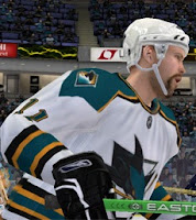
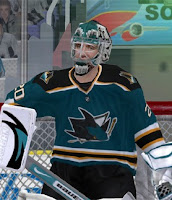
These next images are renderings from a video game — not NHL 08 — featuring a concept someone created for the Sharks. Very simple and classic. Shouldn't garner many complaints.
This cool jersey concept utilizes the shield logo unveiled by San Jose back in July. I really like that idea and it's not completely unheard of to use two different logos on NHL uniforms. Look at the new Wild sweaters.
The white one feels a little plain but not terrible.
Now Californians, let us all know how you feel about these concepts.
We've already seen the Kings' new uniforms, but we're still waiting on the Sharks and Ducks. Word out of San Jose is we should expect to see the new jerseys on September 17 while Anaheim has a preseason game on September 13. So at the latest, we'll see the new Ducks duds on Thursday if they don't unveil them sooner.


Reader Comments (6)
Chris, what game are those Sharks jerseys from?
If I were to offer an educated guess, I'd have to say EA Sports' NHL 07. But I could be wrong. All I know is it's a game where users can create customized uniforms — obviously.
Anybody else have a guess?
Its from an older NHL game. Its on a computer. And just pointing out that using 2 different logos has been done before, Washington Capitols old jerseys. Thanks for putting so much time into the blog/tournament, I'm really enjoying it.
The colours on that concept remind me of the AHL's Manitoba Moose jerseys.
I like the Kings jerseys, but would rather the black on the shoulder area be scaled down a bit. I agree that the grey beard workers better on the purple jersey, but would want the purple beard for the white jersey.
I love the idea of a gold Ducks home jersey. I hate black jerseys, no idea why, it just looks..bad.
Not much to say about the San Jose ones, they're nice. Can't complain.
Well...as a long time sharks fan (Jaimie Baker is my hero) I really hope they downplay the orange. It never has played a prominant role in the jerseys and shouldn't now. BTW, the official word from the Sharks is that the shield logo is only for marketing. It seems very unlikely that it will be used as a primary crest. The only place it might end up is on the pants.