Boston, Buffalo Fan Art
 Thursday · Jan 17 · 2008 | 1:08 PM PST
  6 Comments
 The polling in the Quest For The Worst tournament began this week with logos from the Buffalo Sabres and Boston Bruins. So, really, I should've posted this sooner. Luckily, there's no one to give me a bad grade for turning work in late.
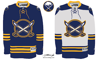
We've seen a lot like this recently, but this is just another really nice Sabres concept that makes use of my favorite logo as well as the favorite logo of a majority of the fans on this site.
But at least that buffalo is where he should be — the secondary position, the shoulder.
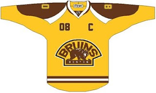
As for the Bruins, a lot of folks seem to be behind whole gold and brown notion. I'd have to see it on the ice to know whether I'd be a fan or not.
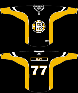
And then there's a scary logo alteration that should never see the light of day — don't take your computer outside.
That's that. I've got some good stuff for tomorrow's Freak Out post. Stay tuned.


Reader Comments (6)
Those are some nice Sabres concepts, even if they are essentially our classic jerseys.
But I must say, I miss the white buffalo on the main logo.
Still, this is better than the gutter trash they currently wear on the ice while they march toward a franchise record losing streak.
Those Sabres jerseys look fantastic. Well done to whomever came up with them.
The Sabres stuff is pretty nice.
A new twist on an old classic. Buffalo should wear these all the time.
Those Sabres concepts are very well done.
I LOVE those SABRES Jerseys!
Best I've seen anywhere,
finally we are the SABRES, and not the buffalo's. And the neck laces add a lot of old school class!
EXCELLENT WORK!