Just To Freak You Out XXV
 Friday · Jan 25 · 2008 | 4:36 PM PST
  10 Comments
 Time for this week's Freak Out Friday post — which happens to be the 25th ever. You know you love it. By the way, you're going to start to notice a very specific theme. Just go with it. I'll begin with a little something to startle you.
Now something to downright disgust you.
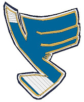
Who would do that to the Blues logo? And why?
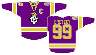
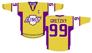
Beware of purple sweaters.
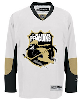
And scary Tim Burton penguins.
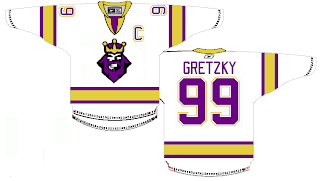
Also white sweaters, apparently.
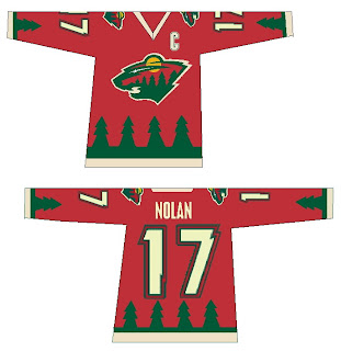
And sweaters with trees on them.
Yellow ones as well.
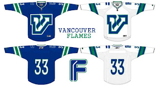
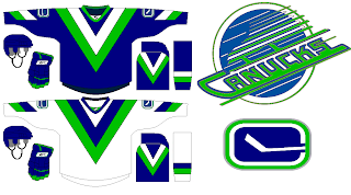
There's so much to be wary about these days that you might hope to find solace in the Vancouver Canucks.
All hope is lost.
And any notion of a sensible design.
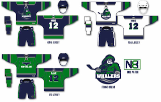
Finally, the fisherman you all love so much may not have worked for the Islanders, but if the Whalers every make a return, I think we've found their man.
Hope you guys enjoyed this episode. Stay tuned for a brand new one next week. Same bat time. Same bat channel. (Batman on the brain. Just watched Batman Begins again today.)



Reader Comments (10)
That penguins logo is from the Krefeld Pinguine in the Deutsche Eishockey-Liga.
Whoa! This Week Sure Did Prove that the Kings need to put out a restraining order against the colours Purple and Yellow being on the same jersey. The only jersey that looked good of the Kings is the White Jersey, Just Not with the Angry King on It.
Blues: No Comment, I'm Not Touching that with a 10 Foot Pole.
Penguins: Is that Psycrow From Earthworm Jim??
Wild: Would look quite funny as a third jersey.
Vancouver Flames: Like the use of the flipped Atlanta Flames Logo, Otherwise it's just stupid.
Canucks: Wouldn't look half bad. I like the pants. Green isn't dark enough though.
Whalers: If they did return I think that logo would be somewhat fitting. Now we'd just need an updated Pucky to match. the Fisherman.
Curtle, I totally disagree with you regarding the Kings original purple and gold. Purple and gold are synonymous with royalty and California. Furthermore, the NFL's Minnesota Vikings and the NBA's LA Lakers wear purple and gold and rarely do people criticize their uniforms. Don't you get bored seeing black vs white, navy vs white all the time? What about originality? I put the Kings original purple and gold with their classic crown in the same class as the Sabres original blue and gold and the Red Wings red and white. We all have our different views and opinions, but not everyone can be black, navy, blue, red, and white. That's why I loved the Kings original colours, along with the North Stars green, white, and gold, because they were colourful, but simple and original. Too many uniforms today look the same and that's not how sell hockey to the major US networks.
The Blues note/stick and the Canucks/Flames are both funny. Good stuff this week!
batman begins sucks...christian bale is a terrible batman, adam west is the only batman for me....nice jerseys by the way...i especially like the upside down atlanta flames logo for vancouver..sexy
The Blues and Penguins logos were horrible. There was something about the yellow and white Kings jerseys I liked. The Canucks designs were pretty cool also, they were different.
I think the Vancouver Flames treatment is pretty sweet.
For everyone with positive comments about the Vancouver Flames jersey. All I want to say is Thank you. Thank you very much.
the F with a stick in it is priceless. worthy of an LOL. a genuine one at that too.
The "F" with a stick in it was actuall the 3rd idea for a secondary logo. it's not quite as good as "C" witha stick in it, but it's alot better than what I had before.