All-Star Duds
 Wednesday · Jan 2 · 2008 | 4:10 PM PST
  22 Comments
 With the Winter Classic and all its greatness now behind us, the next big NHL event is the All-Star Game set to take place in Atlanta in three-and-a-half weeks. Naturally, I have concept art, but before I get to that, I've got some real stuff to discuss.
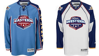
I've gotten a few emails recently that called to my attention the fact that I have yet to really talk about the new all-star uniforms here on the blog. I first posted photos of the new sweaters back in November. Since then, there have been other developments.
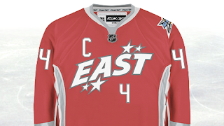
For instance, the reason the "logo" is so high up on the jersey is that the player's number will go below it on the chest.
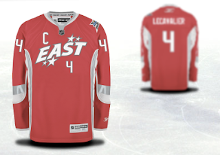
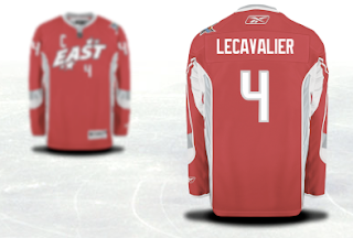
For a better look at the entire jersey, these images come from the NHL.com shop where you can customize and order an all-star jersey. Naturally, I used Vinny Lecavalier in my example.
You'll notice the captain's C takes its lead from the Detroit Red Wings in its right-shoulder placement. We can see that the all-star logo will go on top of the left shoulder while it would seem the player's team logo will go on the right.
As far as creative all-star jerseys go, my personal favorite was what they wore in the 2001 All-Star Game in Denver.
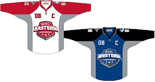
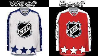
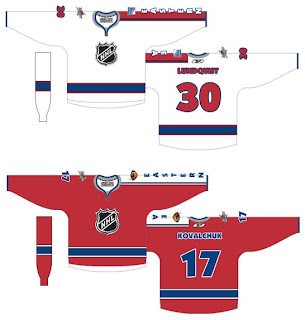
I may have strange taste in uniform design by most standards, but wait until you see some of the concept art that's been sent to me.
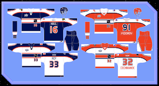
Modeled after the host team itself is a jersey set that is actually quite cool. What if the league made a habit out of this?
Here's a simple set that uses the conference logos as its primary features.
This set just has far too many stars on it.
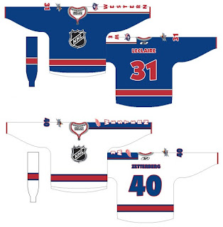
And this final set is a callback to the 2001 uniforms I just mentioned above where the goalies where a different color from the rest of the team — in essence, matching their opposition.
These too are modeled after the Atlanta Thrashers own uniforms, but a little less on the nose — trading the ATLANTA sleeves for EASTERN and WESTERN. It's a set I'm a big fan of.
Overall, some nice designs and some strange designs. I'm curious to read your reaction to these. Comment away.



Reader Comments (22)
i like the logo on the hosting team jersey idea. I would also like if they used the winner of each confrence i the playoffs jersey and put the confrence logo on it.
in hindsight, i should have made both goalie jerseys white ala the 2001 jerseys, i also should have added some stars down the other sleeve to fill it out more
oh well lol
I really wish people would get off this "stripe down one arm" kick... of course, I seem to be a huge minority in hating it, so whatever pleases the masses. lol.
Blech.
Here's my favorite all star jerseys
http://www.nhluniforms.com/2000s/Images/AllStar04.gif
my god, who came up with this new all-star setup? honestly how much s*** can they possibly cram onto a jersey. im actually kind of surprised that the team logo found its way to the shoulder and wasnt squeezed in somewhere up front with everything else.
i would love to see the rejected concepts that were actually thought to be worse than this one. im sure at least one had the players name going across the middle of the chest, slightly below the number but slightly above their date of birth and career stats...
Wow, they've got the captain's C on the wrong side and everything. These are worse than I originally imagined. I'm speechless.
I agree with your choice for best all start jerseys ever worn, it's just that those were worn originally in 2000 at the Toronto all-star game.
It's actually funny, I think those were the most creative all star uniforms and the 2 years they wore them were in the cities of my 2 favorite teams.
go figure.
I like your idea of basing the All-star jerseys on the host team. Though it would work better for some teams than others...I wouldn't want to see the All-star practice jersey and the game jersey look almost the same, as in if they played in Toronto this year. The colors should definitely be based on the host team, the design on the other hand...maybe on a case-by-case basis.
hosting team concept is great. it seems the nhl likes to 're-design' all star jerseys every year. they have great jerseys (mostly) in the 30 teams in the league. simply placing the conference logo on the fron is a good idea (at least it looks great on the atlanta jerseys).
I agree with lostallsympathy's 2004 All-Star jersey. It was a great throwback in the colors of the host city. I finally have a set of the two after missing them that year.
i would love to see the rejected concepts that were actually thought to be worse than this one. im sure at least one had the players name going across the middle of the chest, slightly below the number but slightly above their date of birth and career stats...
seriously. i LOLed at that
There aren't many All Star uniforms I've liked, but the ones used in Minnesota a few years back were pretty cool.
sorry for double posting but i also like this one...
http://www.nhluniforms.com/2000s/Images/AllStar02.gif
the numbers on the bottom of the frontseem good
also this one i like that the name is below the number for one team. make that for both teamss and its the best set ever
http://www.nhluniforms.com/2000s/Images/AllStar01.gif
i also liked that the goalies have different colors (hence like soccer)
not wanting to triple plost but there's no edit button
just found this out that is so cool
http://www.nhluniforms.com/2000s/Images/AllStar03.gif
team logo on the right, country logo on the left, their nationaly. how creative can it get?
Having the 'C' in the wrong spot is terrible... for both the All-Star uniforms and the Red Wings' uniforms.
Why coulden't they just move down the "EAST" a little the they could fit the "C" better . The number would be a bit lower but it would look 10x better.
LOVE the modded host team's jerseys being used as the East and West with using the conference crests!
That could make for a great collectors line! 30 years worth of All Star Jerseys to get the whole league, imagine when teams are moved or go belly up.... those jerseys could become big ticket items!
While this is pretty much exactly what I expected (I figured the number on the front would be centred like Dallas), I'm just shocked it actually came true.
and people said the vancouver canucks jerseys were cluttered ...
The All Star jerseys are just a little too bland for me. I would love them to go back to the original orange and black all star jerseys. By the way, haven't checked in in a while, any third jersey news for next year?
Guess what, kids: Not only does it make more aesthetic sense for the Red Wings to have their C/A patches on the other side on account of the logo's shape (Moving the logo down dosen't do anything to remedy the fact that having the patch over the wingtip makes the jersey look unbalanced), it's a historical throwback. Look at pictures of Red Wings players from previous decades - the patches are on the 'wrong' side.
These All-Star jerseys look awful, though. I hate numbers on the front of jerseys, and the logos themselves look like they belong on a laundry detergent or kids' cereal box.
My favorite all-star jersey was in 2004 they used them for just one year i think i'm not sure