NHL Tournament of Logos

Entries in allstar (6)

Monday
Apr072008

Pre-Playoff Concept Art

The Stanley Cup playoffs kick off on Wednesday night. Tomorrow I figure I'll post my predictions and so forth for anyone who might be interested. In the meantime, I've got concept art for you tonight. Not a lot but just a few things I thought were especially interesting.

First, a big set of third jerseys. Pretty much every team with rumors floating about. And then a special treat.

I told you it was a lot.

Then, with the recent surfacing of the 2009 All-Star Game logo, one reader came up with a concept for a Habs-based jersey design.

In French, no less.

And finally, a Canucks concept I thought was interesting given the current logo tournament going on at ToHL.

Obviously a take on the WHL's Giants.

Enjoy your night and let's get set for some playoff hockey! My favorite time of year!

Saturday
Apr052008

2009 All-Star Logo Surfaces

Quick note tonight. An NHLToL reader ran across the 2009 NHL All-Star Game logo while browsing NHL.com today. Figured I'd share it with you guys. The game will take place in Montreal to celebrate the Canadiens' 100th anniversary.

I'm a fan. It seems a little odd to have the actual Habs logo in the design, though. Usually, the host team's logo is in the all-star logo but altered in some manner. Guess nobody wanted to alter the CH. Makes sense to me.

What are your thoughts on it?

Wednesday
Jan022008

All-Star Duds

With the Winter Classic and all its greatness now behind us, the next big NHL event is the All-Star Game set to take place in Atlanta in three-and-a-half weeks. Naturally, I have concept art, but before I get to that, I've got some real stuff to discuss.

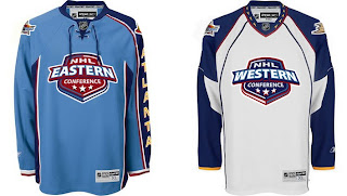
I've gotten a few emails recently that called to my attention the fact that I have yet to really talk about the new all-star uniforms here on the blog. I first posted photos of the new sweaters back in November. Since then, there have been other developments.

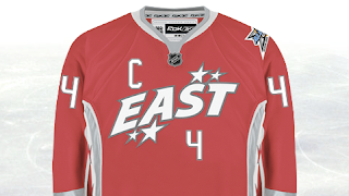
For instance, the reason the "logo" is so high up on the jersey is that the player's number will go below it on the chest.

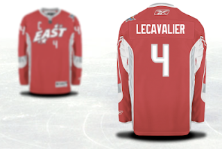
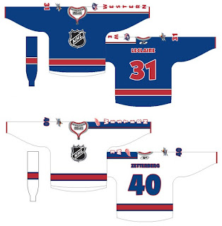
For a better look at the entire jersey, these images come from the NHL.com shop where you can customize and order an all-star jersey. Naturally, I used Vinny Lecavalier in my example.


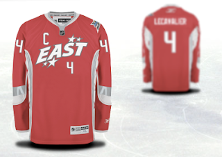
You'll notice the captain's C takes its lead from the Detroit Red Wings in its right-shoulder placement. We can see that the all-star logo will go on top of the left shoulder while it would seem the player's team logo will go on the right.

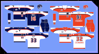
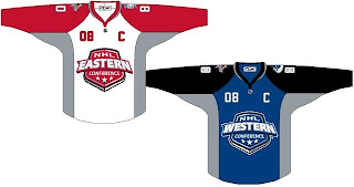
As far as creative all-star jerseys go, my personal favorite was what they wore in the 2001 All-Star Game in Denver.

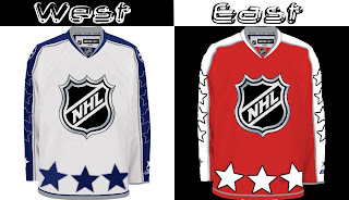
I may have strange taste in uniform design by most standards, but wait until you see some of the concept art that's been sent to me.

Modeled after the host team itself is a jersey set that is actually quite cool. What if the league made a habit out of this?

Here's a simple set that uses the conference logos as its primary features.

This set just has far too many stars on it.

And this final set is a callback to the 2001 uniforms I just mentioned above where the goalies where a different color from the rest of the team — in essence, matching their opposition.

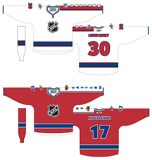
These too are modeled after the Atlanta Thrashers own uniforms, but a little less on the nose — trading the ATLANTA sleeves for EASTERN and WESTERN. It's a set I'm a big fan of.

Overall, some nice designs and some strange designs. I'm curious to read your reaction to these. Comment away.

Friday
Nov162007

Just To Freak You Out XV

We were a little thin in terms of new Freak Out art this week, so forgive me if today's post is a little light. Still, nothing pleases me more than trying to freak you guys out with some crazy concept art.

As many of you know, the NHL unveiled the 2008 All-Star Game sweaters this week. Reader reaction here was not great. In fact, I got some very Freak Out-worthy concepts based off of those jerseys.

John sent those in along with a few others. You'll be able to find them in the Concepts Gallery this weekend.

We'll keep things moving with the Pittsburgh Penguins next. Each concept here imagines a drastic change. For instance, the first example suggests renaming the team the Pirates — a club that once existed in Pittsburgh during the early years of the NHL.

And the second suggests that the team keep the name but move to Russia.

That silly penguin even looks Russian.

And then, this goes out to all the folks from Quebec. It just doesn't look right. At all.

We'll keep things in the Western Conference now. With all the vanity in the world these days, you had to see this coming.

It seems even the Chicago Blackhawks' Indian head wanted a facelift. Either that or he got the Botox. And don't think I'm ignoring the Bears reference in there.

Next we'll head to Detroit where I'm quite concerned.

I think the grey jersey is an interesting choice, but I don't think an octopus will ever be anything but scary on a Red Wings concept. That tradition should stay off the sweater. Having said that, as a logo itself, it's not bad. But I'm still very, very concerned.

And finally, with Christmas just 39 days away, I thought I'd start my decorating now.

Ho ho ho!

If you've made or run across any concepts you think might be worth posting for Freak Out Friday, don't be shy. Send them along! You can email me at nhllogos@gmail.com.

Thursday
Nov152007

This One's All Atlanta

As the title implies, this post will stick to an Atlanta-based theme. We'll start with the team currently in that town — the Thrashers.

A reader emailed in this concept which calls for a return to the days of going heavy on the dark blue and maroon. Don't get me wrong, I don't think it's a bad look. I just prefer the light blue jerseys. One of the best in the league, if you want my opinion — which I'm sure many of you don't.

I bet the asymmetry of that blue jersey is causing aneurysms for a good number of you. I think it's a winner. Not really feeling the sleeves on the white jersey, however. I know what's being attempted, but it just isn't working. Thoughts?

Now let's take a blast from the past with the Atlanta Flames.

You might notice Jarome Iginla's name on the back of these sweaters. Try to ignore the Calgary connection. I really am trying to write an Atlanta post. The one on the left is a little plain but I like the city name down the sleeve. The crest is awkwardly large however. What I like is the one on the right which is oversized just right — if that makes any sense.

I think this is a really cool idea. The giant logo basically becomes the jersey design. I think it provides a really cool effect. Not sure how great it would look on the ice, however. But by itself there, I'm a fan.

And finally, we'll top things off with the 2008 NHL All-Star Game which is being hosted by the great city of Atlanta. The jerseys for that game were recently unveiled to the general disappointment of a lot of the readers here. One fan emailed in a couple of concepts for the big game. They're not bad, but they do borrow heavily from the Philadelphia Flyers.

Oh, and before a handful of you start needlessly jumping up and down on the designer, let me point out that we know a design like this prohibits the use of a "C" or "A" on the chest. And I do think the all-star and team logos should be left on the shoulders. Other than that, I think they work. Perhaps we'll see something similar in the future.

Until then, we have what we have.

Tuesday
Nov132007

Atlanta All-Star Jerseys

Don't know if you guys have seen these, but the new All-Star jerseys are out for the 2008 game in Atlanta.

Not too shabby.

By the way, Round Two of the Third Jersey Logo Tournament begins tomorrow so keep an eye out for that. Mighty Ducks and Sabres.

UPDATE (11/14 2:16 AM): My apologies on not providing a source. I think in my rush I just forgot. But as a few people pointed out in the comments, the images are available on the NHL.com Shop. I snagged them from there so I could show you guys and see what you thought. Sounds like most of you just like to be negative but to each his own. It's a hockey jersey, not a Renoir.