NHLToL: Quest For The Worst
 Monday · Jan 7 · 2008 | 3:11 PM PST
  38 Comments
 It's a big day here at NHLToL. First, I'm introducing the new logo tournament which will be starting soon.
Introducing...
There's currently a video at the top of the page so you can learn which logos made the cut for this competition which will crown the worst logo in the history of the NHL.
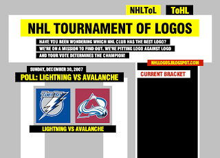
You might also notice that the graphics in the video don't quite match the graphics on the site here. I'm considering a design overhaul for the site. You can see the rough idea I've come up with in the preview below. It's very much a work in progress at this moment so don't expect to see it any time soon.
Just wanted to keep you guys posted on what's going on here. I welcome any comments or criticisms. Thanks for continuing to visit the blog!
UPDATE (1/9 5:21 PM): As you may have noticed the video I referred to in this post can no longer be found at the top of the page. Instead, I've moved it here to the bottom of this post for posterity. Enjoy!


Reader Comments (38)
I like the new skin a lot, just looking at it. By the way, Canucks fans vote the stick-in-rink and the flying skate to the finals, w00tZ~!
By the way, did you make the video? If you did, great job! New skin FTW!
I like the new skin a lot, just looking at it. By the way, Canucks fans vote the stick-in-rink and the flying skate to the finals, w00tZ~!
By the way, did you make the video? If you did, great job! New skin FTW!
Glad to hear to like the new layout. Hopefully I'll have it ready within the next few weeks. And I did make the video. Thanks!
Go with the new layout. Tabloid-style looks great.
Wow!, I wasn't expecting such a professional video to come with this tournament! lol
I really like the (possible) new site design.
Do you think since you're creating a new layout, you'll also create a new URL without the .blogspot.com at the end?
I like the current look!
Cool flash video.
Great video, you're taking this great site to a whole new level.
That was an awesome video! took me by surprise when i opened the site. I personally don't think the first lightning logo should be in the bracket. It must have been hard for you, Chris, to put that in there seeing that you are a Tampa fan. Anyway, the new skin for the site is awesome! Good job on both!
Great video. And finally, a logo contest the canucks can't win...... unless there are as many canuck haters out there as canuck fans.
I knew there had to be a part 2. There was a distinct lack of CURRENT OILER LOGO (though I don't think you'll put that in anyways)
so is there gonna be 32 teams
Hi Chris,
The new look is great, although I'm sure it will take us some time to get use to it.....that's always the way when websites change. It's great that you're still putting so much effort into this thing.
So the other day I asked if you were going to update the uniform rankings, as I had noticed some movement. I accepted your reply but my curiosity got the better of me and I couldn't resist checking for myself.
There was a lot of movement in the middle third of these rankings. By far the largest jump was Vancouver, going from 20th to 9th (probably another Canucks conspiracy right?! LOL). The biggest drop was Philly going from 16th to 20th.
Here is the full list of new results for the uniform rankings:
1) Boston (4.265) E
2) Montreal (4.138) E
3) Washington (4.051) E
4) St. Louis (3.969) E
5) Chicago (3.958) E
6) Columbus (3.907) E
7) Detroit (3.764) E
8) Tampa Bay (3.737) E
9) Vancouver (3.690) +11
10) Phoenix (3.606) -1
11) New Jersey (3.539) +1
12) N.Y.R. (3.535) -2
13) Minnesota (3.477) -2
14) Ottawa (3.392) +1
15) Los Angeles (3.343) -2
16) San Jose (3.304) -2
17) Pittsburgh (3.285) E
18) Calgary (3.243) +1
19) Carolina (3.242) -1
20) Philadelphia (3.233) -4
21) Buffalo (3.081) E
22) Florida (3.028) E
23) Colorado (3.008) E
24) N.Y.I. (2.972) +1
25) Nashville (2.958) -1
26) Atlanta (2.924) E
27) Dallas (2.708) E
28) Toronto (2.636) E
29) Edmonton (2.614) E
30) Anaheim (2.547) E
So there you have it. Overall, you were right Chris, there wasn't too much movement. But the fact that Vancouver took such a massive jump I'm sure will spark some comments, as will Philly's drop. New Jersey, Ottawa and Calgary also passed two teams each. And it's worth a mention that the top 8 and bottom 5 teams remained in the same order. Most of the movement was in the middle third.
Anyway, this was an interesting process...which I did for my own curiosity if nothing else.
Thanks for such a great site Chris. Really good to see that you keep coming up with new polls! Cheers.
Grinder,
Wow, that's a lot of work you did. Truth be told, I have been keeping an eye on the stats all along and I've seen the minor changes you pointed out — actually I've seen a lot more than this over the course of the last few months — but like I said, I can't see altering the ranking at this point. That's how everybody felt about the jersey a month into the season.
If the site's still around next summer, my plan is to organize another means of ranking the jerseys — after we've all had a year to get used to them.
Anyway, I'm continually fascinated by Canucks fans. Fascinated and frightened all at the same time. I'm sure that's how they like it. I'll be heading up to Vancouver in March and I have tickets to a game. It'll be interesting to see them in the flesh.
Thanks again for your comments!
Awesome video
Awesome Chris.
Just wondering where is pucky, but anyway.
funny how most of the logos are third jersey logos. yet, fans still want to see third jerseys for next season.
can you really call the ducks' third logo (wild wing jumping out of ice) a logo? it is more of a mural on a jersey. it was printed on the jerseys, much like the stupid diagonal stripes calgary had in 1995. logo should be a 'patch' that is sewn on the front or shoulder of jerseys.
love the new look chris, cannot wait for the tournament to start. if you are running out of ideas...maybe we can vote one the best font.
Pretty sweet video and skin. I'm not too sure about the black and yellow though.. it hurts my eyes.. :P
It looks so professional! Keep up the great work chris!
*sigh of relief*
so far the hurricanes still aren't in it. (hey, what can i say.. i'm biased :P)
i like the prospect of a new layout...but is yellow on white the way to go? it seems a little...hard on the eyes.
Definitely a good array of bad logos in this first round, that's for sure.
I hope you bring in the Vancouver Canucks "Flying V" for Round 2 because that was horrendous.
I don't know how the hell you can pick not just one, but two classic Canuck logos, the original Stick in the Rink and the Speeding Skate from the 80s and 90s as two of the worst logos? The Stick is a classic and simple design and the Skate represented speed and finesse. Why didn't you pick the corporate birthing Orca C? And another thing: Why did you pick on the classic purple and gold crown of the LA Kings??? Give me a break PLEASE! Ever since the Kings went to black and silver, the NHL has lost its colour and originality in team logos and uniforms. For your info, purple and gold are synonymous with royalty and California. The LA Lakers wear it. The Minnesota Vikings also wear it. No complaining from fans in those teams' respective leagues. The Kings' original crown is right up there with the original Sabres logo, the St. Louis Bluenote, the North Star N, Detroit's Wing & Wheel, and the Philly's Flying P. Colourful, yet simple and original. Oh, how I pray and hope the Kings bring back the purple and gold. Too much black vs white these days.
Loved the video and like the new layout. I would like to point out that Montreal after winning the first tourny has not been in any... why the snub? though I would not want to seem them in the worst logo race. Anyway keep up the good work, that allows me some much needed distractions from my master's thesis.
has everyone lost their goddamn minds?
*gets down to the funky music*
The new layout itself looks good, though I'm not fond of the colours. I don't like the yellow. But thats just me.
Not a fan of the new layout...I think it's too much, personally.
However, great job on the video. That was probably one of the best videos I've ever seen (editing quality).
Very nice new layout. Can't wait to see it!
correct me if I'm wrong, but the "Flying V" was never a logo. The Skate was the logo during the use of the "Flying V" uniform. Making the notion that the "Flying V" is the worst logo wrong. It would be like saying the stars had the worst logo when they wore the jerseys that made the outline of a star on the bottom.