Hi Ted, Caps Fans
 Tuesday · Jan 8 · 2008 | 12:17 PM PST
  20 Comments
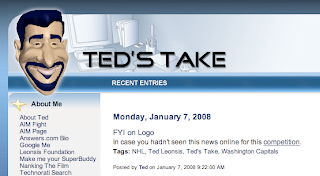
 I noticed yesterday the blog got a mention on Washington Capitals owner Ted Leonsis' blog at AOL.com. On Ted's Take, there was this post.
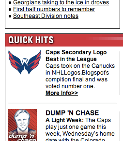
Then also, right there on the Caps' official web site is a link touting the secondary logo's recent victory in the logo tournament.
Unfortunately they got the name of the site wrong (also misspelled the word "competition"), but I guess I can forgive them. And then combining both Leonsis and the official team site was a mention in the Owner's Corner column posted today.
...
And finally, congratulations to our secondary logo mark, which won the NHL Tournament of Logos at nhllogos.blogspot.com. We edged Vancouver’s secondary mark in the finals. Previously we had tied for second in the Rbk Edge Uniform Ranking, joining Montreal behind Boston. The Hershey Bears were edged out in the semifinal round of the AHL tournament by the Bridgeport Sound Tigers.
That’s why I love the web; there are so many ways for fans to interact and connect. Well, I look forward to seeing many of you at our season-ticket holder Meet the Team Party Thursday night and others at the stretch of home games we have ahead. I hope you share in my excitement for what I believe will be a promising 2008.
Pretty cool stuff. I can't believe the kind of recognition this site is getting. My thanks go out to Ted and all the folks with the Capitals' organization for supporting the site — and coming up with such an outstanding logo!


Reader Comments (20)
Recognition is always cool.
Personally I still think the logo is a rip-off of the Pontiac Firebird logo, but that's me.
One could also state it's a ripoff of D.C. United.
Either way, its great to get recognition from a tech-savvy owner and the Capitals fan base.
Congrats Chris on the accolades!
do you think you will get some press from the worst logo winner???
congrats on this, good to see you are getting recognition from the teams.
Someone from the Capitals orgnaization has been reading this because it's fixed now..
Caps Secondary Logo Best in the League
Caps took on the Canucks in NHLLogos.Blogspot's competition final and was voted number one.
More Info>>
Well, the Capitals haven't won too many other things lately, so it shouldn't be a surprise that their logo's victory would get mention on the owner's blog...
I kid, of course.
Unfortunately, you are right lol
maybe it'll convince Ovie to stay and not consider leaving like Drury or Briere!
Eh, if you were to email Ted right now, and ask him serious hockey questions, you'd probably get a reply sooner or later. He's that kinda guy.
here's a serious hockey question, when will they sign Ovie to a long-term deal?
So do you think if we bring it to the attention of the team that wins the worst logo ever contest (the upcoming challenge) that they might be inclined to change it if they have not yet done so?
If that is the case, there could be a lot of voters for that one.
Hmmmm, Buffalo and/or Anaheim, perhaps? I wonder if there are other present team logos in the competition.
Buffalo knows how many people hate the slug. But they're too busy counting merchandise receipts to care. Which pains me to no end.
It's not a bad logo, but it does look like a rip-off of the Firebird and/or the United.
The way people talk, you'd think the slug was the worst thing to ever happen to the NHL. I don't get it. I think it's a good logo.
I'm not one to judge the tastes of others, but Daniel, get your eyes checked. lol
OK, it's a buffalo. It's sort of swooshing across from left to right. It's got a red eye, just like their old logo. It's blue and gold, just like their old logo. And it's even got a cool sword-looking thing going back from the eye. (Don't know if that was intentional or not, but I see it.) What's the problem?
I guess ultimately it's just a matter of personal taste. I like it. *shrug*
"OK, it's a buffalo. It's sort of swooshing across from left to right. It's got a red eye, just like their old logo. It's blue and gold, just like their old logo. And it's even got a cool sword-looking thing going back from the eye. (Don't know if that was intentional or not, but I see it.) What's the problem?"
The original buffalo was white, not piss yellow. I hope I don't need to explain the symbolism and meaning of the white buffalo. Last I checked, there are no yellow buffaloes.
Secondly, there is no sword in the slug design. At least no sword that I've ever seen, and certainly not a sabre, which is the name of the team after all. You'd think that MAYBE the team name would feature prominently in the logo design, but alas.
The biggest problem with the slug is that it looks weak. Puny. Infantile. Silly. Terms like "the slug," "slugalo," "Donald Trump's toupee," and "the horned colostomy bag" don't come out of thin air. They come up because that's what it looks like.
And pray tell, how does a buffalo attain such speeds as to streak so fast that its features are but a blur? Last I checked, buffaloes aren't all that fast. The original didn't look fast, but it certainly looked powerful, and at the very least recognizable. It didn't bring unwanted connotations along with it.
And the original logo had sabres featured prominently in the design. It was hands down the best logo this town has ever seen, yet it remains on the shelf in favor of the slug.
Not to mention, out of ALL the designs that could have been chosen, out of all the fan-made concepts that were out there (particularly those of John Slabyk), how was the slug chosen? How the hell did someone pick that out of a crowd? Was that REALLY the best option on the table? That's shameful.
How could any self-respecting hockey fan watch the Winter Classic and think the slug shouldn't be buried under a mountain of salt as soon as possible?
Someone got bored. I personally like the black, silver, and red logo the best.
I won't go into details of why I like this one better than others. I will just say it is my personal preference
Hey man, I'm not dissing the old logo. The old logo's great. I'm just saying I don't think the current one's bad either. Obviously a lot of it is just my own personal taste, but I can still back it up a little.
I'm not gonna claim that the sword was intentional, but I don't think you can say for sure that it wasn't. The blue stripe going back from the slug's eye sure looks like a sword (with the part wrapping around the eye being the handle).
Who cares whether a buffalo can streak or not? It's a sports logo, not a field guide to North American mamals. It's supposed to look more stylized than the real animal.
Besides, I get tired of hearing about how there's no sabre in the logo. Assuming that the sword I see wasn't intentional, who cares anyway? Any old team can put its name in the logo, but how many teams play in a place that allows them to make a logo based on their city name? It's something that's uniquely Buffalo, and I think Sabres fans should embrace it.
And finally, any logo can look like something bad and/or stupid if you look at it right. Who cares if it can be seen as a slug or a toupee? I don't hear anyone complaining about how the Canadiens' logo looks like an "H" wrapped in a certain reproductive structure. It's all a matter of perspective, and you can do it with any logo.
You can. But not as easily as the slug.