Just To Freak You Out XXVII
 Friday · Feb 15 · 2008 | 4:43 PM PST
  10 Comments
 It's Friday and despite the fact that I'm waist-deep in boxes and half-dead from packing them, I have Freak Out art. And lots of it. So much so that I'm saving some of it for next week. But let's get to the good stuff.
Please don't ask me what that's supposed to be. I think I get the buffalo and the swords. But I'm not sure I understand the raccoon reference found around the eyes there. Perhaps it's just me, though.
But while we're on the topic of indignities...
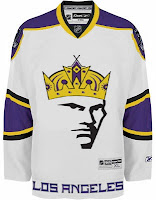
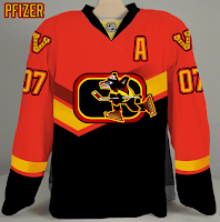
No, the guy wearing the crown isn't Mark Messier. But good guess. And to the right there, the ultimate Vancouver Canucks jersey. How do you improve upon perfection like that?
Couple more oddities.
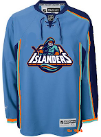
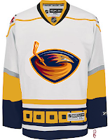
I like those colors on the Islanders jersey. And I know how you guys love the asymmetry on that thing — the original coming from the actual Thrashers jersey, not to be confused with the one on the right which is a recoloring of the Hurricanes sweater. The striping is weird. Yeah.
Sticking to the irony tack, here's an idea no one ever considered for the Anaheim Ducks.
And now you know why no one ever considered it.
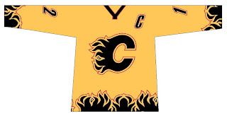
We're developing of list of things the Flames need.
Also on that list: trading Jarome Iginla.
And finally, with the recent introduction of the new Stanley Cup playoffs logo, one reader got to work on new East and West logos — only what if they reverted back to the old conference names?
Despite the creativity, and I have to give a lot of credit for that, they're just messing with my brain so bad. Nice work, but über freaky!
Hope you enjoyed your Freak Out Friday. If I'm unable to update the site tomorrow, just know that's it's because I'm moving to a new apartment this weekend, not that I'm lazy. Not that I'm not lazy. It's just that's not the reason. Did you follow all that?







Reader Comments (10)
the sabres one is a combo between the Sabres red third (recolored of course), the slug logo, and a severely altered Buffalo Bills logo
What's freaky about those conference logos? They look classy to me, and "Clarence Campbell" and "Prince of Wales" are much better names than "Eastern" and "Western". Who decided conferences had to have boring names?
Must have been an American. At least they didn't call them to the National and American Conference. Or replace the Stanley Cup with a silver puck and call it the Supercup.
Excuse the rant.
Yea. Technically, that's what the trophies are called, so it's really not that freaky.
Another Good Week...Here's My Thoughts.
OMG! It's Super Buffalo
No Comment on the Kings
If I didn't already like the V with Johnny Canuck's Head on top. PFIZER's Logo and Jersey would So Be the One I'd Love to See as a Nucks Uniform.
Islanders, I think were onto something.
Thrashers, not so much...
Anaheim...No Comment
Flames...No Comment Either
If they decided to wear Patches for the Eastern/Western Conference Final Those Patches would be Perfect, Just Replace the trophies with a better drawn image and change the name to Western/Eastern Final or don't change them at all.
and with that, That's my Review.
That Canucks concept jersey is simply breathtaking
The Prince of Wales and Clarence Campbell are the Conference trophies
I agree with you Jacob. Campbell Conference and Wales Conference were way better than East and West. As well as the division names, Smythe/Norris/Adams/Patrick. But somewhere, someone felt it better to have geographical names and scrap all the history of the NHL.
I think the Asymetrical jerseys are absolutely horrible. I hate them very much. Campbell and PoW are a million times better than east and west.
The conference logos should have the word "conference" in place of 2008 so they can be used from year to year. Other than thats theey're brilliant logos the artist ought to submit to the NHL. The rest are terrible. Anaheim could use the concept of the webbed foot froming an "A", but it needs to be desperately recolored. The V on the Canucks jersey ought to to be the current Johnny Canuck logo recolored, just to top it all off. The Kings jersey features a good update of the original logo, but seriously, get rid of the face. Carolina striping on a Thrashers jersey? I don't get that, but then again, this is the same franchise that held a wedding with their mascot as the best man, so I guess there realy isn't very much to get. Buffalo=yuck!
The conference logos should have the word "conference" in place of 2008 so they can be used from year to year. Other than thats theey're brilliant logos the artist ought to submit to the NHL. The rest are terrible. Anaheim could use the concept of the webbed foot froming an "A", but it needs to be desperately recolored. The V on the Canucks jersey ought to to be the current Johnny Canuck logo recolored, just to top it all off. The Kings jersey features a good update of the original logo, but seriously, get rid of the face. Carolina striping on a Thrashers jersey? I don't get that, but then again, this is the same franchise that held a wedding with their mascot as the best man, so I guess there realy isn't very much to get. Buffalo=yuck!