NHL Tournament of Logos

Entries in west (120)

Friday
Feb152008

Just To Freak You Out XXVII

It's Friday and despite the fact that I'm waist-deep in boxes and half-dead from packing them, I have Freak Out art. And lots of it. So much so that I'm saving some of it for next week. But let's get to the good stuff.

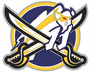
Please don't ask me what that's supposed to be. I think I get the buffalo and the swords. But I'm not sure I understand the raccoon reference found around the eyes there. Perhaps it's just me, though.

But while we're on the topic of indignities...

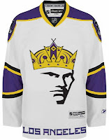
No, the guy wearing the crown isn't Mark Messier. But good guess. And to the right there, the ultimate Vancouver Canucks jersey. How do you improve upon perfection like that?

Couple more oddities.

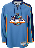
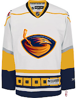
I like those colors on the Islanders jersey. And I know how you guys love the asymmetry on that thing — the original coming from the actual Thrashers jersey, not to be confused with the one on the right which is a recoloring of the Hurricanes sweater. The striping is weird. Yeah.

Sticking to the irony tack, here's an idea no one ever considered for the Anaheim Ducks.

And now you know why no one ever considered it.

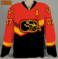
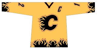
We're developing of list of things the Flames need.

Also on that list: trading Jarome Iginla.

And finally, with the recent introduction of the new Stanley Cup playoffs logo, one reader got to work on new East and West logos — only what if they reverted back to the old conference names?

Despite the creativity, and I have to give a lot of credit for that, they're just messing with my brain so bad. Nice work, but über freaky!

Hope you enjoyed your Freak Out Friday. If I'm unable to update the site tomorrow, just know that's it's because I'm moving to a new apartment this weekend, not that I'm lazy. Not that I'm not lazy. It's just that's not the reason. Did you follow all that?

Friday
Aug102007

Sharks vs Canucks


vs
SHARKS
CANUCKS
5-8
5-8

The Aesthetics
Water-based creatures bearing teeth are prominently featured in these two logos. And they're both breaking things. The shark is breaking a hockey stick and the whale is breaking through ice. But as far as the overall look, I have to go with the Canucks. It's always been one of my favorites. As for the Sharks logo, while the recent change was an upgrade, they could've done better.
Canucks

The Nickname
Canucks are people and by and large, people are not impervious to Sharks. In fact, sometimes they lose limbs to big fish.
Sharks

The Analysis
Even though there isn't a "Canuck" in this logo, per se, I'm willing to give them a pass on that this time around. I love the Haida-style art and you can't say an orca in ice has nothing to do with Vancouver (which I may or may not have previously said). So here's why they're still getting beat by the Sharks. Call me slow, but I just found the "SJ" hidden in the Sharks' new logo and it's awesome! If you want to find it, check out the black in the fins. Look hard. You have to really want it. It's the last day of the tournament, so it's the final match for each logo.
Sharks


WINNER
2-1


Thursday
Aug092007

Kings vs Sharks


vs
KINGS
SHARKS
7-6
5-7

The Aesthetics
These two logos both have rather unique color schemes. You don't really see them anywhere else in the league. The Sharks recently introduced a new logo and this is its first time in the tournament. It's certainly an improvement over the previous logo, and even though sharks are grey, not teal, I like the extra color in the logo. What's unfortunate is that they kept the broken stick in the logo. The Kings logo is a good example of how you work in a hockey stick if you absolutely cannot help yourself. Make it subtle!
Kings

The Nickname
As powerful as King may be, if he took a dip in Shark-infested waters, he'd become lunch and nobody would be able to do anything about it.
Sharks

The Analysis
Despite getting an update, the Sharks logo still leaves a lot to be desired. I think the Kings logo is stronger and hey, what says California more than the suns on either side of the crown? Now, if you can, try and resist the urge to tear apart my reasoning. It's flimsy and would never stand up to it. Come back on Sunday and vote for yourself!
Kings


WINNER
2-1


Thursday
Aug092007

Coyotes vs Oilers


vs
COYOTES
OILERS
5-6
2-11

The Aesthetics
The howling coyote actually gives us something to look at. Is the oil drop at the top of circle meant to be the focal point of the Oilers logo? If not, all that's left is the text and you know how that irks me. Don't you? Notch another one for the desert dogs.
Coyotes

The Nickname
An Oiler is probably a rather rugged fellow. I don't he'd find any need to worry about a little Coyote. Face to face, I think he could take it. Don't ask me how.
Oilers

The Analysis
There are things that bother about the Coyotes logo, small things like the fact that the ear is seen more easily than the eye. The Oilers logo is strong, solid and classic. I imagine it will be one of those that sticks around forever despite the fact that I think it could use an upgrade or two. But who am I to say? It may come as a surprise to you all, but overall, I think it's better than the Coyotes. Oh, and that does it for the Oilers schedule. When next you see them, you'll be placing a vote.
Oilers


WINNER
2-1


Wednesday
Aug082007

Predators vs Coyotes


vs
PREDATORS
COYOTES
7-6
5-6

The Aesthetics
Both of these logos are wild animals with wide open mouths. Because of that, there are a lot of similar elements. The biggest difference, aside from color, is the fact that the there's so much more detail in the Predators logo. Normally that wouldn't be a plus, but here it is. The Coyotes logo is just awkward looking to me.
Predators

The Nickname
We've got cats and dogs here. And normally you'd think the dog would beat the cat, but check out the teeth on the Predator. That Coyote never had a chance.
Predators

The Analysis
As a desert icon, the Coyotes couldn't have chosen a better name for the team — not that the Predators didn't. The Coyotes even have great colors, but I liked the original logo better. The Predators logo kind of has a lot of colors. All things considered, I think it wouldn't hurt to simplify it a little. But overall, I find it to be a little better of a logo. The Preds close out their schedule with the sweep.
Predators


WINNER
3-0


Tuesday
Aug072007

Flames vs Blackhawks


vs
FLAMES
BLACKHAWKS
12-1
2-11

The Aesthetics
Both of these teams wrap up their schedule today. Let's see how they fair. You probably already know who I like better for this category. And if you don't, it's the Flames. What's going on in the Blackhawks logo? Do they have a defined color scheme? Is there a way to find it in the logo? No? Meanwhile, the flaming "C" is cool, especially in black.
Flames

The Nickname
Humans have never been able to really control fire, not even Chief Blackhawk himself. A few Flames get out of control here and there and suddenly the entire state of California is under a wildfire watch.
Flames

The Analysis
Many have argued that I'm insane because I don't agree with "many other sports fans" who consider the Blackhawks logo to be one of the best ever. Thing is, I'm insane for so many reasons, and that's not any of them. It's a good solid logo as far as that goes. But as for what makes it one of the best in all of sports, I am at a loss. It looks to me like a well-drawn Indian head that was scribbled on at one point — and then left that way. But, as I've said before, who am I to say? You guys will get to decide once and for all. Voting starts on August 12. Mark your calendars! In the interim, it's a season finale sweep for the Flames.
Flames


WINNER
3-0


Tuesday
Aug072007

Oilers vs Ducks


vs
OILERS
DUCKS
1-11
1-12

The Aesthetics
Lately it seems like all the good logos are facing off. Today, it's a couple of the worst. With barely 11 points between the two of them and only three more days left in the tournament, I think that is fair to say. The Ducks logo is a word mark, nothing more. To some extent, so is the Oilers logo, but at least there's a little more to it. They'll squeak by with this point.
Oilers

The Nickname
We've all seen what happens when Ducks and Oil get together. Not a pretty sight.
Oilers

The Analysis
You've got to give credit to the Ducks on the rebranding campaign this season. They're like the Tampa Bay Buccaneers. Change a goofy logo, win a championship. The major difference being, the Bucs have a cool logo. The Ducks lack that, though I am a fan of the webbed duck foot in the form of a "D." The Oilers logo, after 20 plus years just still saddens me. I like the red trip and copper in for orange, but it's just not enough. I'm giving this point to the Ducks in hopes they drop the "ANAHEIM UCKS" in the coming season. For now, the Oilers put the lame Ducks out of their misery. Only 17 teams left with matches in the next few days.
Ducks


WINNER
2-1


Monday
Aug062007

Avalanche vs Stars


vs
AVALANCHE
STARS
11-2
8-5

The Aesthetics
This is the end of the line for both of these logos in this tournament. But its just the qualifying round. You will get to decide how good they really are. But I'll make this short and sweet. No logo has ever been helped by incorporating the text of the team name.
Avalanche

The Nickname
An Avalanche of snow has nothing on a Star of fire. Forget the snowslide, a big one could incinerate the planet. Then there's no snow to fall on anybody.
Stars

The Analysis
The giant avalanche across the "A" is a classic logo, not that you asked me. I see it being around a very long time. However, I can think of better ways to deal with a logo for the Dallas Stars. Maybe one day we'll get one. Until then, I like the "lone star" element, but not more than the Avs logo.
Avalanche


WINNER
2-1


Monday
Aug062007

Blues vs Flames


vs
BLUES
FLAMES
5-8
11-1

The Aesthetics
Well, it's the end of the line for the Blues today. Good or bad, its their final match. And it's a tough one for me. One little nitpick I have on the Blues logo is how the top yellow line inside the "wing" goes too far to the left, almost touching that indented area. I don't know why it bothers me or how it can be properly rectified. And anyway, what's cooler than the flaming "C" logo?
Flames

The Nickname
Flames would burn a Blues man and melt his trumpet. He should stay away from fire.
Flames

The Analysis
I always sort of liked the secondary logo the Blues wore back in the mid-'90s during the period when red was one of their colors. I think a trumpet would make a great logo for them, not that the musical note isn't. But you know me, always one for change. Except for the Flames logo. That one is cool. You know why. Sorry, Blues fans. Not feeling it today, I guess. It was a good run.
Flames


WINNER
3-0


Sunday
Aug052007

Stars vs Oilers


vs
STARS
OILERS
7-5
1-10

The Aesthetics
All right, so both of these logos feature the team name as a main element, I'm sorry to say. The Oilers name appears to take up more of the logo than anything else but the the Stars logo also has the city name on it. Which is worse? A single drop of oil is meant to graphically symbolize the Oilers so we'll go with the Stars logo since it at least has a giant star on it.
Stars

The Nickname
Remember that giant ball of fire. Imagine a Star coming in contact with an oil pit. All of the Oilers would be toast. Or, incinerated, rather.
Stars

The Analysis
I thought the Stars logo looked great on all the Stanley Cup champion merchandise back in 1999. It's been a while since we've seen the Oilers logo on that stuff. All right, cheap shot. I apologize. I think despite its tradition, the Oilers might be better served by something like the logo they've been wearing on their third jersey. That was very sharp. The Stars should never ever reconsider their third jersey logo. I recently read where someone called it a "mooterus" which had me laughing out loud for a moment. Sweep for the Stars.
Stars


WINNER
3-0