1000 Posts!
 Friday · Feb 22 · 2008 | 2:45 PM PST
  8 Comments
 That's right, this post I'm writing here is my 1,000th! I began this blog on May 9 and as of today, it now has a thousand posts. I'm very proud and as always, I'm more than appreciative of you guys for continuing to drop in. Obviously, you all are the reason I keep doing this. So as a thank you, I have some third jersey news.
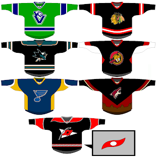
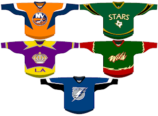
Well, it's not so much news as concept art. It's all the ideas we've had for next season's new third jerseys... visualized! I'll begin with our friend Gary who's emailed in every other week or so since way back in October. He came up with designs for most of the teams we're expecting to see thirds from in the fall.
Vancouver's all right. Needs more of a forest green. Chicago, San Jose and Ottawa are pretty much what I'd expect. I like the 2D logo on the Sens jersey. Nice touch. We already know the Blues will have a new logo for their third. The desert scene didn't work out to well for the Coyotes last time so I doubt they'll try it again. And I like the idea of using the Hurricanes' secondary logo as the crest.
The Islanders and Lightning designs meet expectations, but the rest are a little out there if you ask me. I can't see the Kings bringing back the gold anytime soon. They'll probably stick with silver and black. The Stars sweater is interesting but could use some work. I like the green. Speaking of green, I can't imagine the Wild using that wordmark as a crest. I'd expect to see the bear head and a much cleaner design more along the lines of the current road jersey.
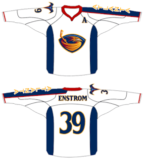
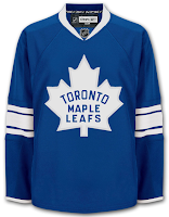
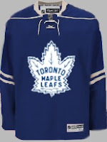
Among that list but not included in Gary's designs were Thrashers and Maple Leafs. Other readers came up with some good designs for them. First, a white version of Atlanta's home sweater.
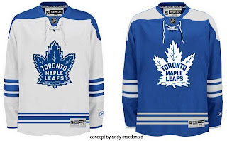
It's nice but I can't see the Thrashers adding another white jersey — especially as an alternate. As for the Leafs, we've got a lot to consider.
When you think Toronto third, you automatically think vintage/retro/throwback. These fit that bill quite well.
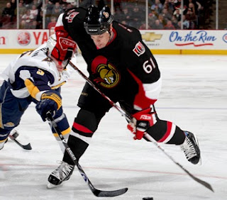
Anyway, I also had a lot of submissions dealing in black. For instance, take the Senators jersey above, painted on Cory Stillman.
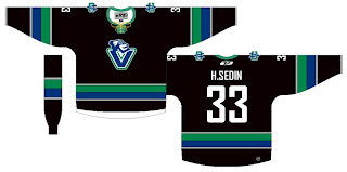
Also a black version of a jersey with the new Johnny Canuck logo.
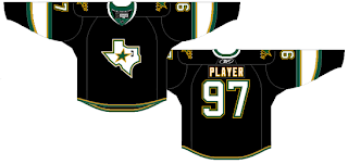
And a black Stars sweater with the Texas state logo.
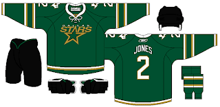
Personally, I'm more a fan of this green version.
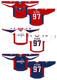
And finally, we'll look at a team who hasn't said a word about a third jersey in the future, but one for which it could work unbelievably well — the Washington Capitals. Imagine a uniform set that looked like this.
Now those are some nicely designed jerseys.
Remember, if you've got some quality work you'd like me to post, send it along to nhllogos@gmail.com.



Reader Comments (8)
Congratulations on 1000 posts, Chris! Please, keep up the great work you've done on this blog. It's awesome!!
By the way, the asymmetrical yoke on the Hurricanes jersey is a nice detail.
Caps in blue? I like it. Meaning this as a compliment, it would go well with white pants.
1,000 posts already? Man, I've had a blog for years and I don't know if I've posted 100 times! But then I have no life, so... yeah. Moving on.
I'm not a big fan of black jerseys in general, but that Sharks one and the Canucks to a lesser extent look nice. The colours just work together really well. Not sure about the yellow laces on the Canucks jersey, though.
The last green Stars jersey is really nice. They should have used that as their home jersey and saved the black one for a third if they had to do it.
all of those leafs jerseys look fantastic. i would love the first set as regulars.
Those are nice. I cannot wait until the thirds debut next season.
1000 posts, all before the trade deadline, awesome. Wait, does that mean you get a silver stick in a pre-game ceremony?
I think that third jerseys should maostly have different logos on them than the home jersey.
The big issue with the Caps shoulder patch is that it loses it's allure for me when it's not on a white surface. On a Red uniform, it's tolerable as a shoulder patch, but looks odd as a primary. Reserved judgement on blue. Kinda tired of primary blue.
That 2D Sens jersey needs to not happen. Keep the 3D logo on the jersey, or don't have a third jersey. Just discontinue the stupid 2D logo.