Just To Freak You Out XXVIII
 Friday · Feb 22 · 2008 | 5:10 PM PST
  13 Comments
 This is the 28th installment of the Freak Out series and the 1,002nd post of the blog. It's Friday, everybody! And you know what that means.
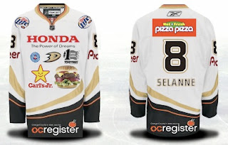
I feel this needs no explanation.
Yes, it's that bad of an idea. And believe it or not, it gets worse.
I don't know how anyone could consider corporate sponsorships which manifest on the uniforms.
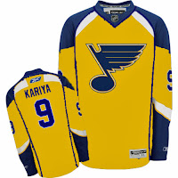
Anyway, there's also some third jersey fun to freak you out. If you're the Blues, I'll tell you what you don't do. You don't wear a yellow jersey.
The Blues.
And for the Canadiens, I like the red sweater with the blue shoulders, but I'm not sure the white one is the way to go here.
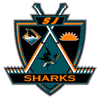
Also, I'll throw in an "If They Mated" logo, matching up the Kings and Sharks.
It may be a terrible idea, but it's extremely creative and I love that.
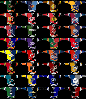
And for good measure, here's a plethora of concept art based on the notion of creating jerseys with two colors — split down the middle.
Everybody's covered and they're all worth a look, most notably the Bruins, Red Wings, Islanders, Rangers, Canucks and Capitals. That's some pretty intense craziness right there.
Have a great weekend, all!





Reader Comments (13)
Oddly enough, I really like that yellow Blues jersey in the stand-alone picture. I think it looks pretty sharp.
I agree with Kronis.
I feel that the yellow jersey is quite good
I mean, right now, 99 percent of teams have red/blue/black jerseys, and it's just boring to watch.
Alot of people hated the yellow Canucks jersey, but at least it provided colour.
I mean, yellow doesn't automatically make a jersey visually unpleasant,it just depends on how it's used.
I'd love to see a diversification of colours...Green for Minnesota, Vancouver and Anaheim, Purple for Los Angeles, Orange for Philadelphia and Calgary (a flame is more orange than red in my eyes..), Brown for Boston, Gold for Dallas, and yes yellow for the Blues and even the Panthers
Oh, and their logo is a blue music note, so a yellow jersey would not compromise them being the Blues :P.
Oh, and I have to say, those two-coloured jerseys are actually quite nice...I especially love the Ottawa and Vancouver ones, but the Edmonton and Montreal ones are nice as well.
And It made me realize that I prefer an orange C to a black one for Calgary...though the flaming horse would still be my logo of choice.
Ok, one last thing.
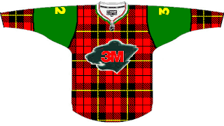
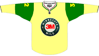
The first "Minnesota Wild" jersey wold be fantastic if Scotland ever got a National team.
It is very encouraging to see more people on this blog support the colour yellow. I, too, agree with Kronis totally. That yellow Blues jersey looks absolutely sharp. And Pointmeatthesky hit the nail right on the head. If a decent shade of yellow is used with the right colours and the sweater is properly designed, yellow would look just as sharp as traditional white. The Canucks' home yellow was sharp because it was a)colourful and b)the pants and the numerals were black. The only problem was the gaudy V design, not to mention all the losing. The LA Kings had a beautiful classic with the gold and purple. Very underrated. The Nashville Predators old third sweaters had the WORST shade of yellow/gold even though the design was good. It was the colour of vomit. As for the Blues, yellow and blue go very well together. After all, team Sweden uses a nice yellow to go with their blue pants.
Love the Scotch Tape and Post-It jerseys! Very funny.
Oddly Enough i tend to disagree with Chris for once, I would love to see les Bleu, Blanc et Rouge take to the ice in the white sweater concept on here....the red one is just tacky. Anyone up for geting that white habs concept on a plaer in game? would be interesting to see and greatly appreciated.
The Islanders symbol in that picture is what they should of done once they got rid of the fisherman!!! I hope someone is looking at this from the club.
Those Montréal jersey are not that bad at all, Of course, i would probably prefer red shoulder on the white Jersey but the mostly red CH logo looks better on blue than red shoulder. Also you should always write Montréal with the accent on the e. Put something like a little fleur de lys on the e of Montréal like the Montréal Expos did which was pretty cool.
I think the Blues jersey looks good as well, and, as andre pointed out, I'm sure Team Sweden thinks those colours make a fine combination
Why on earth do you ruin the Caps jerseys by attempting to return them to black blue and bronze, but making it black green and bronze...huh?
The white Canadiens' jersey isn't bad. I'm really not a fan of their current white - it doesn't have the same historical significance as the classic red (which shouldn't be messed with, even though one of my concepts has showed up on the site!)...
okay haha if you still wanted to have an explaination for the ducks jeresy with all the ads on it here it is... in many of the european leagues and even in the spengler cup they put a bunch of ads every where...i drives me insane... and literally sometimes you can never find the teams logo. and ive heard a few rumors of te NHL doing this... i sure hope not~