Sunday
Feb242008
Oilers Jersey Concepts
 Sunday · Feb 24 · 2008 | 4:43 PM PST
  7 Comments
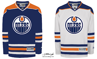
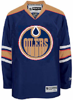
 Got a handful of Edmonton Oilers concepts to offer up before I call it a night.
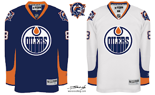
That one is very traditional, this one not so much.
But I like that oilman shoulder logo. Was sad to see it go and surprised at the number of you who nominated it into the Quest For The Worst tournament. But to each his own, right? Speaking of which.
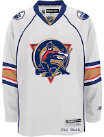
Interesting pair of sweater designs there, but not all that "traditional" and I don't think they'd garner a lot of votes from fans.
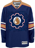
Then this last one's just weird.
I'll be back with more tomorrow. In the meantime, keep the votes coming in as we narrow it down to the finalists for the Quest For The Worst.



Reader Comments (7)
finally somebody agrees with me that the oil rig worker shoulder patch was good. as an edmontonian the main complaint ive had to listen to about the oilers new digs is how boring they are (aside from the whole half stripe thing)...bringing back the shoulder patch would do wonders for the oilers jersey. but in the end it doesnt matter because my beloved red wings stayed true to form.
It was a long time before I realized the oiler man was an oiler man. When I would see it on jerseys I would think it was some Pac-Man thing of a pizza with a slice missing or something very un-Oiler-y. It's not that bad on its own I suppose, but as a tiny shoulder patch it did not do well.
The first set of jerseys there are very similar to the set I designed and sent to the Oilers. The only difference being the stripes are the traditional size (not the Boston size shown there) and the logo has an orange circle around it (like the red circle it has now), which I feel, it needs. I'm glad to see that others agree with me and my designs, it's just a shame the silly Oilers in their blindness don't. Copper can work but you need to make it more brownish rather than band-aid colour it currently is and you also need to ditch the red. I designed a copper uniform set as well, which includes a sharper redesign of the Rigger logo. I am having my designs professionally drawn and am going to make another assault on the Oilers. Once I have them I should find a way to scan them and send them to Chris to put up on here. I've had them made to be added into NHL 08 as well and they look quite good. This Edmonton Oilers jersey fiasco is one of the most frustrating things I've ever experienced. I wish the Oilers organization would just wake up!
I really like the second concept, navy jersey. I don't particularly like the design with the color "dripping up" from the bottom of the sleeve but it looks good there. Maybe it's because it's a single color rather than two on the white jersey. Looks a lot sleeker with the one color contrast.
Great work with that first set, Jacob.
I think a fantastic design for the Oilers would be to take the Panthers' template, throw in the Edmonton colors, and put the Oil Worker on the chest. Put the Oil Drop/Cog logo on the shoulder. That's a cool, industrial-looking sweater, if you ask me.
can somebody maybe try to do the oilers jersey in black with a gold logo (you know, as in 'black gold'?)...somebody posted this in a forum as an idea and i kinda like the concept, but i would like to see what it would look like 1st...it would probably need a contrasting colour around the outer and inner part of the logo, like maybe white or something like that...also put stripes on the arm in maybe white, gold, and white...not sure what to do with the shoulders yet though..hopefully someone can come up with something with this suggestion...i'm not a big fan of black uni's just because everybody has black nowadays, but i think this could work, but make sure its not the old LA Kings gold, which was more of a yellow than a gold, but make sure its a real gold, like the tapout tshirts that you see some of the MMA fighters wearing these days..thanks