A Mass Of Stars Art
 Monday · Feb 25 · 2008 | 4:51 PM PST
  5 Comments
 I was looking through my inbox and you guys have been sending in a ton of Dallas Stars concept art that I've failed to get posted. So tonight is all about the Big D. There are just so many options as you'll see.
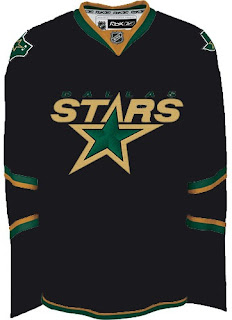
For one thing, a big complaint about the Stars' new Rbk EDGE uniforms has been the word "DALLAS" written across the front of the home jersey, of all things. A simple solution would be to put the crest back.
Now, with all the talk about third jerseys lately, perhaps that design would be better suited as an alternate in, say, green.
Certainly brings a lot more to the sweater. Hell, there's even gold.
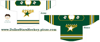
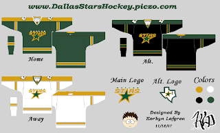
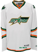
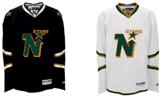
All right, yeah that's probably a bad idea. However, I'm liking the star crests on the green and white jerseys. In fact, the complete lack of black is actually pretty cool. Even something like this — which I like less — might well be worth considering.
But in this reality, I don't see the black disappearing anytime soon. So how about this. Save the black for the alternate.
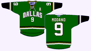
I know they've got the Florida Panthers' elbow stripes going but try to see past that. The Stars really need to return to the green sweaters. Though I know the odds of that are slim.
But let's depart reality altogether and start considering some "different" alternatives. Like a new logo.
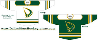
I get the shooting star theme, but there are a lot of reasons why those logos wouldn't work. I'm sure you can figure them out. Still, sometimes it's fun to wonder. Here they are on a jersey.
Then there's the whole constellation fiasco. I get it but it just wasn't well executed. Once you start seeing "that" shape, you can't really see anything else.
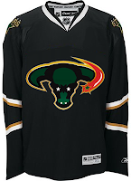
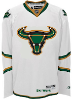
I don't think dropping the stars from the logo works, nor does turning up the horns. That's just strange. I've gotta say I do like the red, though. Red as part of that black/green/gold combo is quite unique. What about a reworked logo based on those colors?
It could use some work, like for instance I'd lose the puck, but it's something. A step in the right direction, perhaps.
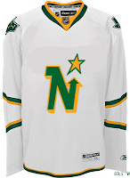
The last two items I have for you tonight are just flights of fancy for the folks missing their beloved North Stars. The old Minnesota logo on the new Rbk EDGE sweater.
Not great. And this last one is more worthy of a Freak Out Friday post.
I think that about covers it. Stars, Stars and more Stars. By the way, just a little over a week now until my Vancouver trip. Can't wait! I'm hoping to be able to write from the road. I probably won't have much in the way of concept art for you. Maybe just stories from my experiences north of the border if anyone's interested. In the meantime, I've got to start packing.






Reader Comments (5)
Although that reworked stars logo with the orange incorporated looks pretty sleek, something about it strikes me as very minor league or even WNBA-ish. (Dallas Starzz anyone? just kidding). Just looked at it again and it reminds me of gatorade.
The mooterus logo with the upturned horns is a definite improvement. Classic TX flavor of the Longhorns.
This is VERY wishful thinking, but in a perfect world, it be great if the Dallas Stars gave the "Stars" name, N-Star logo, and the North Stars' stats and records(1967-1993) to the current Minnesota franchise. The Stars name is too common and the Wild sounds very bushleague and tier 2-like. Always hated the Wild name. Sounds punny as well. If Dallas used the mooterus's horns in an upright position, and renamed themselves, say, the Dallas Bullseyes, that would sound very original and big league. Considering the selling success of Chicago Bulls merchandise, black and Texas green Bullseyes merchandise with that the Bull logo(horns upright) would be a hot sell. And longtime hockey fans throughout North America would more than welcome the return of the North Stars and their classic Irish green and gold N logo. Bill Masterton and Bill Goldsworthy would be smiling in Hockey Heaven right now. Long-live the North Stars!
Seeing that North Stars logo on the RBK jersey makes me wonder if it wouldn't be a good idea if the NHL had regular season games with teams as their former selves in their former locales. So the Coyotes would play as the Jets in Winnipeg, or the Avs as the Nordiques in Quebec. I guess that would just be opening up old wounds, though.
I actually kind of like the shooting star logos. I think with some modifications, a shooting star coming out of the location of Dallas in a picture of Texas would be a perfect secondary logo.
Great work on this all-stars post.
i'm really digging some of this concept art, but the Red on the mooterus just can't be.
they messed up when they thought we would like red on a stars sweater.
the only red ever associated with the franchise would have been Columbus's Red and Black back before the N-Stars Merger, so it really has never been a part of who we are, Minnesota and Texas wise.
as for the returning to green, i really doubt Dallas will for a while. And a little hint on next year's White Uniform for the stars:
They already have a Green and Gold form of their "DALLAS" wordmark on some stars merch they've been selling around the area.
One in particular is a certain Turco Bobblehead with the Green and Gold "DALLAS" on the base.
anyway, thanks for the concepts!
i like the new modern version of the logo on the white jersey. the one with the puck. i really HATE the word "DALLAS" written across the jersey.