LFV Day 6: Last Day In Canada
 Monday · Mar 10 · 2008 | 9:41 AM PDT
  11 Comments
 LIVE FROM VANCOUVER!
Well, today is a sad day for me. My flight back to Tampa is tonight. I have to leave this wonderful weather (yes, I know it's raining right now) and go back to work on Wednesday. And since I've been away, the Lightning just keep losing. So this concept post is meant to honor all those teams that defeated the Bolts in my absence.
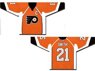
The teams I'm talking about would be the New Jersey Devils, Columbus Blue Jackets, and of course, the Philadelphia Flyers. We'll start with them.
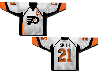
Also got a white version of that.
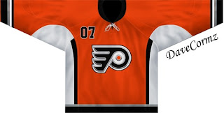
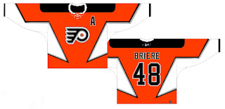
Not a bad design at all. There are also a couple of orange ones with the alternate Flyers logo.
This one is based on the old New York Islanders third jersey.
And speaking of alternate logos, here's something different.
Not really sure what to say about those. Not normal but not quite crazy enough to warrant a Friday post.
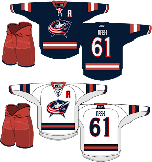
We've also got a very sharp jersey set for the Blue Jackets.
And a fan suggesting they switch from red pants to blue.
And either wishful thinking that one day a certain Sedin will find his way to Columbus or the idea that the Jackets would look better in a jersey with striping similar to the Canucks.
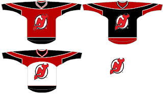
Moving on now to the New Jersey Devils. Here's a black concept without the circle in the logo.
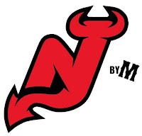
My feeling is that if you're going to dump the circle, you need to make some upgrades to the rest of the logo. Something like this might work well.
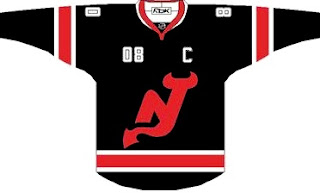
Continuing on the tack of black jerseys, there's this one.
Very nice. Then there's this set.
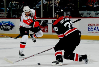
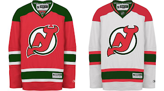
Those jerseys look like hoodies to me, though. Maybe I'm just losing my mind. And finally, here's why it's a good thing that the Devils dumped green out of the logo and uniforms.
It looks bad!
And that's it for this afternoon. Gotta get things packed up and maybe take one last walk around the city before heading to the airport this evening. Bye Vancouver!







Reader Comments (11)
I love the Devils in black. It would make an awsome alternate. Have a safe flight back to Tampa :)
The Flying F logo is from a hat. It doesn't look terrible on a jersey and might make an interesting alternate jersey. The Liberty Bell logo is amateurish at best and would probably be best on a Freak Out Friday post if for no other reason than the designer assigned jersey number 88 to the mockup. None of us want to see that number on a Flyers uniform again, thanks!
I do like the first two Flyers designs. They look good if the Flyers stay predictable (I'd still love to see a radical new alternative jersey / logo for the Flyers. Something different would be nice).
the firs two flyers concepts are weird. What is with the armpit sweat stains.
love the liberty bell idea. and the orange (briere) concpet.
I designed the first 2, it was just something i did out fo boredom, my dad was complaining about the lack of orange that the flyers have and how they used to stand out with orange as the primary color as opposed to black which is used alot in uniforms. As for the pit stains, i dont know i was just trying to do something kind of different with the piping and stuff, i just dont like the new uniforms too much, they kind of look like the flyers are wearing overalls or something.
I like the first flyers jersey maybe a little less piping but please bring back the orange, there are way too many black jerseys, we need more color. And I have always like the devels in Red and Green. Have a good flight back to Tampa, maybe when you return they will go on a winning streak.
you think vancouver was nice? you should come to edmonton, we're not the second lowest place players want to play for nothing you know. you havent lived untill youve seen...that mall...and groat road. hellz yeah...also, i think the devils should bring back the green, its dead sexy
Chris, I am sorry, but I agree with Darryl regarding the Devils' old green and red combo. How many teams have a red and black combo: Chicago, Ottawa, Calgary, Carolina, and New Jersey. The Devils had it right in the beginning by mixing deep green with red instead of using a vibrant Irish green. The Milwaukee Bucks of the NBA went back to their old deep green and red uniforms because they not only have history, but the colour combo was sharp and unique. Naysayers say that red and green is too Christmas-like, but the Italian and Hungarian flags also have a red, white, and green combo. The other thing I disliked about the Devils switching to black trimming was reducing the amount of red and increasing the amount black on their whites. The deep green was to represent the swamp land resided by the legendary New Jersey devil. If the Devils had kept the deep green trimming during their Stanley Cup years, people wouldn't have criticized those colours. Anyway, Chris, I hope you had a great time in Vancouver. Make sure you visit Vancouver in the summertime. You would love it!
There is something neat about that Liberty Bell concept. Philadelphia has such a rich history; no reason to leave that out of future logo considerations
Glad you enjoyed your stay in my fair city! Your presence seemed to result in victory for the Canucks so it's a shame to see you go!
I like all the Flyers concepts except for the flying F. The Liberty Bell logo is different, but not sure how it would look on a jersey as the main logo. It would be a good shoulder logo.
The Columbus jerseys are cool. I think I prefer the red pants to the blue.
I wouldn't mind seeing the Devils do a retro jersey and go back to the green and red. Too many teams now have the black jersey.
Your Lightning might keep losing, but I am one Caps fan who wishes we still had Jeff Halpern - not you guys.
As far as the jerseys are concerned, the Devils wearing any color but red would be like the Packers wearing purple.
Flyers have a fine logo. No need to change it at all.
I don't really see much wrong with the Blue Jackets. They're one of four teams I could let get away with red, white, and blue schemes (The other three being Washington, NYR, and Montreal).
the best devils logo alternative i've EVER seen is here:
http://logopond.com/gallery/detail/21235
it puts all other concepts for the Devils to shame...