Guitar Logos, Part 2 of 10
 Wednesday · Mar 19 · 2008 | 2:24 PM PDT
  16 Comments
 Last week I posted the first in a series of designs for guitars based on the shapes and designs of the various NHL team logos. We're going alphabetically and so began with Anaheim, Atlanta and Boston.
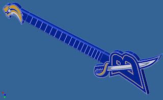
Today, we start with the Buffalo Sabres.
I think the primary would've worked better on the other end. You'll see what I mean in a minute.
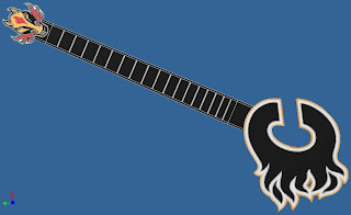
The Calgary Flames is cool. But you've got a big hole under the strings and the logo on the other end is no longer used.
The Carolina Hurricanes is by far one of my favorites to this point.
And this is what I meant about the Sabres.
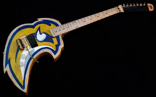
This design was submitted by a different reader but it's very effective. I like the hockey stick used in it. More guitars are on the way so keep an eye out for that.
This last thing is a quick note about the upcoming goalie mask tournament. I've got 66 mask graphics made so I'm thinking we'll do a two-poll preliminary round to decide which two goalies make the final cut for the 64-goalie competition. It's going to be the biggest thing we've done here yet. Can't wait to get it started!
Voting ends Friday. At that point we'll know which 32 goalies will be placed in the bracket first. I'll announce their opponents over the weekend and I'm anticipating posting the first poll on Monday.


Reader Comments (16)
the 'Canes guitar would look better if the logos were switched... it would look like a metal guitar - James Hetfield style!!!
maybe you can stop the guitar series right now? I think we get it - primary logo for the body and secondary logo at the head. They look kind of shit anyways.
Wow, i really don't like the Buffaslug logo to begin with.
But that second Sabres guitar actually looks nice.
i would play that slug guitar, no questions asked.
Hey, speaking of the Sabres, they're playing your Lightning tonight. LET'S GO BUFFALO!
and also, I want that second Sabres guitar. It would've been nice to have last year when my band had our "Blue and Gold Party" a couple of days before the end of the regular season.
can somebody say "6 goals in the third period?"
yeah im not one to boast. but thinksojoe has the right idea.
Go Sabres!!!!!
Ohhhh what a come back.
(noted though, were fighting for our playoff lives, we shouldn't of had that type of 2nd period)
..im a leafs fan who still "beleafs" so i was hoping buffalo would lose tonight... i saw the score 4-1 lightning i was happy... then still 4-2 in the 3rd.. still happy and i thought to myself "i hope the bolts dont pull a Leafs and break down in the 3rd period" .... i check the score 10 minutes later and its 6-4 buffalo.. 7-4 buffalo final. Thanks Tampa Bay Lightning.
THESE ARE ATROCIOUS HORRIBLY RENDERED AND JUST PLAIN DULL... the other readers buffalo one is alright though
Dude, come on, stop posting this crap, those guitars aren't even remotely proportional, let alone any good at all. Atleast the second buffalo guitar had strings and actual guitar parts.
As a guitarist, let me just say that these guitar threads offend me. Horribly.
And those Sabres guitars... I just threw up in my mouth a little bit. Anyone have any Listerine?
they are logos with large sticks jutting out of them...not very good at all. the second readers buffaslug guitar is well done however, very nice, and best of all, it actually looks like a guitar...amazing, maybe the guy making the other ones can take some pointetrs
Wow. Didn't realize you hated these so much. If you really don't like them, I'll kill the series here. Thanks for being honest.
honestly chris. I can't see how you could actually like these. if you want to keep going with these, contact the person who made the second buffalo guitar (the good one) and tell him/her to do the rest.
honestly chris. I can't see how you could actually like these. if you want to keep going with these, contact the person who made the second buffalo guitar (the good one) and tell him/her to do the rest.
Well, yeah the design is poor quality but so is most of the stuff I post on a day-to-day basis. I just thought they were fun.
I like the guitar series. It is interesting, at least to me. You can at least put up pictures of the rest of the guitars.