Thursday
Mar202008
New York Fan Art
 Thursday · Mar 20 · 2008 | 2:21 PM PDT
  5 Comments
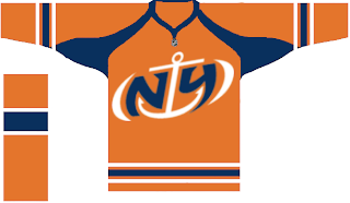
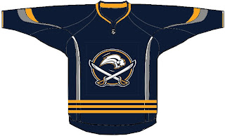
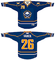
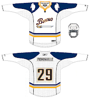
 Today's concept post theme is the great state of New York. Mostly we've got Buffalo Sabres artwork, but we'll kick things off with the New York Islanders.
That's a fan-designed logo I posted a while back. I like the orange jersey.
This Sabres design makes an attempt at a new logo.
Quite unique, I must say. Also got a pair of Sabres pieces, one of which involves John Slabyk's logos.
That's all for tonight. Get your votes in by tomorrow for the goalie mask tournament. It starts soon!


Reader Comments (5)
A noble attempt on those Sabres unis... but they just don't do it for me.
The Sabres had it right the first time, back in 1970.
this was the worst concept post yet...Buffalo can't do anything right, except host outdoor games..they can't control the weather.
That's right Bill, because the Sabres made those mockups.
as sarcastic as you were, i wouldn't be surprised if they did.
Not really a fanatic about any of the designs, but I kind of like the Islanders logo. Doesn't really work for me as a primary, might be okay as a secondary.
I think the Sabres had it mostly right in the 70's. The navy and gold jerseys have always been a favorite, not just from the Sabres, but in general. I've never liked the logo much though - in any of the different versions they'va had.