Canada I: Toronto
 Saturday · Mar 1 · 2008 | 8:46 PM PST
  5 Comments
 I'm probably getting annoying with all the talk about my Canada trip, but can you blame me? I've got concept posts coming specific to Canadian clubs for the next few days leading up to my trip. (I fly out of Tampa on Wednesday morning, by the way.)
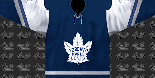
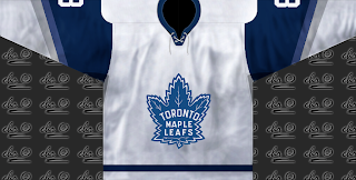
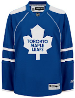
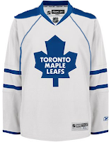
Anyhow, tonight we're getting things going with the Toronto Maple Leafs. First up is a simple design that would be acceptable as an alternate sweater.
With the same logo, but on a different tack comes this set.
That's really cool but probably somewhat unrealistic. More on the realistic side is this next set.
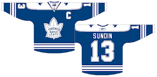
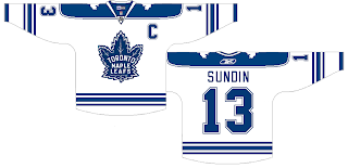
But most folks probably won't like the piping. However, I think the shoulder yokes make up for it.
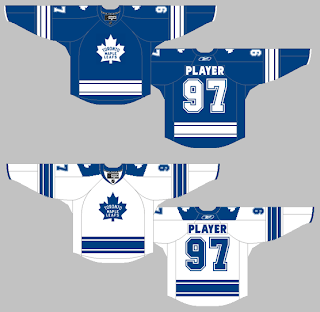
These jerseys are nice. A lot of people will probably complain about the broken stripes around the waist.
I understand that, but it's a unique feature. What I like about the next set, which is similar to this one, are the shoulder logos.
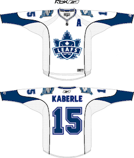
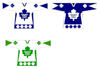
These last two are just for fun. One designer suggests the Leafs use a version of the Marlies logo.
Probably not the best idea. And the last one recommends green for an alternate sweater.
I don't really know what to say about any of that.
But that's it for tonight. Can't wait for Vancouver!



Reader Comments (5)
I love the jerseys with original Leaf logo. They are a classic. I would, however, drop the white shoulder yokes from the blue sweaters, though. The Canadiens, Red Wings, and Blackhawks haven't touched their crests since the 50's because those crests are beautiful and have a lot of history to them. It's time for the Leafs to drop the corporate "Harold Ballard" Leaf and go back permanantly to their historic "feathered" Leaf crest. I always loved the blue yokes on the whites. And besides, what have the Leafs done since wearing the Harold Ballard Leaf?
there is nothing beautiful about the Blackhawks or Canadiens logo. The Rangers are boring too. Why do ppl like these logos so much? just bc or history?
I like most of the designs except for the Leafs jersey with the Marlie's style logo. It just looks odd for the Leafs to have that logo. Another one that doesn't look good is the bottom design with the leafs around the bottom of the jersey. I know that green was their original color, but it looks bad with the Maple Leafs logo.
The broken waist stripe design would be improved with a small maple leaf filling the gap somewhat.
Not so sure on the Blackhawks, but the Canadiens and Rangers are great. There's something to be said for not throwing as much glitzy crap on a sweater every year just to sell merchandise. Sure, there's a sense of tradition there now, but they wouldn't have stuck with them so long if they weren't popular, and they're popular because they're solid iconic designs.
I just wish the Avs had kept their mountain stripe.
Sorry, but I have always disliked the Colorado Avalanche's uniform. Probably the most overrated uniform because of all the success the team has had. With the exception of their A-mountain logo, their mountain range design and all that thick trimming from the shoulders down the arms just looked too busy and tacky. If they had a more simple uniform design like the Red Wings or the Leafs with an all-maroon look, some blue trimming, no black, and with the A crest, the Avalanche would finally have a uniform to complement the great talent that they have.