Thursday
Mar272008
Third Jersey Ideas
 Thursday · Mar 27 · 2008 | 3:23 PM PDT
  12 Comments
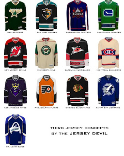
 I haven't written a concept art post since the weekend so I think we're due. But it's going to be a short one. One reader came up with 13 different jersey designs he'd like to see implemented for various teams at some point in the future.
I told you it'd be short, but we've got 13 different teams covered. Hope you enjoy it.
We've got a Freak Out Friday post coming tomorrow and hopefully some more concepts for the weekend. I've been keeping pretty busy with the Goalie Mask Tournament. Voter turnout is great so far. Keep 'em coming!


Reader Comments (12)
I actually like the idea of using the old caps logo for the third, however, I suspect most people will like the Weagle better.
Yeah, you're right, Weagle all the way.
Minnesota's reminds me of oatmeal.
well, minnesota reminds me of a junior hockey club here, the Quebec Remparts. Their use of the weat combined with the red hot style of the letters are up for a great look. At first it seems like the jersey is brown, but with some time it turned out to be the best jersey I've seen so far in the LHJMQ.
I really hope that the idea of a green Canucks jersey, even a third jersey, never comes to fruition
I'd buy that white Minnesota jersey in a heart-beat.
While there are some good ones, and some less than great ones, I have to come out and say I especially like that Minnesota one. I'm not sure if it's just my screen that's making me think this, but I've always been supportive of Minnesota using their beige colour as the primary colour on a "white" jersey, if that concept is indeed beige, then that would be fulfilling my dreams, if not... still pretty good.
Weagle > Capitol Building.
Those 90s logos seem more cartoonish than being a worthy logo to embrace a hockey sweater.
I Like the Stars Jersey, I would be nice to see a green jersey on the ice. I also like the Montreal jersey, I know it is very similar to the old white jersey they wore in the outdoor game against Edmonton back in 2003 I think. Vancouver looks like Hartford and finally I have always liked the Blackhawks in black.
All of them are nice, especially the Stars, Wild, Canadiens, and Canucks. If the Devils and Hurricanes ever go to a 3rd jersey, I hope it's not black. too many teams go to a black jersey.jndyj
the hurricanes are definitely going to a black third.. but I can see the sleeves being red at the tips instead of white. I think it would bring more balance with the colors.
Whoops, I kinda worded that wrong. I meant I can see it if they switched the white and red on the sleeves :)
That caps jersey is horrible. Get it off.
I'd buy the Canucks and Habs jerseys right now, even if they were never made. Where do I sign?