Just To Freak You Out XXXII
 Friday · Mar 28 · 2008 | 4:34 PM PDT
  14 Comments
 Can you believe this is already the 32nd installment of the Freak Out series? Who knew it would go this long? What's interesting about this week's post is what comes at the end and the fact that it's real and not concocted in the freakish mind of one of the many readers of NHLToL. No, it's quite real and that's what freaks me out the most.
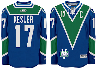
But first, let's talk third jerseys. We know they're making their big comeback next season after having taken a year off. We'll begin in Vancouver.
But wait, there's more!
And I'm sure this was just a case of colors lost in translation.
Doesn't make me feel any better. I'm all right with the purple on the Kings' uniforms because it's partnered with black and silver.
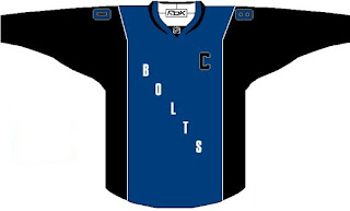
Here's a Lightning jersey even I wouldn't consider buying.
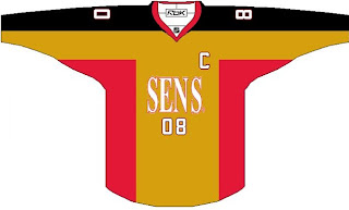
And a Sens sweater absolutely no one would.
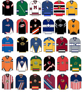
But hold on, why one team at a time? Let's go for all 30 all at once.
A good try to be sure, but I'm afraid a few too many of these missed the mark in terms of what one might consider, you know, aesthetically pleasing. (What the hell kind of sentence was that?)
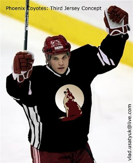
It's worse when you make it look real by painting it onto a player.
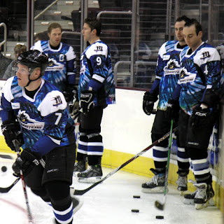
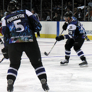
And now for the little thing I was teasing at the beginning of this post. I know it's not NHL, but I'm making an exception. The AHL's Lake Erie Monsters, this season, actually wore jerseys that... I'm sorry, there's no other way of putting this. They were tie-dyed. Behold the horror.
Because one photo wasn't enough...
Peace. Love. And hockey.
And now I'm just going to go put forks in my eyes. Until tomorrow, friends.



Reader Comments (14)
To be completely honest, that green and blue "V" sweater isn't half bad.
The issue with the first one was the terrible colour scheme, this however is tolerable.
Better still, I'm requesting a shop that image, with a logo over top of it, similar to Montreal.
Would those be...Lake Erie Monstrosities?
Omg, those tie-dyed jerseys. I could barf.
I really wish the Anaheim Ducks would bring back the ol' duck-shaped goalie mask logo. I guess they didn't find it intimidating enough but it is so stylistically superior to their current "Ducks" logo.
Hey Chris, great stuff. I've been reading for a while and have never commented, but thought I should give a little info on the tie-dyes. My hometown Milwaukee Admirals do the same thing once a year (or some other novelty jersey) and then auction them off after the game for charity. http://img408.imageshack.us/img408/9383/milwadmstpats07nf9.jpg" REL="nofollow">Check this one out. So, although the Erie ones are pretty bad, its for a good cause.
It's great that you write 'Peace, Love, and Hockey'
I went to the Wilkes-Barre game in Lake Erie the night before they wore those things. Not only were they heavily advertising the fact they were wearing those but the tag line actually was "Peace, Love, and Hockey"
Ilike the coyote on the sweater
it's from bryzgalov's mask
but the jersey design isn't that good
the nordiques logo on the avalanche jersey loks like a question mark??
yeah, the blue V is interesting
To be completely honest, that green and blue "V" sweater isn't half bad.
i second that...
1) i really like the 1st canucks concept.
2) the person who made the image of 30 should get hit by a bus ASAP
4) i didnt know the greatful dead owned a part of the monsters
3) purinton wearing a jersey that saiz "peace" on it is just crazy that man is a maniac (loved seein him freak out when he was on the rangers and or wolfpack)
Wow. Both of those Canucks jerseys are unis I'd consider buying.
The only uniform that I thought was nice on the 30 pack was the Mongreal with a Maroons logo. If you did that, and threw Habs logos on the shoulders, I'd buy it in heartbeat.
besides the logo on the arm the first vancouver jersey looks awsome... but i think they should use the updated rink/stick logo instead of the old one.
that first canucks concept is sweet, i would like to see that as a third jersey next season
I can't believe someone actually managed a pretty sharp Canucks "V" sweater... impressive.