Fan Art To Finish Your Weekend
 Sunday · Mar 30 · 2008 | 3:39 PM PDT
  17 Comments
 I think I promised you guys a concept post before the weekend was out, so here it is. I've assembled some of my favorite designs from my stash. There's a lot of quality work, so let's dive in.
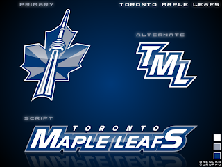
First, an interesting new look for the Toronto Maple Leafs.
I'd like to see the jerseys that go with it. If nothing else, the production value is through the roof on this one.
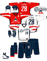
But if you want to talk excellent concept logos, look no further than this one for the Washington Capitals.
I admit I had to stare at it a while, but there it is, a "W" and a "C." And I don't know why it took us so long to realize that if you put those two letters together the right way, it forms a star! However, I'm not sold on the wordmark. I get the whole Declaration of Independence thing (been watching John Adams today), but for a sports team it's not a good idea.
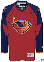
I like that Thrashers jersey as well. With much thanks to Jacob at We're Revolting! for that one.
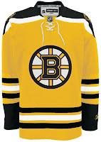
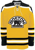
You guys always give me trouble for my aversion to yellow jerseys, but I've come across a bunch that I actually like — despite their resemblance to what I can only assume is Hillary Clinton's favorite suit.
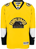
Well, it's the Boston Bruins of course. Can any other team really do a yellow sweater?
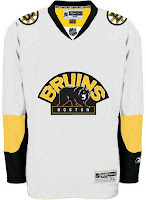
This second set wouldn't work because yellow is still a light color. It wouldn't work as a dark home jersey. However, I am intrigued by the use of the secondary logo with a black background and yellow text.
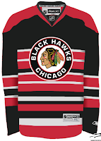
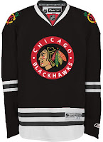
Up next are the Chicago Blackhawks.
All those stripes do weird things to my brain. And there's not enough contrast in the other one. But I don't know, either could work as a temporary third jersey.
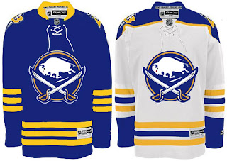
Finally, it's the Buffalo Sabres.
It's a nice logo on a traditional uniform design. I think you'd be hard-pressed to find nay-sayers.
That's good for now. Stay tuned for new polls going up tomorrow both here and at ToHL. Here, we'll have Cam Ward and Josh Harding going head to head and for the WHL Tournament of Logos, it'll be the Calgary Hitmen and the winner of the Americans/Thunderbirds poll which closes tonight.



Reader Comments (17)
the yellow on the home sabres jersey is a bit too intense...if they toned it down a little then it would be awesome! cool logos, also!
That striped Hawks jersey is downright heinous!
That Primary Leafs concept isn't bad at all!
Really good stuff today, especially that first set of Bruins jerseys. Those are great.
I like the Leaf/CN Tower on its own, but I don't know about it for the Maple Leafs. Any other Toronto sports team would be fine, though.
I really like that Sabres sweater set except for one thing. OK, two. First, the primary logo would look better on the shoulders. Second, the colors could serve to be muted just a bit
the Capitals text and logo do not do it for the jersey. Poor choice in lettering and the logo is too plain and screams World Hockey League or even a North American Soccer League team, But overall, its a drastic downgrade.
Really? I think the white capitals jersey is badass!
yeah really, might want to take a closer look. also for the white jersey, why put the primary logo below the numbers, while on the sleeves? furthermore, the script for the primary logo on the upper-right portion is completely different than the script on the front of the white jersey.
those sabres jerseys are amazing...i would buy them both...i especially like the white one...yes the colors are a little intense but that would be the PERFECT design for the sabres...it mixes old and new...couldnt do any better...wish golisano and them woulda talked to that guy who made them before anything else
The Maple Leafs logo is killer! I'd love to see it on a complete jersey mock-up.
I love the Sabres jersey...But yes, the colors are a little too overbearing and need to be a little bit more subtle.
That leafs logo would make an excellent shoulder logo for them.
I really like the Toronto TML and Leaf/CN Tower, not crazy about the Wordmark, I like the first set of Bruins jerseys, the NHL needs some more color. And I have to say a love the Sabres jerseys! Would love to see those old colors back on the ice and get rid of the buffalo slug. I also like the white Capitals jesrey, very unique concept. I feel the red they wear now is just to bright, they need to bring back the old shade of red.
i like the word mark for the caps, but am not crazy about the dome. i'd love to see the word mark and the primary logo (a star with eagle head) concept that someone did on this site a few months ago. it was a much better logo. still, all-in-all, i like the new caps look too much to want to see them change it - especially the outstanding weagle.
THe Toronto concept is really good, I too would love to see it on a jersey. But for some reason I'm annoyed by it's being crooked...but other than that, it's spot-on!
The Caps concept is the best I've seen yet for Washingtons team. But maybe the wordmark should be for third jerseys instead of the regular away white.
Both the red and white jerseys for the Caps are downright terrible. The logos are terrible.
The wordmark makes it look like Washington is in the Rockies, with the elevated thing, and the script is god awful.
You can throw a w and a c together, and I somewhat see it, but it still looks like trash. I want to stop looking, and I can't. They're really that bad (With all due respect to the creator, I couldn't make much better). Those jerseys belong on "Just to freak you out"
Sabres and Bruins unis there look nice, and the Thrashers jersey is acceptable. The Leafs logo set wouldn't be so bad, if the logo they had wasn't fine (or they didn't have 4 or 5 better ones. The striped Chicago jersey is far superior to the non-striped.
ogre, thank you for agreeing with me. i felt in the minority about the caps jerseys and couldn't grasp how some people actually like them.
As a Sabres fan, I have never complained about having a buffalo as the primary logo. I like their current ("Buffa-slug") logo and jersey. It seems like everyone complains that the majority of the Rbk Edge jerseys are cookie-cutter-like in design, but yet they complain about the Sabres' which is completely original...
Even if you don't like the current ones and want to go classic (I love the old school jerseys/logo too) then there's no reason to change them. They're great the way they are; simple, classy, and make a definite statement.