Tuesday
Mar042008
Canada IV: Vancouver
 Tuesday · Mar 4 · 2008 | 6:57 PM PST
  16 Comments
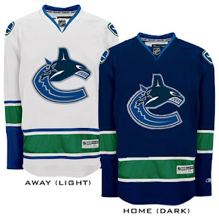
 Last of the Canada posts here before I start my journey to the Pacific Northwest tomorrow. Naturally, I've got Canucks concepts.
This is a nice, simple set. Same logo on both jerseys, sans the VANCOUVER across the top of the chest.
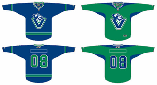
I like it but my vote still goes for the V logo that we've been getting a split response over.
And I think I like the green one better. Speaking of green Canucks jerseys...
Yeah so that's really something else.
Sorry for the short post, but I'm ready to go on vacation. I'm sure you'll hear from me this week. If nothing else, I'll try to write about my experience at GM Place on Thursday night. I'm going to see the Canucks play the Predators. Should be a blast!


Reader Comments (16)
Finally, the Canucks' concepts! I absolutely LOVE the Johnny Canuck V crest. It looks great on either a blue or a green sweater. Just as long as the orca is gone for good. The picture of the Canucks wearing green looks great except I would put the JC-V on the front and the modified Stick logo on the shoulders. The JC-V logo is a logo the Canucks should have had from Day One. It will take some getting used to for some fans. However, this logo will definitely give the Canucks the true identity that they've struggled to have from the very start. Enjoy your time here in Vancouver, Chris! Be sure to take on a Giants game at the Pacific Coliseum. Great hockey atmosphere! Take care. :)
Have a good trip!! Enjoy the game.
i love the vancouver jerseys without the vancouver on top.
Gawd, I HATE that "Vaschon Cakes" logo. It's terrible. I like the idea of Johnny Canuck, but someone has to come up with a better design than that.
Anyone remember the first Power Rangers movie? We were used to seeing our favourite crime fighters in spandex suits and we show up to the movie and suddenly they're in these high tech metal suits of futuristic armor. Well that's what that final Canucks image reminds me of.
I must say... Vancouver... you dudes NEED MOAR GREEN!!!
Love those green ones with stick & rink.
I think a uniform set with stink in rink AND Johnny Canuck is the only way to go...and ditch the corporate whale.
Hi Breaktheice. As a Canucks fan, I understand about the comparison between the Johnnny Canuck V and the Vachon cakes logo. At first, I felt the Canucks could have done something else with Johnny Canuck. However, I decided to print the JC-V logo and take it to the supermarket just to see the similiarities and the differences. From far away, they both look similiar, but take a closer look. First, it's NOT the same V. The bottom of the JC-V is flat to match the top ends of the V while the bottom of the Vachon V is rounded. Second, the baker's head is on the top left side of the V, with his right arm forming the inside of the letter. JC's head is bigger and is on the top centre of the V with no arm present. I wouldn't be surprised if the Canucks got the Vachon idea but made sure to make their JC-V logo a lot more of their own than a cheap ripoff of Vachon. The last thing Canuck ownership needs is another lawsuit against them. Let's remember something. Like Chris says and I've said this numerous times, the Canucks are in desperate need of a true identity. The V is a borderline design of the Stick 'n Rink and the old Vancouver Millionaries logos. To have the head of Johnny Canuck on the top centre of the V gives the Canucks that simple and true identity. V for Vancouver and JC for the history of the Canucks name. It's a pure combination of simplicity.
using neon lights and special glow fabric is a nice touch. it matched the reflective piping in the practice jerseys
Again, why is there so much hate for the orca? Christ forbid the Canucks get a logo that actually demonstrates some kind of regional identity, something that's been nonexistant in every other jersey they've come up with. A stick in a rink dosen't say anything about Vancouver - hell, it barely says anything about hockey. Ditto with sticking the letter V on your chest and addong on the head of a mascot that hasen't even been used in eons. Even Calgary's taking the lazy route and simply slapping a C on the chest and flags on the shoulders is less visually insulting. It just screams "We don't respect home ice enough to put effort into this"
Matthew, it seems that you are a big fan of the Orca and it is your entitlement. And it's true, the Orca and native art is symbolic of B.C. However, you need to realize that the team name is CANUCKS, not ORCAS. For example, the Philadelphia Flyers don't have a picture of the Liberty Bell for their logo. They use something simple: P for Philadelphia and the P's wings for Flyers. The Chicago Blackhawks logo isn't just a head of a Native Indian. The logo is the head of Chief Black Hawk, who resided in the area now known as the State of Illinois. Johnny Canuck symbolizes the history of the team name, Canucks, and he was used by the Canadian Armed Forces during WWII. Furthermore, the city of Vancouver was built on the lumber industry. You talk about not having regional identity. Well, the V stands for Vancouver and the blue, green, and white represent the natural beauty of Vancouver and British Columbia. You love the Orca and I love both the Stick 'n Rink and the Skate logos. Fair enough, but Johnny Canuck should have been the Canucks' logo from the very beginning. The reason the Canucks went with the Orca back in '97 was because of the Orca Bay Sports & Entertainment ownership. Orcas may have a lot to do with B.C.'s native history, but they don't have anything to do with Canucks. When someone in New York or anywhere in the US were to commonly ask, "What's a Canuck?", then all you have to do is point to the Johnny Canuck element of the V and explain. And being a longtime Vancouver Canucks fan, I will be very proud to see my team wear the Johnny Canuck V. We are Canucks, not Orcas.
I'm not really a big fan of the Johnny V as a primary logo. The resemblance to Vachon is too similar for my tastes. I'd be ok with it as a secondary logo though.
Hope you have fun in Vancouver, Chris!!
Only one team should have a Whale on it's jersey, and it played in Hartford. Take that stupid shamu and put on something else.
"You talk about not having regional identity. Well, the V stands for Vancouver and the blue, green, and white represent the natural beauty of Vancouver and British Columbia."
I'm also talking about inexcusable laziness when attempting to portray that regional identity. A letter dosen't say anything about identity, it just shows that the people who 'designed' the logo could identify the oft-hidden first letter of 'Vancouver'. The orca logo makes use of a letter, but it's incorporated into something that makes Vancouver (and the NW coast in general) not only unique but world-famous.
I'm in a minority in that my team isn't the regional one, but ultimately Vancouver is the reason you *have* a Canucks team to support in the first place. Most people in Vancouver support the Canucks because they're the local team - it dosen't matter what name they happened to choose, it's the *LOCATION* that's is what in most people's minds is what's sacred. Not that a V explains *anything* about what a 'Canuck' is in the first place, nor does the cut-and-paste presence of what in the minds of virtually everyone outside the most die-hard of Nucks fans is a generic lumberjack head. It's lazily designed and says nothing about Vancouver *or* Canucks. Keep the orca, keep the old-school colours, ditch the unnecessary VANCOUVER wordmark, then it'd be perfect. If they stake out onto the ice with these Vachon logos on their chests it'll be the ugliest thing in hockey since the Flying V.
Matthew, I totally understand that you like the Orca logo, but let's be realistic here. First of all, Vancouver is a great hockey town, that's for sure. Second, Vancouver loves its Canucks. The "Canucks" name is very synonomous with hockey and with Canada. The lumber industry is synonomous with the Port City of Vancouver and the Province of BC. You call the designing of the Johnny Canuck V "inexcusable laziness" when attempting to portray that regional identity. Then what the heck do you call the Philadelphia Flyers' Flying P crest? The Boston Bruins' Spoked B? The Calgary Flames' Flaming C? The Montreal Canadiens' CH? Lazy designs? No. It's called simplicity and simple is more. The Johnny Canuck head is the same design as the original Johnny Canuck logo. Furthermore, the only similiarities between the Johnny Canuck V and the Vachon logos is that they are both V logos and the heads of both Johnny and the baker look to the right. After that, both V logos are very different and Johnny's head is bigger with his eyes open and on the top center. NO OTHER TEAM in pro sports has a V logo. Also, remember this: diehard fans in any particular city not only cheer on the home team because of the local identity, they also cheer on the team name. Having a good team name and a crest that defines the name make a world of difference. The Minnesota Wild have the stupidest name in big-league sports, but right now, the fans in Minny are crazy about the team because of the novelty of having the NHL back. Forget about the Vachon cakes logo and think about the "Canucks" name for a minute. The "Canucks" name has been the name of Vancouver's hockey team, from the PCHL, to the WHL, to the NHL, since 1946. The name "Canucks" was chosen in honour of Canada's fictional hero, Johnny Canuck. Most people in the US don't know "what a Canuck" is nor the history behind Vancouver's proud hockey namesake. Johnny Canuck is long overdue to be on the Canucks' uniforms. Most longtime Vancouver Canuck fans who followed this team from its PCHL and WHL days would agree. Like the saying goes, "in order to know where you're going, you have to know where you've been". We are Canucks, not Orcas.
"Then what the heck do you call the Philadelphia Flyers' Flying P crest? The Boston Bruins' Spoked B? The Calgary Flames' Flaming C? The Montreal Canadiens' CH? Lazy designs?"
-I hate the flaming C with a passion for the same reason as the V logo. Ditto the flying P. IF you're going to hire graphic designers to come up with a logo, make them put effort into it.
-The Bruins and Habs can be excused for their simplistic designs because of the age of their clubs and their desire to maintain their vintage legacy, one that Vancouver, compared to the Original 6, shouldn't be pretending to have. Calling a few years in the WHL a legacy is laughable compared to that teams like the Leafs and Habs possess.
"diehard fans in any particular city not only cheer on the home team because of the local identity, they also cheer on the team name."
They'll cheer on whatever name the organization has decided upon. They could be called the Vancouver Marshmallowpuffs and people are still going to support them because they're the local team. The team's name is a completely independent variable, it's where they play that's significant for the majority of fans.
"The name "Canucks" was chosen in honour of Canada's fictional hero, Johnny Canuck. Most people in the US don't know "what a Canuck" is nor the history behind Vancouver's proud hockey namesake."
Right, let's pick something that is unknown to virtually everybody instead of showcasing something about Vancouver that the world-over can recognize and celebrate. Putting JC's head on the logo isn't going to say anything about what a Canuck is, it's just going to leave the vast majority of people saying "huh?".
"We are Canucks, not Orcas."
Nothing about this proposed logo says ANYthing about Canucks either. You've been rambling on yet nothing you've said reflects how this miracle logo is suddenly going to create a dictionary reference for 'canuck'. It's a V with a head on it. Saying it's JC's head dosen't contribute anything because 99% of people frankly just aren't going to care who his identity is. Basically all you've said is 'The logo identifies us with the Canucks because Johnny Canuck's last name is 'Canuck'". Circular reasoning dosen't make for a good jersey logo, neither does letter-stamping purely for the sake of letter-stamping. It's a weak secondary logo at best, and that's only because I could use a sheet of paper as a urinal and it'd turn out better than the rink-and-stick.