Live From Vancouver!
 Wednesday · Mar 5 · 2008 | 3:24 PM PST
  11 Comments
 I landed in Vancouver a few hours ago. I'm pretty sure I never want to leave. Anyone know if anybody's hiring or any good apartments? Anyway, I wrote this post up while I was on the plane just so I'd have something for you guys tonight. I'm pretty beat. Seven hours on a plane isn't something I'd want to do on a regular basis.
So it's all about concept third jerseys, as it happens. With the rumors swirling over what all the new sweaters might look like, many of you have sent in your work. Let's look.
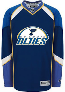
First up, the St. Louis Blues have discussed plans to introduce a navy sweater with a new logo incorporating the Gateway Arch. Well I've been sent a handful of various attempts at such a design.
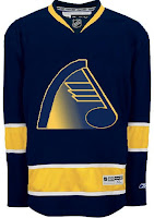
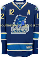
That one's simple enough. Oddly, these next two are based off the Vancouver Canucks striping pattern.
Both of those are quite unique. This one as well.
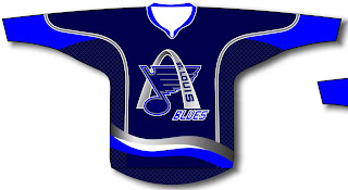
One of my favorites is this one. I like how silver replaces the yellow. That's what a third jersey should be if you ask me.
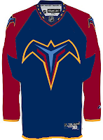
I'm not so sure about all the text on it, however. But this isn't all about the Blues. We've got the Thrashers and Hurricanes too.
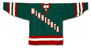
Also the Minnesota Wild.
When I first read it, I didn't like the idea, but that particular jersey design doesn't look half bad.
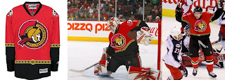
This last design isn't based on rumor so much as just wishful thinking by a Senators fan.
That's all I've got for tonight. I'll try to get something posted tomorrow afternoon, but the likelihood is it won't be until after the game tomorrow if at all. Going to see the Canucks and Predators down the street at GM Place.
Note: The time stamps will be Pacific time as long as I'm in Vancouver.




Reader Comments (11)
I love that Minnesota jersey... I'm a big fan of that style... The first and last St. Louis ones are pretty good as well...
See if you can get yourself interviewed by sportsnet! Or just wear a lightning jersey so we know who you are.
And cheer from the canucks! Remember, we took Luongo from the Panthers.
The Blues would look great in Navy Blue. I like that Sens Concept.
i lived in vancouver for a while in 2006. if you want cheap appartments - langley tend to run between $500-700 a month. the negative is you need at least a bus to reach the train system (which is among the best in the country)
I really like the first and last St. Louis jerseys. I'm not a fan of the text jerseys (Rangers, Avs, so I'm not crazy about Minnesota's either)
i like minnesotas b/c i LOVED the "PITTSBURGH" jersey the pens had from 1993-96. i wish they'd bring it back with the las vegas gold and the skatin penguin. it'll look sharp.
I like that thrashers 3rd jersey!
So why does the Minnesota jersey 'not look half-bad' yet in your eyes the Rangers jersey is one of the worst visual atrocities in hockey?
Wow! Are you seeing a heck of a game here.
The Blues' third should use the same concept as the old Dallas jersey with the big star. Use a large arc across the jersey to divide the jersey in two parts, below the arc would be a different colour than above the arc.
Canes looks excellent! - the black looks great with that creative logo (representing "The Triangle - Raleigh-Cary, Durham and Chapel Hill)!
But do not change anything on the original home and away sweaters, one of the best designs in the NHL (great colors and design). Symbol of a Champion and great organization.
Go Canes and Caniac's