Pre-Playoff Concept Art
 Monday · Apr 7 · 2008 | 2:21 PM PDT
  12 Comments
 The Stanley Cup playoffs kick off on Wednesday night. Tomorrow I figure I'll post my predictions and so forth for anyone who might be interested. In the meantime, I've got concept art for you tonight. Not a lot but just a few things I thought were especially interesting.
First, a big set of third jerseys. Pretty much every team with rumors floating about. And then a special treat.
I told you it was a lot.
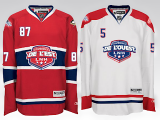
Then, with the recent surfacing of the 2009 All-Star Game logo, one reader came up with a concept for a Habs-based jersey design.
In French, no less.
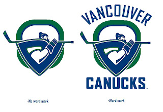
And finally, a Canucks concept I thought was interesting given the current logo tournament going on at ToHL.
Obviously a take on the WHL's Giants.
Enjoy your night and let's get set for some playoff hockey! My favorite time of year!


Reader Comments (12)
that senators third jersey concept... is just too much like the ducks home
that blackhawks third would be a great jersey as well as the canucks green jersey, we need more variation in these jerseys
There are some pretty sexy Jersey's in there.
third jerseys....meh, some good, some bad.
2009 All star concept....numbers on the front - no deal.
Vancouver...I do not get. the truncated 'G' does not work. looks like a deformed paper clip.
Atlanta's is sick
y is buffaloes labeled
bolts wouldn't be that bad without the bolts written across it
hey chris how happy are u that the bolts won the lottery-they needed it
stars is bland, islanders ick the rest are actually pretty decent the canucks would look good in green, the oilers goin back to the orange n blue is great to see and the sabres one is REALLY sharp with the yellow shoulders
as much as i hate black jerseys, the senators jersey (even though it has the same striping for the ducks jersey) and the coyotes jersey look extremely nice. all the other ones suck especially the sharks and blues.
that canucks logo is AWESOME! it kinda looks like a V, kinda looks like a C, has the johnny canuck thing going, pays homage to the stick-in-rink logo ... just awesome.
Some nice ideas for thirds in there. Atlanta, Boston, Buffalo, Chicago, Edmonton, Phoenix and Vancouver are all good to great. I especially like Boston, Buffalo and Edmonton.
Ottawa would be on the list as well if it wasn't for the striping.
Minnesota's logo has been butchered. It's funny now switching the red and green can make such a difference. And not a good one.
I think I like the idea of the All Star jerseys being based on the host team's jerseys. But then maybe I wouldn't feel the same if the game was going to be held in a place that didn't have such nice jerseys.
im starting to get tired of the number on the front shoulder.. it was nice when buffalo did it because it was different, now, almost all the new jerseys have it.. if Dallas' home jersey style becomes trendy also im gonna be pissed.
No, no and never. That Senators jersey needs to never see the light of day. The 2D logo is just horrible. Whoever invented it should be fired.
quite enjoy the all-star jersey, especially being from Montreal.. however, what the hell is the need and desire of having numbers on the front of the jersey? really, it looks moronic.