Capital Conceptualizing
 Thursday · May 15 · 2008 | 2:14 PM PDT
  7 Comments
 I've got some third jersey concepts for the Washington Capitals to share tonight.
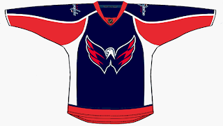
The first one is based off the current uniform with colors and logos swapped.
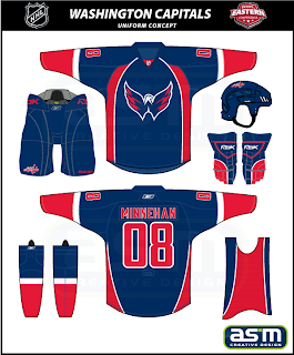
Not bad at all but I'm partial to this next design.
The striping and style fit in with the current sweaters while also being different in their own right. Really, they could do a lot worse.
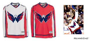
And I know a lot of people like the eagle secondary logo, so much so that they've asked to see it as the primary. Well here you go.
I think it could be smaller on that jersey, but I certainly like it better than the wordmark. The Ducks could learn a thing or two from this but we'll save them for another day.
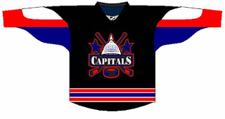
And don't take this last item too seriously.
I was going to save it for tomorrow's Freak Out post but it fit with the Washington theme today. Anyway, check back tomorrow for the 35th installment of the Freak Out Friday.


Reader Comments (7)
that second blue concept ROCKS!
That blue should be deeper. Reminds me of the Rangers too much.
I agree, the second one looks a ton like the Rag's statue of liberty jersey.
I've always hated the (probably inevitable) prospect of the Weagle as a primary, but I must say that second blue concept is amazing. As long as the Weagle is small enough (with the rest of the jersey design filling in the space nicely), it works pretty well. The blue would end up being darker, to match the current blue I'm sure, so in the end it wouldn't look like the Rags unis too much. Hopefully if/when the Caps do design a third, it'll come out as strong as that one.
As a Caps fan, I really like the first one the best. At this point, I don't know if they even need a 3rd jersey (although being a collector, I would definitely buy it)..... I think they have the best looking new uniforms in the league
the second design + darker = $$$$$$
As a caps fan, I could live my whole life and never see a weagle primary, and I'd be ok. And, if you do it, make it on a white jersey, so the capitol dome look makes sense.
Ugh.