Wednesday
May282008
GFB Exclusive: Unused Lightning Marks
 Wednesday · May 28 · 2008 | 2:20 PM PDT
  23 Comments
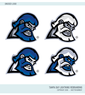
 Earlier this month, I posted Matt's new Tampa Bay Lightning logos as part of his Rebranding The NHL series. They were met with much admiration. But there is a logo you haven't seen yet.
It was left out of the final design but as part of my partnership with Matt (aka GhettoFarmBoy), he's made some of his unused work available for your viewing pleasure.
I'm not sure what to make of it myself, so I'm looking forward to your comments. Post them below!
Don't forget, there's a Freak Out Friday coming at the end of the week. Get your wacky artwork in by tomorrow night if you want it included! Email me at nhllogos@gmail.com.


Reader Comments (23)
This one actually makes alot of sense.
TB Lightning - Zeus is the God of Lightning.
The bottom right logo is a smurf, right?
Hey did Johnny Canuck switch teams
or what?
they look good... but I agree with the smurf comment, I don't really like that one though..
Santa Smurf.
...or it's Thor, God of Thunder. Either way, it's a refreshing take on what has been a brand in a rut.
Nah, Thor always had a golden beard. But regardless of my Norse myth geekery coming out, that image is amazing. I would've loved to see that on the jersey concepts!
I like it alot! like bill says... lightning = zeus, makes sense! i see that logo on a 3rd jersey!
johnny canuck, thor, zeus, hulk hogan , papa smurf all rolled up in one!!
I like! What about having a lightning bolt incorporated somewhere.. maybe where the neck is? Where that sharp point is.. Other than that.. looks sweet.
If he used the grey skinned, white haired one and incorporated him throwing a bolt of lightning, it could work kinda cooly.
I like! What about having a lightning bolt incorporated somewhere.. maybe where the neck is? Where that sharp point is.. Other than that.. looks sweet.
maybe put the bolt in the form of his crown over the ears (like the olive leaves/caesar kinda deal?). without the bolt, it's kinda hard to tell what team that logo is for.
like all of Matt's work, amateur.
These look like they belong in the ECHL or some league even lower down, if that.
Leave the designs to the pros please, you are embarrassing yourself.
Tony has some issues. There is no need to bash someone else's effort. Show some of your own work if you think you can do better. That is the point of the site.
Yeah Seriously Tony if you are to make a negative comments at least make it in a constructive way, your comment make you sounds like a douchebag who doesnt get enough love,,
" HUGS ",,There i think you needed one :)
they look pretty cool..although i think there needs to be a lightning bolt on there somewhere...and the one looks like a smurf
I agree with pascal and scott
Stop criticizing and do something.
Matt's work is really well done.
And Tony, I don't think logos get worse as they go down the leagues; some are just really good and some aren't.
The stockton thunder logo is better than the ducks logo.
I'm digging it. I agree with the folks who say it needs a lightning bolt worked into it, but it's good work as usual by Matt.
Well I finally decided to join this wonderfull blog, so this is my first comment :)
I think these "Zeus"-logos aren't as good as the previous "Mercury"-logo which was awesome. Those just look too minorleagues to me. They look good, but they aren't as cool as the Mercuryman.
Hey Tony, lets see you come up with some "awesome" work then, if you think that ghettofarmboy is an amateur. Hey Tony, YOU SUCK!
haha, I could easily do something as simple as that....
I never tried to "REBRAND" the NHL in the first place...
I will leave the professional logos to the professionals... There is a reason they get paid to design logos.
Lets see you make something as simple as that then Tony
I like 'em and could see it on a NHL jersey! Keep up the great work!