Thursday
Jun192008
Philly Concept Logos
 Thursday · Jun 19 · 2008 | 2:48 PM PDT
  21 Comments
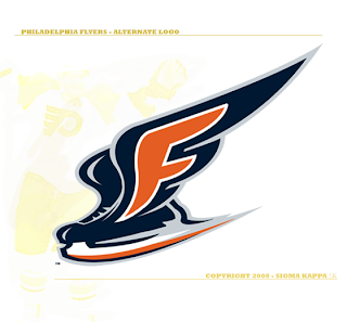
 You've seen concept logos for the Devils and Predators from this artist and now he's moved on to the Philadelphia Flyers for his latest design.
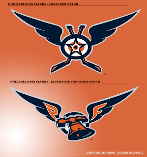
Here are the secondary logos he came up with.
Even if they aren't entirely feasible as NHL logos, they're still very sharp and nice to look at. It's got the best Liberty Bell logo I've ever seen too. Anyway, what do you guys think?
By the way, I've got some great Los Angeles Kings concept art to post tomorrow. I think you'll enjoy it too.


Reader Comments (21)
we're seeing alot more artwork from this guy than GFB. i still think you should have them go head to head...
i liked the nashville logos a lot, but this primary logo is just not matching the flyers... i can't really tell why, maybe because the skate reminds me of the old canucks logo? but i have to agree with chris, the secondary logos, especially the one with the liberty bell, are very sharp
nice designs, but philly's logo is a classic, shouldnt change it. even changes as small as attempting to make it 3d-ish like on their alternate jersey of years past shouldnt be done.
these are hot
I agree that the current Flyers logo is classic, but those logos would do well for just about any other team that can incorporate a nickname to the logo...they look good...
The shoulder patch could even be a primary logo (in fact I kind of like it better as a primary logo).
Those look nice but nobody should ever change the Flyers logo. It's classic and should be left alone. It's been there for over 41 years and counting.
Even being a lifelong Flyers fan, I think the current logo needs a major tweak. Unfortunately, this isn't it. Take away the hockey sticks from the shoulder patch logo and I could see that as a decent shoulder patch for the Flyers, but I don't like the bell logo at all - nor do I see a need for the Liberty Bell in a Flyers logo and I really despise the skate logo.
the first one hes done i like
i really like all of them
the best liberty bell one chris has seen, of like 3
but i like these
lookin forward to the kings
I hate to say it, but when I first saw the liberty bell, I thought it was a camera.
the best liberty bell logo is the one in the concepts gallery.
Seriously, GFB and "this guy" need to go head to head. Both have great stuff. Good times for us consumers.
I like the winged skate, but I think he should lose "F", just a winged skate (which probably goes into the Canucks and red Wings territory so... might not work).
Love the shoulder patch, and the Liberty Bell, but lose the "P" and "F"
The skate is kinda nice, but forcing the "F" into the wing is weak. The Liberty Bell is executed nicely too, but the wings on it are kinda weak too.
I don't think the first logo is intended to replace the "classic" primary logo. Right above the skate it states "alternate logo".
its good work, but i would love to see that skate without the obvious F. Then it would have the not super obvious but definitely there feel of their current logo. Also, im curious to see these with uniforms.
CHris, congrats on youre teams new player. Have you "Seen Stamkos"?
Would that liberty bell look better as a hockey lgo if it didn't have the wings?
Can you please post that LA Kings artwork you said you'd post by yesterday?
The "P" and the "F" in the bell logo is leaving itself wide open to being called "P.F. Clang's". :)
That winged bell doesn't look too similar to the Weagle at all.
Wait. Yes it does.
The Flyers should just stick to what they have,their logo and colors are the BEST in the league....period.
with the re-introduction of the classic 74-75 style orange jersey as their 3rd this year fans will have the best of both worlds,old and new.
im not a big fan of placing a "bell" on the uniforms anywhere...even though it has something to do with the city of brotherly love,it just doesnt look right.
and a flying "winged bell"...is even worse.