Fan Art Fit For Kings
 Saturday · Jun 21 · 2008 | 11:41 AM PDT
  18 Comments
 I know in Thursday's post I promised some L.A. Kings concept art for yesterday but that's what I get for promising things. But I just crashed in the afternoon. I must've slept 14 hours yesterday. Anyway, I've got it for you now.
A couple of great artists have recently started submitting new concept artwork to me to post here. You saw one example yesterday with the Flyers. On top of that, I mentioned his work on the Devils and Predators while completely forgetting about his Senators design.
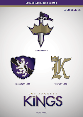
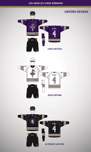
But in that same post was an amazing concept for the New York Rangers. Well that artist has now come up with a beautiful rebrand for the Los Angeles Kings.
The gold offsets the purple perfectly and the silver doesn't hurt either. And the logos look great on the jerseys.
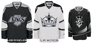
I love being able to post work from truly talented artists and look forward to continuing that. However that doesn't mean I won't also post the simpler designs, such as this one — which takes a page from the past.
And yes that alternate jersey is a recolored Ducks sweater. Wow.
Keep the fan art coming!


Reader Comments (18)
Simply stunning. What talent, I absolutely love those logos. The jerseys are great as well. Of course, I'm refering to the first set, never mind the second. And that third jersey with the crest logo is beautiful. Gotta love that K logo, too.
I agree, WHAT talent? These fan art posts just keep getting worse.
the primary kings logo created looks very clipartish and i can't think of anything good about it
that said, i'm a HUGE fan of both secondary marks. the subtle crown on the K is superb.
Are you kidding me? That is simply perfect, and ten times better than LA's current set. Let's see you get off the couch and make something like that, with such detail and time put into it. And no, that angry "king" doesn't count as a logo.
so the concept is a sword going through a crown...like stabbing the top of one's head?
great execution, poor concept.
i like the shield, don't mind seeing that as primary logo.
love the purple and whites. great to see "los angeles" NOT on the hem. the purpose of a logo is to be identified by it...there is no need to 'inform' others of your city of origin with a word mark.
i'm just saying, what does that first logo represent? i would believe it for the restaurant Kings before a sports team.
when we discuss logos, and why the best logos are the best, we mention things like "character" or "power" or "represents the team/name/city/region well." the primary mark has none of that. the secondary and tertiary marks do...the wordmark has more of that...but i simply do not like the primary logo.
when you look at it on the jersey, it simply looks awkward...like the players are going to stab themselves in the crotch or something.
you want to talk perfect? go back to the black and silver. i'd go with those 90s jerseys before these. hell, i'd go with the 67 jerseys before these. as far as i'm concerned, pair the secondary and tertiary logo up with the current crown, and you MIGHT have something
ehh its ok
the colours are great but im not sure on the logos. if you mixed all 3 it could work
the shield with a k in it and the sward through the crouwn behind it
the script is plain
sward?
soory cant spell
sword
How does a shield with a lion on it and a crown more identifiable to a king than a crown and a sword. You guys make no sense the primary is definitely better than that secondary one.
That first set is excellent! I like the sword and crown, I think it properly displays both power and aggression. Very cool.
i really like the logo set. its one of the few sets from this artist that i think is actually good and comparable to GFB. wit that being said, i do have a few comments.
1) the primary (though well done) looks like a secondary logo
2) the word mark is boring and looks like it was done in a couple minutes
3) i would have likes to see more from the tertiary logo. its just a calligraphy K.
i do, however, love the primary and secondary logo. the updated 60's color scheme, etc.
I think that primary and secondary logos would be great secondary and tertiary logos respectively; mostly because I feel the sword/crown logo is too simplistic to be a primary and is a bit awkward in length to go on the chest. I love the colors though. I don't really have a problem with their current primary and when you couple it with the sword/crown logo as a secondary and lion-shield tertiary, I think you have a solid set.
Great work!
I was impressed by the small details put into the tertiary logo. I think the jerseys as presented here don't quite have an NHL "feel" to them, but if this logo set was reworked on the jersey templates presented, I think it could really be great.
I like the shield logo better than the crown/sword. Pretty good over all, though.
Outstanding...all of them!
Solid work all around on these concepts. This takes a team whose identity has always been weak and really shapes a great look around it. This is the best work I've seen for the Kings. I'm really very impressed.
I'm really surprised by all the negative comments I'm reading here.
The purple and the white jerseys are gorgeous, but the black seems to be trying too hard.
I like the primary and secondary logo.. the secondary logo I'm nearly certain comes from a football (soccer) club, but I can't recall which. But as a Kings season-ticket holder, I still think that the only adjustment they need to make is make the home jersey purple instead of black and bring the "coat of arms" back to the primary. That pretty much defines "kings". Heck, at the 2008 NHL Entry Draft, the scoreboard even had that crest, instead of the crown. When they changed to that logo in 1997, I loved it, and I can't say I'd be sad if they went back to it.