Monday
Jun232008
Designs For The Desert
 Monday · Jun 23 · 2008 | 4:26 PM PDT
  46 Comments
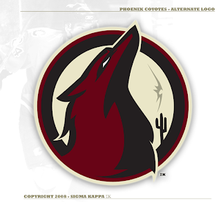
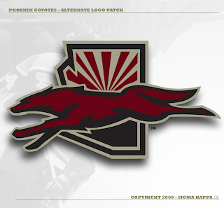
 One of my favorite new designers submitting artwork has sent in a lot of great concept logos for teams including the Devils, Predators, Senators and most recently, the Flyers. Up next, he's taking a shot at the Phoenix Coyotes.
And it seems to me his work just keeps getting better with every design.
I've read that some of you are comparing his logo designs to Matt's work and I'm not sure I can argue with you there. These two concept logos are top notch — definitely worthy of any professional sports club.
That's all I've got for today, but what we lack in quantity here I believe is made up for in quality. Let me know what you think of these in the comments.


Reader Comments (46)
Is it visually appealing? yes, it is - Sigma Kappa's work definitely has a professional aesthetic to it that puts other pieces of fan art to shame. Props to him.
But this particular logo, though - I can't tell if what I'm looking at is supposed to be a coyote or a phoenix. Clearly he's drawing on the symbology of both, but in the end, it feels a little indecisive. Either SK, or the logo itself, can't decide what it wants to be.
I feel awful continuing my criticism here, but the second one looks like an ad for the AZ office of Greyhound Bus Lines..
Like his entire collection thus far, the PHX logos are visually stunning. But they're still a little off the mark, and in my opinion no better or worse than what the team has going for them already..
GFB does have a job Godsave1thequeen, i was just talking to him on the chris creamer's message boards, and he was making a logo for one of his clients, and i think he deserves to get that out of the way first, since he doesnt get paid by NHLTOL to do his stuff....
about the logo, i like it except for in the primary, it looks kinda out of place with the fur, its like the head and the fur from the shoulders, but the shoulders arent on there.
The coyote running over the map outline rocks! The coyote howling without a mouth is creepy. But two paws up for another excellent set of designs, colors and overall appearance.
I usually don't pay much attention to concept art, but this one struck me because the top logo just looks way too much like a rooster.
two cents:
$.01 - eyes and cactus need to be slightly bigger to read from afar
$.01 -slim down the neck, loses coyote profile from a distance.
other than that, these are AWESOME!!!! would like to see jerseys to match these. i hope Wayne and Co. are surfing this site.
i agree. it is contest time. but, let's include everyone. give everyone a week or two for redesign. to be 'fair', do not give the name of designer until end of tournament.
These look the same as GFB's...
While they may be decent attempts at art, they LACK all the qualities that make a good SPORTS LOGO.
That is what people seem to miss with these renderings.
A logo should be simple, easily recognzible and reproducable. All these fancy attempts look like the lower leagues and comics that do not know how to create brand identity.
Look at Montreal, Toronto, Boston.... it is a simple concept not an elaborate desert scene.
While I think these are great. The current yotes logo is perfect in my opinion and is too difficult to improve upon.
why does it take GFB so long to create a new set of alternative logos????????
what do you mean by
" elaborate desert scene"??
there is only ONE cactus in the background,geez
Tony is correct. I agree GFB's are better than these guy's. And can you all stop hating on GFB? Do you know how long it can take to complete a whole concept from start to finish? There are a lot of stages and much trial, error, and planning... plus GFB does uniforms as well. I guarantee you this guy had completed these before and is just submitting them one after another.. plus it is lower-quality work (though it is still quite impressive), in terms of sports logos, than GFB's. Lighten up people, be patient.
Oh and plus the second one looks like a horse and I can't tell the top one is even a living thing. Just work on the hand shadows a bit.
I'm no designer, but I know what I hate, and I hate these. I have yet to see a good one come from either guy. Am I not entitled to my own opinion?
I respect him for trying, but these logos are just terrible. I don't have to like them and I'm going to continue to say that I think they suck when I think they suck. That's the only way you get any improvement.
Oh, right, I forgot I was talking to a Leafs fan, you haven't mastered that one yet.
for some reason, i always think of mozilla/firefox when i look at these logos.
also, whats with the contrast of eye color? white in the first but black in the second?
Again, great stuff, so close, but some feedback for future designs.
Not bad. The alternate is a little dark all in all.
I love the alternate logo patch, but it seems for some reason like a fox, and not a coyote. Not sure why.
On a different note. Why do all the Arizona teams incorporate the state flag? Is there a rule?
this is by far my favourite!
wheres GFB?
If I was in charge of design for an organization based in AZ, I'd want to use the flag too. Why? Simply because it's quite possibly the best looking flag on earth.
These are really good, my favourites by this guy. Personally, I believe he is hit and miss, while GFB is consistently good with his designs (except I really hated that Ducks one). All in all, these arent perfect, but they are really good still. Also, that guy that did the Rangers and Kings is just as good as Sigma Kappa, hit with Rangers, miss with Kings. This site just keeps getting better and better.
Love the logos..hope you can make one for the Canucks!!
BRILLIANT!
To Dan Angell: All I asked was for you to show him a little respect for creating what OTHER people think are beautiful logos. I understand everyone needs a little constructive criticism, but at least encourage him if you're not a fan so that hey, maybe he'll make a set that you actually like. Your attitude reminds me of Mike Keenan, someone who needs to chill and get happy.
regarding the bottom logo (coyote running across arizona): what if the inside of the bottom of arizona (the black part below the coyote) was the gold color and the most inside outline was changed from gold to black?
the only reason why i ask is because the ground seems to blend in with the shadowed part of the coyote and you might not see the coyote from a distance (if you were a fan at the arena).