Monday
Jun232008
Designs For The Desert
 Monday · Jun 23 · 2008 | 4:26 PM PDT
  46 Comments
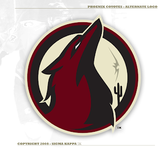
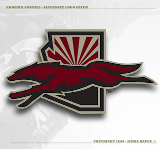
 One of my favorite new designers submitting artwork has sent in a lot of great concept logos for teams including the Devils, Predators, Senators and most recently, the Flyers. Up next, he's taking a shot at the Phoenix Coyotes.
And it seems to me his work just keeps getting better with every design.
I've read that some of you are comparing his logo designs to Matt's work and I'm not sure I can argue with you there. These two concept logos are top notch — definitely worthy of any professional sports club.
That's all I've got for today, but what we lack in quantity here I believe is made up for in quality. Let me know what you think of these in the comments.


Reader Comments (46)
I am loving this one. Great work
love it!
While I don't necessarily see any need for change in Phoenix (their newer logo set is WAY better than the old), these concepts are just fantastic. Great work!
This guy needs to be hired by the league. If any team had logos this good, I'd buy their jerseys in a heartbeat. I like how he incorporates the current secondary patch as the backdrop in the second image, and the coyote certainly looks intimidating in the first. In the second design, the coyote just looks incredibly majestic.
i love these logos, also WHERE IS GFB i personally am getting tired of waiting for his worl when this sigma kappa guy makes higher quality work at a staggering pace
this guys awesome!
Great looking logos, although its more of a wolf than a Coyote.
Good work once again! Their current stuff is great and doesn't need changing, but this is still nice. The second one reminds me of the Soo Greyhounds, a logo I've always liked.
ive said it before (many times) and i'll say it many more times.
CONTEST
I'm wondering what he can do with the swords....
Ugh. No, just...no.
How many bad ideas am I going to see? I can see why this guy and Matt are being compared, both keep turning in performances that make me thankful they aren't actually doing this for teams. These are terrible.
this is REALLY sharp
i like the coyotes logos now
but these are good, the last to by this guy have been good
and to please cody brown
8 of his 8 of gfb
1 winner
Great work. But is it not weird that the background depicts players from different teams?
I think we have a rivalry brewing here, loll.... Chris, maybe you should have a poll to see what percentage of your readership likes either designer, i'd like to know loll
IMO both of them are really good, but i wanna see a redesign from both of my Red Wings (arguably the hardest team to redesign in the league), before i decide :D
personally, i think the coyotes one, and the preds one are easily the best two (between gfb and this new dude)
but chris, you should contact both these fellas on a few teams that havnt been done yet. post their results and then poll to see who makes the better logo. 1 point per winner. first to like 10 points wins or something.
I like this new i dea for a competition between gfb and the new guy. PLUS the coyotes sweaters are really looking sharp, i would like to see those on jerseys.
I agree with Cody Bown. A competition is needed.
I suggest the following:
-The contest is limited to only logos which the artists have not posted up on here yet.
-8 logos each
-Each week, Chris names the team they have to do, and at the end of the week, it's posted. The day it's posted, Chris names a new team for them to do, and while we wait for that one, all the readers get to vote on the one which was just posted. With this format, there's never any dead time, and it sort of works with the normal production schedules of both artists, so neither gains a real advantage.
-At the end of the 2 months (8 weeks=8 teams=2 months), a winner is named based on who won the most. A tiebreaker could be a classic team, named by Chris or the vote of the readers.
After that, the competition could be over, or we could do more head to head match ups, either with these artists or others who'd like to try their hand at it. If we did more of GFB and SK, we could do all defunct teams, or possibly even minor league stuff.
All just suggestions Chris, feel free to take what you like, and discard what you don't.
Interesting how this guy only does alternate logos. None of these have been meant as a primary. So everyone who's apparently hating on these, cool your jets and get a life. Dan Angell, get real. You seem like one of those stubborn people who can't admit that anything can improve. Yes, as good as the Coyotes' logo is (I think it's tops in the league), and I know these are alternates, but I think these are better.
So all you whiners, how about you make something better if these are so "Ugh. No, just...no." Oh yeah, you can't, so give him some respect.
for the guy that suggested all of the rules to a showdown the teams have to be like the ones whos logos are difficult to rebrand
red wings, black hawks, leafs, canucks, canadians, penguins ect ect
then like the tie breaker would be like the seals...hahaha that would be fun
holy crap amazing!!
Here is is a challenge to both designers...re-tool the Avalanche logo. I dare you. Can you come up with anything better? What can you possibly create the will be better than the existing primary AND secondary. Snow coming down a mountain in a deadly fashion (hard enough to conceptualize) with the NHL team twist. Good luck to both of you...you are going to need it.
Again some GREAT work! Would love to see a redone Rangers-Logo from this guy.
Let's get a remake of the SJ Sharks! (didn't really like GFB's remake, no offense)
Awesome logos! And like leafers lp said: These are alternate logos, so the primary logo would be even more awesome!
I personally prefer GFB's logos, but these are great too.
Btw there hasn't really been any Blues logos ;)
If there's gonna be a contest, then they should do some vintage logos - Whalers, Jets, Nordiques, etc. I'd love to see that.