Anaheim Sweater Concepts
 Sunday · Jun 22 · 2008 | 3:45 PM PDT
  11 Comments
 Today I've got a number of sweater designs sent in by readers to share with you — specifically for the Anaheim Ducks. Interestingly, none of them features a redesigned logo or color scheme. So have a look.
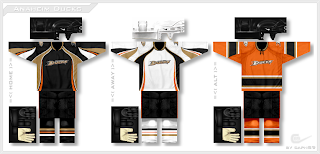
This first set is all about unique striping patterns and I'm a fan — especially the orange one.
The next one is simpler with a little less originality than what we just saw but I'm sure traditionalists would love it.
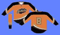
And this one is another example of why the Ducks would look good in orange — except you obviously can't have gold numbers on the back of it.
The next two are sort of an upgrade to the current uniforms.
I definitely think the wordmark needs to get off of the chest.
And these two are just examples of gold jerseys — probably not the best of ideas.
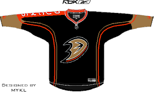
Lastly we have a black jersey with some simple striping and the team name down the right arm.
Some of these are pretty bad but it could be worse. They could keep wearing what they have now.


Reader Comments (11)
most of these are plain
i like the first set
and i like the orange ideas
mine was just a strange idea(last one)
look for designed by mykl, its me
I really like the first set, my only qualm is I'd like the striping the whole way around the arm on the orange one.
I don't mind the wordmark so much, it's just that it's too small on the sweater. Think "RANGERS".
The first ones are really good.
But the ducks logo, even though it looks unusual on the front because it is a wordmark, is something that we have gotten used to, and now my veiw of it has changed to like it. BUT, it still needs a better jersey and definetely a shoulder logo. The first set of jerseys fulfil that requirement.
And I agree with delicious that the word mark needs to be bigger.
One of the nice things about the ducks jersey right now is the striping, but I think the jersey needs a little bit more of orange.
YOU KNOW WHAT: I have decided to make a ducks concept jersey!!!
I love that striping in the first one!
sorry, but none of these are working for me. I like the Ducks and their jersey/logo now, as a matter of fact, i have a jersey, and i personally see no improvements here. The first one was a good idea, but the orange for it reminds me of the Oilers, the other 2 of a hat i own. Thanks for the ideas though.
I like 4th set. The left one looks cool. Hey wait a second! That was in the "New looks for the whole league"-post. Was my favourite and I still like it.
never a fan of teams defaulting to black as their 'main colour'. the firsts set is awesome. love the white and orange. reminds me a bit of flyers, but that is okay, since they too do not have the balls to shy away from black.
also, just having the "D" is way better than the whole word. and how small is the word "anaheim"? you cannot even read it...not that i like teams displaying the city they are from.
that's all i got for now, thanks for reading.
The first two in the first set make me dizzy with all those wavy stripes. The orange one is pretty nice, though.
Either take the current wordmark and add a black circle around it or just drop the "UCKS", leaving the current striping pattern, and I can live.
Flyers are probably going to stick with Orange in the next couple of years, so the ducks need to find something else!