Just To Freak You Out XXXVIII
 Friday · Jun 27 · 2008 | 2:43 PM PDT
  17 Comments
 The absurdity continues here in my little corner of the world. First thing's first. We all have to be able to laugh at ourselves every now and then and god knows I make a habit of it. But this whole "rebranding" thing — it's a little weird, right? I mean it takes a special kind of person to keep an entire blog dedicated to the redesigning of NHL logos by various artistically inclined hockey fans.
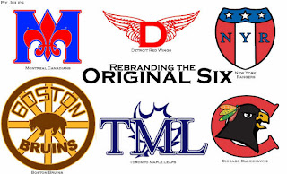
I got a graphic emailed in this week that really made me laugh and I have to lead off with it.
Let the petty sniping begin (we all know that's what the comments are for anyway). I think it's absolutely hilarious. And when it comes to well-designed artwork, I get inspired regardless of whether I think a team should actually wear it in real life. That's what art is for anyway, isn't it?
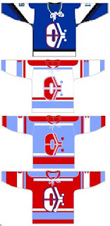
But this post is about freaking you out, so you won't find any detailed and well-thought-out designs here. Instead, imagine the Quebec Nordiques going out west to become the Denver Dekes.
I don't have the words for it. Nor this.
I need a prescription for a drug that will allow me to fly. What's that? You say they don't make one? Hmm...
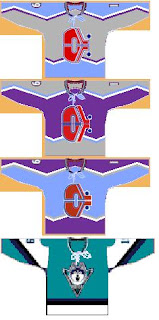
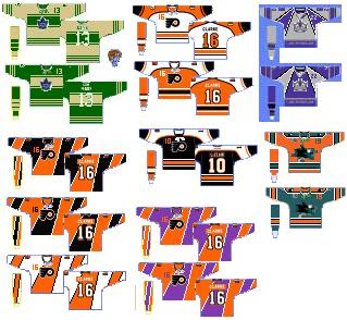
Forgive the poor quality of the jerseys in the next image, but these are worth looking at.
Be sure not to miss the purple and orange Flyers jerseys.
And lastly, an article on Yahoo! was pointed out to me today. The writer talks about the horror that was the Mighty Ducks third jersey back in the mid-'90s. (You guys should know, you voted it worst third jersey logo EVER!)
Anyway, that got me thinking. A while back I got these logos from a reader. He took the duck bursting through the ice and painted a different team's logo and jersey onto it — and then did it again for every team in the NHL! It's an absolute riot and this is the perfect time to start posting them.
As you can see I started with the Pacific Division so that I could show you the crazy duck with the new Ducks logo and colors on it. Just wait until you see the rest of the league. I'll post a new division in each Freak Out Friday post until we get through all six.



Reader Comments (17)
THESE ARE GREAT!!!!! For a freak out Friday post. Ha, wow, just bad. I personally think that the Leafs one at the top looks like some sort of a tourism logo, but no chance for the NHL.
I never realized until seeing those Denver concepts that we missed out on a team that could have been nicknamed the Freaky Dekeys.
Hey Chris or anyone who can answer this question:
I want to get Photoshop Elements for a number of reasons, but one of which is to be able to change uniform colors on pictures as well as fill in templates, like the NHL jersey one on this site. Does Elements has this capability as opposed to the full Photoshop suite?
Thanks
Also, I love that the guy who made the Denver Dekes logo and uniforms included that third jersey that the team never used. It looks so hilariously out of place next to the other 7 uniforms. Well done.
This is kinda sad, to me but those Wild Duck logos actually look pretty good to me. Maybe it's cuz we're so used to it now, I don't know. But I would be curious how they looked if you changed the Ducks' head on the body to something that represents the new team, like a Coyote head or a Shark head or something. I think that'd be something freaky to look at.
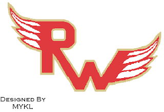
As a Detroit fan, Red Wings redesigns usually fill me with dread. It's hard to imagine something replacing the winged wheel. That winged D in the original six is one of the best alternates I've seen.
Those Flyers unis in the upper middle actually look pretty good! They look like actual hockey jerseys, unlike the crap half the league wears these days. The rest are indeed true freakouts!
Ksy92003, that's what I originally wanted to do, but it proved to be too difficult to do on MS Paint.
Am I the only one that likes the Ducks logo fly out the ice?
The New York logo (Original six)is the only believable logo. I like the idea of the fleur-de-lis but it covers the M too much
obviously, disney was targeting kids with the ducks 3rd jersey. good idea, bad execution.
instead of seeing different team logos on the same duck, i would rather see team mascots crash through the ice...which reminds me to remind you, the next tournament should be mascots.
Awildermode, that would be impossible, as not every team has a mascot.
Also, I disagree about a mascot tournament. There would be even more homer votes than for Luongo in the goalie mask tourney.
"Awildermode, that would be impossible, as not every team has a mascot."
That doesn't really ake it impossible...we could just use the the teams that do have mascots...not that hard.
my wings one (rw) was 50 50 serious/ joke
and s the worst, 3rd jersey, and alternate logo tournament didnt have all the teams
Nothing wrong with the brown and yellow Bruins logo.
"go sens go", that's the rebranding of the Montreal Canadiens logo; the New York Rangers are up in the upper-left corner.
LOL Denver Dekes......plenty of Double D's advertising opportunities with that one.