Saturday
Jun282008
Colorado Concept Logos
 Saturday · Jun 28 · 2008 | 6:55 PM PDT
  14 Comments
 Recently I noticed in the comments of various posts, some of you pointing out that among others, the Avalanche may indeed have the perfect logo. That is, there's no way to improve upon it. Some even went so far as to challenge anyone to make one that's better. And a few people responded.
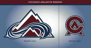
This is the best of what I received but even it doesn't come close to the Avs' current logo. A valiant effort to be sure, but certainly no replacement.
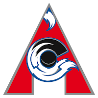
There were a couple of others, not as great, but worth a look.
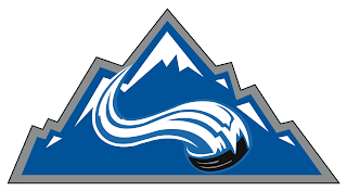
And then this one which borrows a major element of the actual Colorado logo.
That does it for tonight. I'll have a look at some Detroit Red Wings concept logos tomorrow.


Reader Comments (14)
the last one looks like the mountains from coor's light.
It's not that the avalanche logo is the best logo in the league, it's just that there is no way of improving it. It's not the best logo because there are other logos in the league too that can't be bettered.
i love the avalanche logo. it is one of the best in sports and i can't see how it could be improved.
that last one is actually the colorado rockies (baseball not original hockey teams) logo with the avs avalanche/puck...cool nonetheless
I actually think the first primary logo is better then the current logo. It's more subtle in terms of the A, and the mountains look terrific.
The Avalanche's surrent logo is perfect, everything from the subtle use of the letter "A" to the unique color combination. There's no way anybody could improve on it, and I hope that the team doesn't make any effort to modify it.
looks like your lightning are about to sign roberts and malone. as a pens fan, i would take your third round pick for nothing any day.
I think that CA logo at the top definitely beats out the Avs' current secondary logo.
Sorry guys ... the current/original logo is still the best. It is the perfect logo.
I am absolutely amazed at how many people are stating that the avs logo is perfect. It is not even good in my opinion. I am usually pretty aware of where my own opinions differ from the majority, but I am shocked by this one. It blindsided me. I really thought it was common opinion that the avs logo is not very good. Guess I was way off on that.
While not being, say, Hartford Whalers perfect, there is nothing inherantly objectionable about the current Avs logo. There's some great artwork here but nothing I'd replace it with.
the C A logo at the top is pretty cool. sharp, classic looking logo
Very impressive work. Fan of Coors Light?
The current Avs logo is great! It's a clean design that designates the team name, colors, sport, and region. It can't be used for anything but a hockey team called the Avalanche. I've seen other teams called the Avalanche, but their logos were never this good. It's hard to say if it's the best logo in the league, but it scores very high in my book.
These logos are a nice effort, but they don't beat the original.
Their jerseys could use a little work, no doubt. The secondary logo with the abominable snowman paw is too hokey and not very accurate for Colorado. It was supposed to be removed after the first season, but the team keeps it out of superstition because they won the cup in their first year wearing those patches.
I think the Avs desperately need a new third jersey and fresh alternate and tertiary logos - no sense in changing the original - it's too good.
You know, there could definetly be some major improvements to the current Avs logo.
Just look at it-
Is there any reference to the state of Colorado at all? Or even just a letter C?
No.