Concept Art Variety Show
 Tuesday · Jun 3 · 2008 | 4:55 PM PDT
  12 Comments
 All right, this is new for me but I'm going themeless today. There's no underlying theme that ties all of these designs together. They're simply the ones I chose to post today.
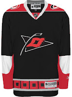
First up are the Carolina Hurricanes.
Here we have a couple of different designs. They have their similarities but overall are nothing like each other. I like the one with the red shoulders better.
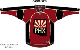
Also a pretty sharp Phoenix Coyotes concept was recently submitted.
Consider me a fan. I've been starting to see that is it possible to use the PHX logo on the front of the jersey. Didn't think it would look good at first.
That looks cool too. I especially like the non-traditional sand color for the sweater.
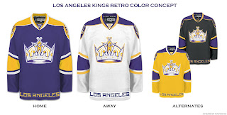
Finally, we're going all retro on you with these Los Angeles Kings jersey designs.
The yellow one makes me laugh and laugh. But shockingly, none of them suck. Maybe even the Kings have a potentially good alternate in their future.
Time will tell. Hope you enjoyed today's crop. Keep sending in your work and I'll keep posting it.


Reader Comments (12)
I like the Kings jerseys, except the black. Also, not really a fan of the black Hurricanes jersey. I'm not a fan of black jerseys in general. I like both Phoenix jerseys, very sharp. Not real crazy about the piping on the jersey,thp.
purple and yellow [along with black and silver] should definitely be the base for the kings 3rd jersey
[my hs schools were purple and gold, and we used the kings last season templates for jerseys - looked pretty sharp]
the red-shoulder 'canes jersey is alright. not sure the secondary logo works as a prime, and there are still waaaay too many black jersey teams in the league.
[i hope the blackhawks don't go back to their black 3rds... and hopefully one day phili goes back to orange.]
The 'Canes photoshop looks sharp. I like the all black sleeves and with the circle logo on the shoulders, it doesn't need the red triangles.
I like the kings purple and yellow jerseys as well. That colouring looks a lot better than their current ones, IMO.
The tan Phoenix one looks pretty cool to. I'd be interested to see it with their current logo.
I love the Kings home and away jerseys.
with the Lakers having such a good run this year I'd say it's only natural for the kings to switch back to Purple and Yellow
Kings concepts are awesome (except the boring black one). NHL and Kings organization should look into purple or yellow one as their thirds. Great job!
Black might work for the Lightning, sir, but it'll never really sit right for old school hockey guys watching the Kings.
I know that it's not the most common color, but I still hate black as a jersey color unless deserved by the team logo - Black for Lightning makes sense, it's a storm. Black for stars make sense, you see them at night. Black for Flames never made sense to me - I'll give the Blackhawks the ok for a black third because they're the Blackhawks.
That gold third for the Kings is awesome, and really ties in what they have with what they had.
Laugh it up, but if any team can pull off a yellow third, it's the Kings. If anyone else can, it's the Bruins, because they've done it.
I have been pushing for a sand Phoenix jersey for, god, at least 3 or 4 years now.
I'm still alive, and I'm still thinking that these yellow kings jersys are what the team should go for.
i personally like the phx logo jersey
cause i made it...
but still
i really liked it when i sent it in
look for designed by mykl
thats me
Just found your site, I like it. I don't really like the Canes jersey, I've seen the secondary used on "potential" third jerseys and as a fan I don't like it.