NHL Tournament of Logos

Entries in blues (55)

Tuesday
Jun192007

Blues vs Oilers


vs
BLUES
OILERS
2-0
0-2

The Aesthetics
We certainly get a fair amount of blue between these two logos. That aside, the circle has always been a classic logo shape, but I've always found odd shapes more interesting to look at. The Blues logo features a musical note attached to a wing. My eye is more drawn to it.
Blues

The Nickname
I guess you might say an Oiler could sing the Blues. But who has the upper hand. Since an oil man is a person, though, he has the freedom of choice. He could sing a happy tune if he wanted.
Oilers

The Analysis
Both teams have been in the league for a lot of years and both, in the past decade, have given upgrades to their logos. In fact, the Blues current logo is more of an improvement on the original. But you could also say that about the Oilers as well. It's a very difficult call to make as to which team gets this point, but as far as logos go, I've never liked ones which spell out the team name. The Blues get it.
Blues


WINNER
2-1


Friday
Jun152007

Blues vs Red Wings


vs
BLUES
RED WINGS
1-0
1-0

The Aesthetics
For one thing, both logos incorporate a wing element. So that's interesting. While the Red Wings logo has been around forever, the Blues is a little sleeker. I would almost venture to say that the same guy who designed the Flyers logo had a hand in the Blues. As far as aesthetics, the Blues logo has the edge.
Blues

The Nickname
This will be complicated. The situation here is that both teams have a color as part of their names. To determine which is superior — red or blue — we must look to the American Revolutionary War. Since the British fell, the Red Wings are obviously inferior to the Blues. (I warned you to expect some crazy nonsense.)
Blues

The Analysis
As I mentioned, both logos have elements attached to a wing. In the Red Wings case, it is the primary element, the wheel being there to represent the Motor City of Detroit. In the case of the Blues, the musical note is the primary element. The attached wing — I'm not really sure about why it's there.
Red Wings


WINNER
2-1


Wednesday
Jun132007

Blues vs Ducks


vs
BLUES
DUCKS
0-0
0-0

The Aesthetics
Simplicity abounds in design here. Both teams use a simple but attractive color scheme. The problem is the team is named the Ducks. I don't see a duck. There's a duck footprint in the shape of a "D," but it's drowned out by all the other letters. The musical note, however, is the perfect way of symbolizing the Blues.
Blues

The Nickname
Playing his sax, a jazz man could certainly drown out any quacking Ducks while playing the Blues.
Blues

The Analysis
Cheers to the Ducks for dropping "Mighty" from their name this season, but the logo they turned out was unfortunate. When compared to the Blues, the Blues win it by a landslide in overall design and style. If the Ducks want a better shot, they should drop the words from the logo and at least make the duck footprint the primary.
Blues


WINNER
3-0


Wednesday
May162007

HF&P, Part 3: St. Louis Blues

In case you missed Tuesday's post, I've started a new post series here on the blog in the weeks leading up to the opening of the tournament. HF&P stands for "Hockey Fans & Photoshop" and has to do with the fact that this series features potential uniform designs consistent with the new Rbk EDGE unis to be used next season. No NHL team has yet officially unveiled their uniforms, but hey, fans can dream right? None of it is my own work, merely re-posting of other people's handiwork that I found around the net.
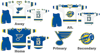
Today we get a glimpse at a potential design for the St. Louis Blues. This designer is a lot like me in that we feel like change is good. Style and design are fluid things that are constantly changing with the times. I like the idea of toying with the old secondary logo. In my opinion, it better personifies the team nickname than the musical note with a wing attached. Still, its interesting. My only change would be adding that dark shade of blue that the team currently dons. We like the two-tone Blues.

For those of you wondering, these are obviously not official NHL designs. To say their fake would be a misnomer. They're real inasmuch as you can see them. But I'm afraid they haven't been commissioned by the league. The way you can tell is that Gary Bettman has said that the NHL will temporarily drop the third jersey program while the teams adjust to the completely new uniforms. Also the secondary logo in the graphic isn't very clean.
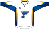
Anyway, kudos to the designer, as always. And feel free to make yourself known if you wish. I'd love to have you on the blog to talk about your work. Speaking of which, this graphic to the right comes from a separate designer who is incorporating the front shoulder number being used by the Buffalo Sabres this season. It uses the all-star uniform design with the current Blues color scheme.

By the way, I open the floor to anyone who has worked on jersey designs in their spare time. I'd love to hear from you and I'm sure the few readers here would too. It's great work. We're all looking forward to the unveiling of all the new designs this summer.

Coming tomorrow: the Los Angeles Kings.

Sunday
Apr292007

Blues


St. Louis BLUES


Team Information
Team Colors / blue, gold, navy, white
Inaugural Season / 1967-68 (40 years)
Current Logo / 1998-99 (9 years)

Tournament History

2007 Qualifying Tournament
5-9, 15 pts
Finished 12th in West; 22nd overall

Page 1 ... 2 3 4 5 6