NHL Tournament of Logos

Entries in panthers (40)

Sunday
Aug052007

Senators vs Panthers


vs
SENATORS
PANTHERS
5-6
11-2

The Aesthetics
There's a lot of detail in each logo but it doesn't really get bogged down in it. But still, that panther is scary. We're anticipating a logo change for the Senators, but could it really be better than the Panthers?
Panthers

The Nickname
It's a Senator who sits in his government office making laws to protect animals such as the Panther. He, therefore, has the upper hand in this relationship.
Senators

The Analysis
These two teams have nicknames that are associated with their city, so a logo that references it specifically is doing double duty. The Florida panther is from Florida. Ottawa is the capital oif Canada where government representatives get together. But in the Senators logo, you could say there's a gold "O" for Ottawa and a red "C" for Canada. Or at least that's what I'm telling people. And the Panthers are done for this tournament.
Senators


WINNER
2-1


Friday
Aug032007

Panthers vs Canadiens


vs
PANTHERS
CANADIENS
11-1
7-4

The Aesthetics
That panther makes for one fierce logo. Unfortunately for the Panthers, though, simplicity is going to win the day for the Canadiens logo. There's a profound quality to it that's hard to describe which likely stems from the fact that it's only been around since the beginning of time itself. No, I'm not usually one to bend to the irritating whim of tradition, but what can I say? I'm helpless against the force today.
Canadiens

The Nickname
On the other hand, a hungry Panther would totally eat a Canadien for breakfast.
Panthers

The Analysis
The Panthers logo speaks for itself, but not necessarily Florida or Miami. Whatever. The Canadiens logo speaks French to me, although there's been some debate about the meaning of the "H" here among the readers at the NHLToL. And when I say "debate," I of course mean me being a smartass. Now once and for all, may I state my opinion here before ultimately giving this point to the Habs. I understand that back in the day (1917 to be precise, right?), the "H" stood for hockey as the team was called Le Club de Hockey Canadien or something to that effect. However, my (ignorant?) stance is that in today's world where the team is more commonly known as the Habs, why can't the logo evolve to take on new meanings? I'm actually asking if anyone has a good reason why that makes absolutely no sense. Because I'm sure that's the case.
Canadiens


WINNER
2-1


Thursday
Aug022007

Panthers vs Sabres


vs
PANTHERS
SABRES
10-1
6-4

The Aesthetics
I wonder if the Panthers logo might just be the most fear-inspiring in the league. I almost said scary. But it's the "Buffaslug" that's scary. But as far as it being a good sports logo, it's a tough call — even though Sabres fans hate it. But come on, is there realy a question here?
Panthers

The Nickname
In the hands of an experienced swordsman, a Sabre is rather dangerous, even to a Panther.
Sabres

The Analysis
Look, the animals in both logos have red eyes. Creepy. Anyway, panther? Check. Sabre? Sort of, check. It's been pointed out there's a very subtle blue sword extending from the horn on the buffalo which doubles as the sword's handle. I kind of see it. But the Panther is much cooler.
Panthers


WINNER
2-1


Saturday
Jul282007

Panthers Unveil New Uniforms!

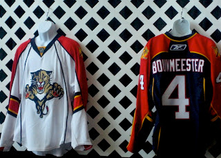
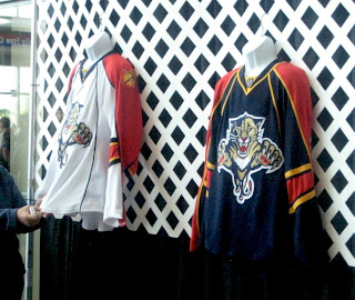
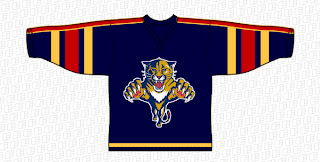
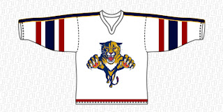
It's finally here everybody! The Florida Panthers unveiled their new Rbk EDGE jerseys tonight at the Year of the Rat Alumni Game. A generous reader pointed this image out to me so I'm posting it to share with everybody.

My initial reaction is very positive. These are sharp-looking uniforms with a great color scheme. I think I almost like the red sleeves better than a red sweater for the home duds, by the way.

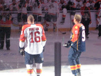
These two images give us different views of the uniforms. The one to the left is a little out of focus (hey, better than nothing, right?) but you can get an idea of how they look on the players at least. Like I said, I like them. I think if anything they're an improvement on what they were wearing.

I'm still dying to see what the Lightning will be wearing this fall.

Big thanks to jrzman for pointing us to the original photos! You can find links to the original message board posts below in the comments if you're interested. When the team or the press make official photos available, I'll have them here as well to perhaps offer an even better look. What are your feelings?

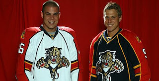
UPDATE (11:49 PM): Nothing major, just got home from work and saw the Florida Panthers had a photo up on their web site of Nathan Horton and Stephen Weiss in the new Rbk EDGE jerseys.

They really do look good and that panther on the front is bigger than I've ever seen it. Now we know what dynamic meant.

Friday
Jul272007

New Panthers Jersey Design Concepts

Big thanks to a reader who pointed me the way of the following images. Seems one Florida Panthers fan has designed a rendering of his team's new uniforms based on the teaser picture found on the Panthers' web site. Now I can't tell up from down in that picture, but kudos to this guy for the effort.


The stripes on the arms are large. Probably a bit too large. But we have heard that the Panthers will be going with something rather new and different for the new jerseys. One way or another, we'll know by tomorrow night. The Cats will unveil their new uniforms at the Year of the Rat Alumni Game. I'll have photos up as soon as they're available.

Wednesday
Jul252007

Panthers vs Hurricanes


vs
PANTHERS
HURRICANES
9-1
9-0

The Aesthetics
These two logos lead the Southeast Division and sit among the top 5 in the league at this late point in the tournament. The Hurricanes logo has managed to fare perfect so far in this category. But that ends today. There's little doubt that the 'Canes have a strong logo, but the Panthers logo almost literally jumps out at you. It's got a great color combination and a fiercec look.
Panthers

The Nickname
A Hurricane is Mother Nature's way of taking out her aggression. To her, a Panther is just another cat with nowhere to hide.
Hurricanes

The Analysis
It all comes down to the analysis. Despite the detail when you get up close to it, nothing about the Panthers logo is lost when you have to view it with less detail. The Hurricanes logo is simple and even works in a subtle puck as the storm's eye — something I really like. Then there's the fact that both teams are so appropriately named that there's no need to reference the home city specifically in the logo. It all comes down to the shape, now. I would like the Hurricanes logo even more if it were more circular. The oval shape makes the puck fit well, but there's no reason you couldn't be looking at the puck from above rather than at an angle. This logo is finally dealt a hit as it loses its first match.
Panthers


WINNER
2-1


Tuesday
Jul242007

Penguins vs Panthers


vs
PENGUINS
PANTHERS
2-6
8-1

The Aesthetics
The Panthers logo looks downright scary, let's just be clear on that. The Penguins logo makes an attempt at looking mean but it's feeble at best. I don't think it should be carrying a hockey stick and wearing old-fashioned gloves. I also think the secondary logo would be an improvement, which it was for a time until the Pens returned to this one.
Panthers

The Nickname
A Panther could eat a Penguin for lunch without even trying that hard.
Panthers

The Analysis
Both logos depict their namesake well without bothering to indicate the home town. It's not necessary for the Panthers, but it wouldn't hurt the Penguins. Now if the penguin could just put that annoying stick down we'd all be better off. The Panthers logo engages in quite a bit of minutia and it would be nice if they had a simpler version of the cat. Failing that, it's still a winner. The Panthers logo should be around for a long time. It's become a great hockey symbol in its 14 years.
Panthers


WINNER
3-0


Sunday
Jul222007

Red Out For Panthers?

Posting speculation isn't something I love but often the source can change my mind. Miami Herald writer George Richards wrote in his Florida Panthers blog a brief description of what the team's new uniforms may look like. Apparently, team executive Michael Yormark said some interesting things around the time of the all-star game in Dallas.

The Panthers will also have a new look next season, the first real update since the team’s inception in 1993. Like each team in the league, Florida will only have two jerseys next year because of the Reebok redesign. The Panthers will get rid of their original red jersey at least for the time being.

“We’ve made changes,’’ Yormark said. “It’s a much more contemporary look. The look is going to be different from what we have now. We’re pretty excited about it.’’

The away jersey will still be white, but red will be the predominant secondary color; the home jersey remains blue, with yellow as the main accent. Yormark says horizontal stripes are out and vertical stripes are in. The leaping Panther logo on the chest will be larger and more dynamic.

Now I don't know what he means by "more dynamic," but the Panthers haven't publicly said anything about altering their logo in any way. So stay tuned with regard to that.

For a look at the full post and other writings by Richards, go here.

The Panthers have since announced the date for the unveiling as July 28 — this Saturday.

Sunday
Jul152007

Panthers To Unveil New Uniforms July 28

On their web site, the Florida Panthers have announced they will be unveiling their new uniforms on July 28 at the "Year of the Rat" alumni game.

July 13, 2007
Dave Joseph / floridapanthers.com

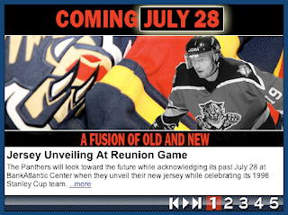
Jersey Unveiling At Reunion Game

The Panthers will look toward the future while acknowledging its past July 28 at BankAtlantic Center when they unveil their new jersey while celebrating its 1996 Stanley Cup team.

Fans attending the ‘Year of the Rat’ alumni game beginning at 2 p.m., will be the first to not only witness the unveiling of the Panthers new jersey but season seat holders will be the first to order the new item.

Presale order forms for season seat holders will be available July 29 at FloridaPanthers.com. Presale forms will be available to the general public beginning Sept. 1. The jersey will be available at Pantherland Sept. 14 at BankAtlantic Center.

The new jersey features a new cut and lightweight advanced materials to provide increased range of motion, ventilation, durability and comfort. The jersey is also treated with new moisture, repellent technology.

Along with the unveiling of the new jersey, fans will watch favorites like John Vanbiesbrouck, Scott Mellanby, Brian Skrudland, Bill Lindsay, Tom Fitzgerald and Paul Laus from the ‘Year of the Rat’ team play an exhibition game against Panther alumni.

The ’96 Panthers, playing in only in third NHL season, were a longshot to make the playoffs. But before a home game in October of ’95 at the Miami Arena, Scott Mellanby one-timed a rat off the wall after the creature had found its way into the locker room. After Mellanby scored two goals to help the Panthers to a 4-3 victory over Calgary, goalie John Vanbiesbrouck credited Mellanby with scoring the “Rat Trick.”

And the Year of the Rat was born.

After each Panther goal the remainder of the season, fans would shower the ice with toy rats. A few turned into a dozen, and a dozen turned into thousands. By the time the Panthers found their way into the playoffs, the ice was flooded with rats and a local tradition turned into a national sensation.

The Panthers beatBoston, Philadelphia and Pittsburgh to earn the Eastern Conference championship before losing to Colorado in the Stanley Cup finals.

Panther alumni members participating in the game include Val Bure, Peter Worrell, Jesse Belanger and Trevor Kidd.

Friday
Jul132007

Panthers vs Lightning


vs
PANTHERS
LIGHTNING
7-1
3-3

The Aesthetics
Time to look at a pair of cross-state rivals. The two logos have almost no commonalities. And that works in favor of the Panthers. That being said, this is an easy point to determine. Just so I'm not cutting corners, I won't neglect the explanations. While the Panthers logo is a little more detailed, the words in the Lightning logo do it no favors. I love the bolt across the middle, but it needs more. Good thing for the Bolts, a new logo is in the offing this summer.
Panthers

The Nickname
Like most outdoor creatures, Panthers are vulnerable to a bolt of Lightning.
Lightning

The Analysis
Neither logo makes any effort at referencing their home cities, not that its really necessary as the team name does that for them. The colors are appropriate and cool and its tough to say who deserves this point. Unfortunately for the Lightning, this is one more instance where the 17 letters strewn across the logo will be detrimental.
Panthers


WINNER
2-1