NHL Tournament of Logos

Entries in panthers (40)

Tuesday
Oct022007

Rbk EDGE Review: Panthers

Part 9 of 30. All 30 NHL clubs have unveiled new jerseys under the new Rbk EDGE Uniform System for the 2007-08 season. Here at the NHLToL, we're going to review every one of them. Read up and then rate the new sweaters. We'll do a full ranking after completing all of the reviews.

Rbk EDGE Uniform System

Florida Panthers


New Uniforms

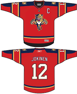
Old Uniforms

The Unveiling
Saturday, July 28. The Panthers unveiled their new jerseys to fans at the Year of the Rat Alumni game in Sunrise. Nathan Horton and Stephen Weiss modeled the jerseys on the ice in full gear.

Home vs. Road
Home: Blue. Road: White. The two sweaters are essentially mirror images of each other and both feature secondary logo patches on the shoulders with the primary logo serving as the crest.

The blue home jerseys feature thick red stripes extending from the shoulder the length of the sleeve, bordered in yellow piping. Yellow piping also runs down the front of the sweater from the neck line to the bottom. Spaced yellow-red-yellow stripes go around the underside of the elbows, stopping at the yellow piping along the sleeves. The collar is blue outlined in thin yellow piping.

The white road jerseys feature thick red stripes extending from the shoulder the length of the sleeve, bordered in blue piping. Blue piping also runs down the front of the sweater from the neck line to the bottom. Blue-red-blues stripes with yellow spacing go around the underside of the elbows, stopping at the blue piping along the sleeves. The collar is blue.

In The Details
The logo on the chest is now much larger than before. The same numbering and lettering style has been retained.

New & Old
The Panthers new jerseys differ in several minor ways from the old ones. Gone are the slanted stripes around the sleeves and the pointed shoulder yokes. The horizontal stripes around the waist have also been removed. The Panthers did keep the primary and secondary logos in the same location as well as sticking with blue for the home jersey. Little else has really changed. Mainly, piping has been introduced along with stripes extending past the shoulders and down the sleeve.

Standard FAQ
Numbers on the front? No.
Laces at the collar? No.

NHLToL Editorial by Chris
My initial reaction to the new Panthers jerseys was good. On first glance, I thought they were really sharp. But if you really look at them, you notice how busy they are. We see a lot of piping and the clash of horizontal and vertical stripes at the elbow. While it doesn't look great on the rack, this is one jersey that is very nice looking on the ice. Still, one annoying trend among the new EDGE sweaters with piping is the captains' letter crossing that line. I could live without that. But aside from some tiny nitpicks, I think this is a very nice looking jersey. 4/5


Buy your new Panthers jersey!

Friday
Sep282007

Your Daily Dose Is Here

You know what this is. I've got today's concept art right here and there's a lot of it! And it's gonna be good. Mostly.

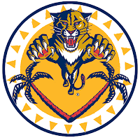
We'll start out with this Florida Panthers logo that caught my eye whilst I perused my inbox.

It's a sort of fusion between the primary and secondary logos that the designer said stemmed from an idea based off of the old Buffalo Sabres logo. But while that logo seemed to red "Buffalo Sabres" from top to bottom, this one seems to say "Panther Palm Trees."

No but seriously, it's very sharp. A little to detailed to ever see printed anywhere but here, but still nice.

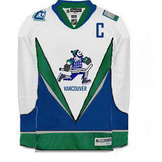
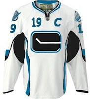
What I'm concerned about is this logo. I'm certainly more a fan of the official VC logo introduced by the Vancouver Canucks last month. They introduced so many cool new logos, though. It's hard to like the orca on the crest anymore.

I got an email a while back, the source of which I cannot vouch for, that suggested the Canucks have planned to change their logo again in 2010 following the Olympics. This time they would feature Johnny Canuck as their primary symbol. I won't take a position on whether or not that has any validity, despite this logo just being introduced.

Anyway, perhaps a jersey may look something like this.

Although that V across the front of the jersey really scares me.

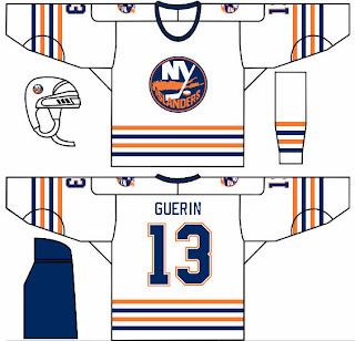
In other news, one of my things is that I feel like the New York Islander should make use of a lighthouse in their logo — if even just as a secondary. This concept borrows a recolored lighthouse logo from the mid-90s logo introduced as part of the "fish sticks" get up. That design wasn't all bad.

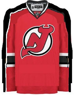
What I could live without is any changes to the New Jersey Devils' uniforms. I rated them a 5/5 in my review yesterday. Still, someone toyed with it a little.

That is something I feel would work for improving the Edmonton Oilers' sweaters, but not so much the Devils. Interesting as it is, I'd never want to see the Devils hit the ice in it.

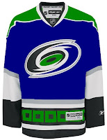
Along those same lines is this item. The Hurricanes are just one of those teams that I cannot possibly envision in any colors but black, red and silver. I just can't do it.

So this whole Hartford Whalers thing has me thrown. It's just so unacceptable, you know? Or maybe it's just me. I often tend to go against the grain. You know this already if you're aware of my feelings regarding the Blackhawks' logo and uniforms.

And that about wraps things up. If you have any comments you'd like to share with the rest of the class, please do so by leaving a comment below. If you have any of your own artwork or have stumbled across someone else's that I haven't posted, feel free to email me.

Tuesday
Sep252007

Mailbag: Cats, Devils, Blues Concept Art

I have a bunch of concept designs to share with you all today. We'll start with the Florida Panthers.

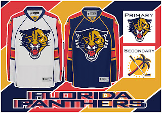
This concept keeps the same uniform design while simplifying the primary logo to feature only the panther's head. I'm not a fan of the rounded elements, though. I think the sharp edges offered a fierceness that this logo lacks.

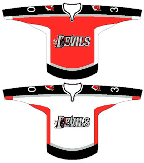
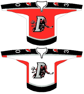
I was also emailed a couple of New Jersey Devils designs.

These concepts borrow from the AHL's Lowell Devils logo, relegating the current primary to the shoulder. Personally, I couldn't see the Devils converting to a minor league logo. That would just be strange.

And finally, someone emailed me some St. Louis Blues art. I've always wanted to see the Liberty Bell in a secondary logo for the Philadelphia Flyers. Along the same lines, I've also been curious to see the Gateway Arch as a secondary for the Blues. But not quite like this.

This design was suggested as a possible future third jersey. It needs a little yellow and some work on the logo, but it certainly has potential. Thoughts?

Thursday
Sep202007

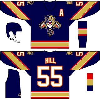
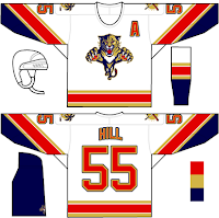
Rebranding The Panthers

We've seen some great work from this guy in the past. He's redesigned images for the Ottawa Senators and Boston Bruins as well as the New York Islanders, Atlanta Thrashers, and Anaheim Ducks.

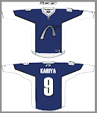
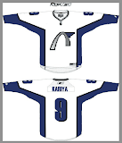
GhettoFarmBoy has now posted his Florida Panthers redesign. In this instance, however, his concept isn't so much a complete overhaul, as a rethinking of that which we already know.

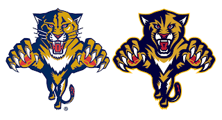
He simply reworked the current primary logo a bit. Sharp work if not familiar. He basically simplified it in areas and added more curved lines to replace straight ones.

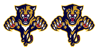
He kept the secondary logo, essentially, the way it was. Overall, though, the biggest issue I had with the logo was that the panther itself seemed a little cross-eyed compared with the old one. Others on the SportsLogos.net message board felt the same, so he reworked the eyes a bit.

A great improvement. The new eyes make the animal feel more cat-like.

The jersey designs are also pretty nice. Again, they still feel more familiar to me than anything else. Certainly an improvement, but not to the point that they're downright amazing the way his earlier Ducks redesign was.

I commend the work being done by this artist though. I think he has a real talent and it's a shame the NHL doesn't hire peole like him to handle uniform and logo designs. I think it would be a much better looking league if they did.

I should also point out that he's said his next "rebranding" will be the San Jose Sharks and that we should expect the New Jersey Devils soon as well.

Personally, I'm pulling for the Lightning, just to see what he comes up with.

Now the floor's open to you all. What do you guys think of this work?

Sunday
Sep092007

Prospects Put Cats' Threads Into Action

Seems a handful of teams have sent their rookies to Traverse City this weekend with their new Rbk EDGE uniforms. All right so not everybody is in Michigan. These guys are in Kitchener, Ontario. (Thanks for pointing that out to me in the comments, guys. I should read more!)

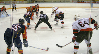
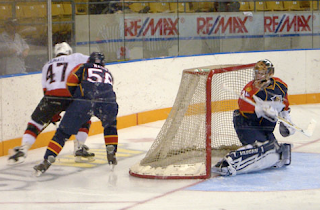
Anyway, it's cool because it gives us a preview of what's to come, not only in talent, but aesthetically as well. The Florida Panthers prospects were wearing the new threads and we have pictures courtesy of the Ottawa Senators' official web site.

I know a lot of people have been complaining, but if you ask me, these jerseys look pretty damn good in action.

What do you guys think? Do you like what you're seeing so far? Or are you dreading the new season?

Tuesday
Aug282007

Just To Freak You Out, Part 2 of 5

I'm back with more weird and wacky designs from the world of hockey art. Prepare yourself.

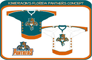
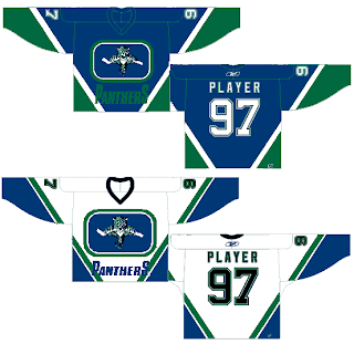
What sports franchise first comes to mind when you think Miami? The Dolphins, right? Well what made them famous? Was it their colors or the fact that football is one of the most popular sports in the U.S.? Well, the colors, obviously! So to help out the Florida Panthers in becoming more famous, one designer swapped out their colors. Take a look.

Go ahead. Rub your eyes. You aren't seeing things. Can you believe that? One incredible design after another, I tell you. Still, I can do better.

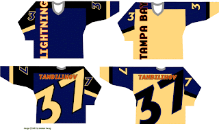
You'll have to look closely to tell, but that, my friends, is another fascinating concept for the Tampa Bay Lightning. No crest. Crazy numbers. The most original design I think I've ever seen. Here's my question: Can anybody Photoshop this jersey onto a picture of a player? Because I totally want to see how that bad boy looks on the ice.

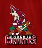
The Phoenix Coyotes had a great logo when for some reason they decided to throw it to the wolves in 2003. They dropped out what made their logo unique and colorful. Guess bland is back. Or not, so this designer thinks. Check that out. It's a wonderful combination of old and new.

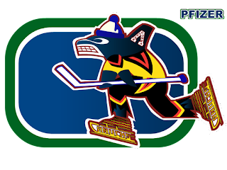
Kind of like this. And while we're on the subject of that crazy Canucks logo. What you really need to see is the fully-colored version.

How can you improve upon something like that? It's like finding pure gold in the Black Hills. Oh, and while we're still on the topic of Vancouver — all you Canucks-haters — feast your peepers on these.

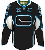
Yesterday we had black and neon green. Today we've got black and sky blue. If I haven't freaked you out enough yet today, just wait until you see this. I'm going to make this lousy post come full circle right before your very eyes. Behold.

From Panthers to Canucks. And I don't even have the words to describe it. No words would be worthy of describing it.

You'll tell your grandchildren this story. And you know it. Stay tuned. More is on its way tomorrow.

Tuesday
Aug212007

Result: Panthers vs Penguins

Pittsburgh
PENGUINS

70% 6,862 votes

Florida
PANTHERS

30% 2,895 votes

9,757 total votes

Pittsburgh Penguins
Advancing to Quarterfinals to face Canadiens or Islanders

Florida Panthers
Eliminated


Poll opening date
Aug 14 @ 4:49 AM
Poll closing date
Aug 21 @ 11:59 PM

07CHTRN | #E1B | FLAvPIT

Saturday
Aug182007

Revisiting The Caps, Cats

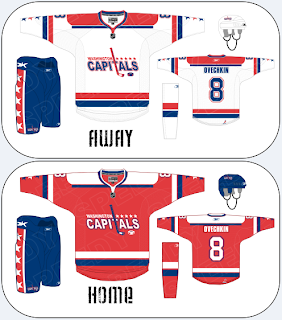
The Washington Capitals and Florida Panthers have already officially unveiled their new Rbk EDGE jerseys for this season, but that won't stop me from posting fan-designed concepts for those two teams.

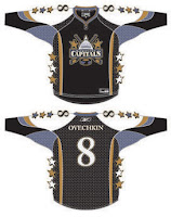
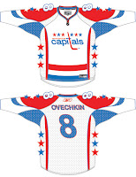
Let's start with the Capitals and a couple of designs that have been floating around since about way back in January.

How about those lookers? Naturally, they're based off that infamous all-star jersey template. There are lots of colors. The quilt in my old bedroom is coming to mind. Sew a patch here. Sew a patch there. By George, you've got yourself a hockey jersey.

Moving right along now. Shortly after the Capitals announced they would be making a return to their traditional colors of red, white and blue, this concept popped up on the web.

The logo aside, that wouldn't be a half-bad uniform design, if you ask me. I could see the Caps wearing something like this and looking very good doing it. Know what I'm saying?

For a closer look at the logo used in that design, see the image to the left. What's interesting is that it makes use of "capitals" in the text of the logo. The irony is that the current logo and the one from the '70s are written in lowercase type. Weird, right? In addition to that, this logo also uses the stick and puck from the dome logo of recent years.

It's sharp work, but ultimately I don't feel it would be an improvement on what the Capitals ended up going with for their new unis. Now let's move on to the Panthers. Got some cool stuff there.

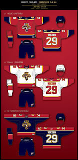
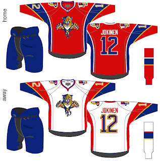
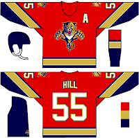
This is from the designer who treated us to the Ottawa Senators jerseys I posted yesterday. Check out the swooshes on those sleeves. That's quite something. Not sure about the choice to put blue numbers on the red jersey. Probably better off with white. I'm also intrigued by the use of the yellow. These jerseys look nothing like the Panthers despite the use of the same colors.

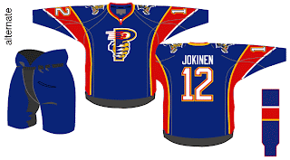
What I think is cool is the concept for a new secondary logo on the shoulders of these sweaters. For a closer look at that, check out this alternate jersey idea.

That's different. Though between that and the sun with the palm tree crossing the hockey stick, I prefer the current shoulder patch. Also, try to visually imagine a player wearing all of those items. That is quite a lot of blue, isn't it? Blue sweater, blue pants, blue socks — and the only thing that breaks it up is the red stripe on the sock.

Hope you enjoyed that. If you want to see what these two teams' uniforms actually look like, I've set up a photo gallery you can access from the sidebar.

But enough with my opinion, let's have yours. Comments go below.

Tuesday
Aug142007

Poll: Panthers vs Penguins


vs
Florida
PANTHERS
Pittsburgh
PENGUINS


Place your vote and then feel free to leave a comment as to how you came to your decision. Tell all your friends to drop in and vote! The more voices heard, the more accurate the results!

Poll opening date
Aug 14 @ 4:49 AM
Poll closing date
Aug 21 @ 11:59 PM

07CHTRN | #E1B | FLAvPIT

Thursday
Aug092007

Revisiting Some New Uniforms

The designs in this post are for teams that have already unveiled new uniforms so, like the rest of the concepts I post, it's just for fun. Hey, I can't post artwork the caliber of that Anaheim stuff everyday.

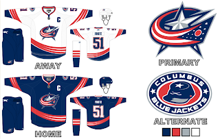
Here is what one fan thought the new Columbus Blue Jackets jerseys should look like.

I really like the curved stripes. Very interesting. I'm a big fan of the real Blue Jackets uniforms, but these aren't bad either. Maybe the team could consider something in this vein for an alternate once that program is reinstated in a year or two.

Then I also had a few ideas for the Florida Panthers emailed to me.

We've never seen that kind of gold on a Panther jersey. I wonder how it would look on the ice. I feel like the Panthers have always been more associated with red than blue, which is why I thought it was strange their home Rbk EDGE jerseys are blue. Then there's these two.

The white jersey seems really familiar and the red is almost how it should be. Speaking of red, one fan based a red jersey off of the new ones just released last month.

They also tried wrapping the elbow stripes completely around the sleeve as opposed to just halfway. I think it makes a world of difference. But I don't really mind the elbow stripes the way they are. I just know there are a number of people who are annoyed by it.

Any thoughts on these designs? Remember, if you would like to send in a design or you own or one you've seen elsewhere on the web, you can submit it at nhllogos@gmail.com.