NHL Tournament of Logos

Entries in predators (35)

Sunday
Aug052007

Red Wings vs Predators


vs
RED WINGS
PREDATORS
4-9
7-5

The Aesthetics
Neither of these logos are very simple in design but they're complete opposites in color. The Red Wings logo is rather monochrome while the Predators logo just goes nuts with color. Ultimately, that will give the Preds the edge here.
Predators

The Nickname
I'd imagine any Red-Winged bird would be smart enough to fly up high so as to avoid the Predators on the ground.
Red Wings

The Analysis
Even though I think the Red Wings logo could use some upgrades (think Boston Bruins), it is still very effective and one of the most well-known in all of sports. That has to earn it some credit, right? The reason I'm giving in this point, though, is because it takes that extra step in referencing their home city with the wheel (you know, Motor City) while the Predators does not. And so ends the tournament for the Wings.
Red Wings


WINNER
2-1


Wednesday
Jul252007

Wild vs Predators


vs
WILD
PREDATORS
9-0
7-4

The Aesthetics
These are two teams still working on their first decade in the NHL — though if certain billionaires have their way, the Preds won't make it beyond ten years. The most noticeable thing about these two logos is their similarities in shape. There are very distinct triangles make up the heads of some rather vicious animals. I think they are two of the league's best and that shows in the standings. Still, I think the Predators logo could use a little less minutia and final a real focus for the color scheme. The Wild logo already has all of that.
Wild

The Nickname
You might say a Predator is the king of the Wild, catching prey and dispatching of it.
Predators

The Analysis
By now, you already know the story of how the Predators got their name. Unfortunately, there's no sign of the city of Nashville in the logo, so it will be very easily transferred to Hamilton, er Kansas City, er... screw it. Anyway, I've also already talked in length about the greatness of the Wild logo in its ability to work in so much in such a small space.
Wild


WINNER
2-1


Saturday
Jul212007

Predators vs Blue Jackets


vs
PREDATORS
BLUE JACKETS
7-3
6-1

The Aesthetics
The top two logos in the Central Division are going head-to-head this afternoon. Both logos are rather detailed and have great colors, albeit the Predators' colors are aren't as common. For originality, this point goes the way of the Preds.
Predators

The Nickname
The Blue Jackets would be armed with bayonets so no Predator would have a chance unless it was impervious bullets and knives.
Blue Jackets

The Analysis
With the Ohio flag strewn across a silver star, there's no way the Blue Jackets logo can lose this point. I like the Predators logo and the reason behind it, but just looking at it, you wouldn't necessarily know the team was from Nashville. In fact, they could be from Hamilton and we wouldn't know the difference. All right, that's enough digs from me.
Blue Jackets


WINNER
2-1


Friday
Jul202007

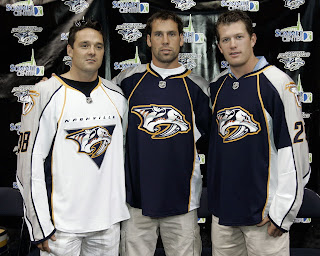
Predators Unveil New Uniforms!

The Nashville Predators have joined the small club of teams who have unveiled their new uniforms in the Rbk EDGE style for the 2007-08 season. And here they are.

Vern Fiddler, David Legwand and Ryan Suter modeled the jerseys in front of the home crowd at a team rally in Nashville. As far as differences from what they used to wear, you'll notice that the white jerseys now feature the word "NASHVILLE" written above the crest. I understand you can peel it off and replace it with "HAMILTON." No, but seriously.

Hope you like them. The Preds are the fourth team to officially unveil the new duds. I'm going to start keeping a running list of who's unveiled what. Some of the teams that have yet to do so have announced dates for said unveilings. You can find countdowns at the top of the sidebar.

Friday
Jul202007

Sharks vs Predators


vs
SHARKS
PREDATORS
4-5
6-3

The Aesthetics
Neither of these two logos are very simple in design but offer unique colors and appropriate symbols for their teams. I like the teal but the Sharks logo does not make enough use of it. There's a thin line of it in the triangle surrounding the shark. Plus, there's a hockey stick so I don't exactly love it. Meanwhile, the Predators logo is very sharp despite its minute detail.
Predators

The Nickname
This is a tricky one. In most instances, a Shark is a Predator. In part for that reason, the Sharks will slide by with this point.
Sharks

The Analysis
The Predators got their name from the remains of a saber-toothed tiger found by construction workers during the building of their arena. The Sharks don't have a story like that. All right, but I can't hold that against them. What I can say is that this outdated logo needs an update. And one is coming in just four days, as a matter of fact. Maybe it'll have a better chance then.
Predators


WINNER
2-1


Tuesday
Jul102007

Predators vs Flames


vs
PREDATORS
FLAMES
6-2
6-0

The Aesthetics
It's interesting to see the stronger logos going up against each other in this tournament. The tough part is for me in figuring out which deserves points. Here, the Predators logo outweighs by a very slight margin the Flames for the use of color and sleek design. The Flames have a great logo but I feel like it could be updated somewhat. The Flames on the left side seem unbalanced.
Predators

The Nickname
Funny thing about Flames. They burn everything, even Predators.
Flames

The Analysis
What I do like about the Flames logo is the prominent use of the "C" for Calgary. The Predators logo doesn't really have any elements that represent Music City. While their colors are great and their design is spectacular, it's really the Flames that deserve this point.
Flames


WINNER
2-1


Monday
Jul092007

Predators vs Blues


vs
PREDATORS
BLUES
5-2
4-3

The Aesthetics
Both teams are halfway through the tournament and are currently at the top of their division. Let's see how they fare one-on-one. For one thing, their colors are similar and very cool. The Predators logo deals a lot in minute detail while the Blues logo mostly avoids it. Still, its the Predators who get this point for colors and overall sleekness.
Predators

The Nickname
What's with animals eating people today. We have a Predator dining on a Blues singer now.
Predators

The Analysis
Predators and Blues are both generic names. Same as Flyers or Wild or Canadiens. You're not really sure what the logo should look like but that means a lot of different things can work. Here, both logos make sense with the name (so, that's good) but its the Predators that goes a step further and creates an icon. (A trumpet or some type of musical instrument could've gotten the job done for the Blues.) And that's why this point goes to them.
Predators


WINNER
3-0


Saturday
Jun302007

Stars vs Predators


vs
STARS
PREDATORS
1-0
4-2

The Aesthetics
The Stars logo breaks a cardinal rule by spelling out the entire name. They all but forfeit the point just for that. But the Predators logo is just too cool to be beaten despite being a little heavy on the detail.
Predators

The Nickname
A Stars is a giant, all-consuming ball of fire, and if one fell to earth, not even a Predator would survive.
Stars

The Analysis
Both teams were given appropriate names, the Stars being a good adaptation of North Stars for the Lonestar state. The saber-toothed tiger works for Nashville since, if you weren't aware, the fossilized bones of one was found during construction of the team's arena. So it's a tough decision. Ultimately though, the Predators logo takes this point for its slick and scary design. (I wouldn't want to come face-to-face with that animal, extinct or otherwise.)
Predators


WINNER
2-1


Sunday
Jun242007

Predators vs Oilers


vs
PREDATORS
OILERS
3-2
1-4

The Aesthetics
Normally, too much detail and too much color would kill a team pretty quickly, but I really don't like words in logos. The Oilers logo's main saving grace is its simplicity and color scheme. The Predators may have had it but for the minute detail in the logo.
Oilers

The Nickname
The Predator would totally eat the Oiler. The poor guy would never stand a chance.
Predators

The Analysis
Again, both logos are more than appropriate for their respective teams. I'm getting the Oilers here for their use of the team name in what should be more symbolic. That and I love the Predators logo. I actually bought a Predators jersey when I was in Nashville a few years ago just because the logo is so cool.
Predators


WINNER
2-1


Friday
Jun222007

Predators vs Ducks


vs
PREDATORS
DUCKS
2-2
0-3

The Aesthetics
You know, despite having won the Stanley Cup this year, the Anaheim Ducks sure have one lame logo. I love the colors, but ditch the wordmark you have plastered all over the front of your jerseys. The Predators, on the other hand, have one kick-ass logo. I wonder who wins if they go up against the Panthers.
Predators

The Nickname
The Predator eats the Duck. Any questions?
Predators

The Analysis
The Predators have a very appropriate name and a rather fierce logo. But the Ducks could use some help. I'm all for losing the "Mighty" from the name but let's do something with the logo, already. Even the duck foot in the form of a "D" would be better than what they have now. Another sweep against the Ducks here.
Predators


WINNER
3-0