NHL Tournament of Logos

Entries in predators (35)

Sunday
Oct212007

Out West!

We're heading out west for some concept art this morning. I figure we'll start at the coast and work our way east.

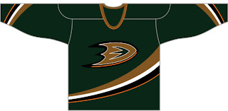
The Anaheim Ducks concept suggests workinng green back into the color scheme. I think that would be a wise move, but maybe something a little brighter would be in order. I do like the "D" logo on the chest as well. Definitely an improvement.

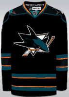
Another designer has also suggested that the Sharks try out black sweaters — be it on a full-time or part-time basis. This isn't half bad. The orange works very nice in this concept. Pretty sharp.

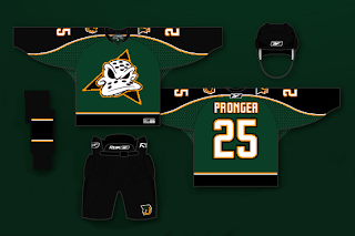
Here's a new design created for the Dallas Stars.

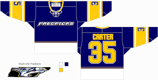
It's so weird looking. You really have to stare at it a minute. The stripes around the bottom are odd. Looks like they're going to eat me. Anyway, we'll finish things off in Tennessee with the Nashville Predators.

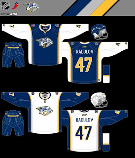
Also weird, but not quite enough to freak me out. I sort of hope that thing in the bottom left corner isn't meant to be a logo of any sort. That would freak me out. Anyway, not a terrible jersey, but also not one I'd be a fan of.

If you've got thoughts on any of these, feel free to leave them below.

Monday
Oct082007

Odd Art, Part I

Do you know how much I love my multi-part series? As much as I write them, how could you not?

Anyway, I'm looking at stuff that borders on being worthy of a Freak Out Friday. Unfortunately, it's not quite there but nor is it to the point where I'd want it to be taken seriously as far as that goes. Don't try and figure out what I just said. It's not worth it.

Let's move along. We'll start with the Atlanta Thrashers.

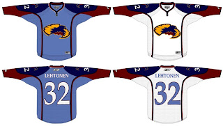
If anyone can work out what's going on here, I congratulate you. And fill the rest of us in, if you wouldn't mind.

Interesting choice going with the old unused Atlanta All-Star Game logo. I kind of like the head logo on its own. That way it doesn't look like the bird is stirring itself in a bowl. Yummy thrasher!

I wanted to let you look at this one before I explained it. It took me a minute, but if you stare at it for a very long time, you'll slowly begin to see the shape of the state of New Jersey appear in there somewhere. Oh yeah, it has horns and a tail. That's probably what's tripping you up. This was spawned along the lines of using state/province outlines in team logos.

Not sure how I feel about the placement of that number on the front, but I would someday like to see a black third jersey for the Devils. That would look pretty killer.

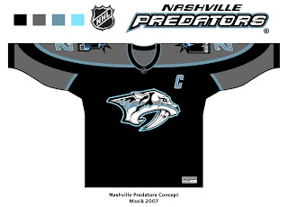
And finally, the Nashville Predators.

This is a very interesting color scheme. However, I think the only way you can really get away with limiting the colors is by first simplifying the logo itself. It's a very detailed mark and all of its colors do work in its favor. But then I've always like the Preds' logo the way it was. Crazy? Perhaps.

I'll have more where that came from tomorrow, if you're good. Eat your peas and don't stay up past your bedtime.

Friday
Oct052007

Predators, Here's How You Fix It

I used to believe the Nashville Predators were among the clubs with the best jerseys. With the introduction of their Rbk EDGE sweaters, I'm now less than convinced of that. Anyway, it's not horrible, but some folks thinks it needs fixing. Hence this.

Here is one solution. Flyers fans should be able to pick out the design in a heartbeat.

This jersey is in fact based on Philadelphia's. Only the colors and logo have been changed. I do like that blue.

I don't know, though. I'm not sure it's that much of an improvement on what they're wearing now. But it certainly isn't a bad alternative.

Nor is this.

I think it looks an awful lot like the Buffalo Sabres — perhaps a little too much — but there you have it. Count me as a fan though. We'd have to lose the anniversary logo off the shoulders, however, before I'd fully approve. Otherwise, I really like the idea of contrasting the sleeves and torso like that.

What do you guys think? Do either of this fix it? Did it need fixing to begin with? You be the judge.

Coming next: Buffalo Sabres.

Sunday
Sep302007

We Like Concept Art

Yes, we do. And concept art loves us. First off I just want to thank everyone who sends in their cool and crazy work. I love opening my email everyday to see what surprises await me.

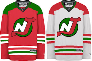
One such surprise was this New Jersey Devils uniform concept. If I'm to understand right, the logo seen here is one of the original designs that never made the final cut.

The Christmas colors don't work. If you want to see how to make green and red work together, see the Minnesota Wild.

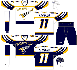
Here's an interesting Nashville Predators design that was actually a little too good to be considered for the Friday Freak Outs.

I say "good," but not necessarily on the level of the NHL. If not as a Preds third jersey, I could totally see something like this passing in the AHL or ECHL. I like the white swipes across the sleeves. Need to find a different font for the wordmark, though. That one doesn't work.

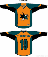
And then I have this San Jose Sharks concept which I think I'm only posting because the orange seems to annoy Sharks fans to no end. And I like a little ribbing now and then.

I was going to try to say this isn't that bad of a design, but it really is. The teal works too well for the Sharks. No need to go playing up the orange when you already have the best color in hockey. I would like to see more silver come back though.

They need to bring that back. Moving right along now.

This Anaheim Ducks design is a bit of a mix between concepts I've posted here in the past. While this jersey looked great with the flying duck logo, I can't honestly say it looks horrible with this one. I know it's a Disney cartoon, but they do some of the best animation work in the world, so let's not knock them there. And despite the fact that they're similar to the Dallas Stars, I think these colors would serve the Ducks well. Maybe use the logo on a third jersey, though.

That's enough out of me. What do you guys thinks of these? Are they total duds or do they have some redeeming qualities?

Saturday
Sep292007

Rbk EDGE Review: Predators

Part 6 of 30. All 30 NHL clubs have unveiled new jerseys under the new Rbk EDGE Uniform System for the 2007-08 season. Here at the NHLToL, we're going to review every one of them. Read up and then rate the new sweaters. We'll do a full ranking after completing all of the reviews.

Rbk EDGE Uniform System

Nashville Predators


New Uniforms

Old Uniforms

The Unveiling
Thursday, July 19. The Predators unveiled their jerseys at a fan event at Sommet Center in Nashville.

Home vs. Road
Home: Blue. Road: White. The two sweaters are essentially mirror images of each other but for minor alterations in terms of overall design and both feature secondary logo patches on each shoulder.

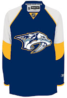
The blue home jerseys feature yellow piping extending down from the collar. The side panels are white. A thick stripe of silver outlined in blue extends from the neck to the cuff on the sleeves which are otherwise blue from the shoulder to the elbow and white to the cuff with blue piping around the wrist. The collar is blue and yellow and the primary logo serves as the crest.

The white road jerseys feature blue piping extending down from the collar. The side panels are blue. A thick stripe of silver outlined in blue extends from the neck to the cuff on the sleeves which are otherwise white with blue piping around the wrist. The collar is blue and yellow and the primary logo on a blue triangle serves as the crest with the word "NASHVILLE" just above it.

In The Details
The same shoulder patches featuring the secondary logo are found on both shoulders of each sweater. The white sweaters feature the city name above the logo, slightly differentiating it from the blue sweaters. The same numbering and lettering style has been retained.

New & Old
There are several differences in the overall design of the new sweaters when compared to the old. The silver shoulder yoke now extends completely down the arm. It also had yellow piping and a much thicker blue stripe around it that curved down to the wrist. The stripe and elements around the waist are also gone but replaced by side paneling. The new white sweaters do not include as much blue as the old ones did. On the ice, the jerseys look relatively similar, but you can find differences if you're really looking.

Standard FAQ
Numbers on the front? No.
Laces at the collar? No.

NHLToL Editorial by Chris
I've always been a fan of the Predators' jerseys. The old white is one of two non-Lightning jerseys that I actually own. (The other being a 1996 Mighty Ducks third jersey so that may not be a good barometer.) Looking at the home sweater on a rack, it can make you think of a t-shirt, the way the blue extends only down to the elbow. But I think that just adds to its uniqueness while many find that it's a fault. Another thing a lot of folks aren't fond of is the city name above the logo on the road sweater. That's one element I'm on the fence about. I see the merits of it while at the same time am bothered by it as a design element. On top of that, seeing these jerseys on a rack versus in action are two very different animals. I really don't care for how the whites look on the ice. I am impressed with the blues though. I'll call it a wash. 3/5


Buy your new Predators jersey!

Friday
Sep212007

Just To Freak You Out VII

I've decided to make the Freak Out series into a weekly feature to be posted on Fridays from now on as long as crazy artwork keeps landing in my inbox. And man, do I have some stuff for you this week.

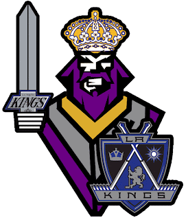
We'll begin with our friend Pfizer who's created mish-mash logos for the likes of the Vancouver Canucks, Buffalo Sabres and New York Islanders (check out the Freak Out series for those if you haven't yet). Now comes another shot at logo merging for the Los Angeles Kings.

For my money, it's not his best effort, but it makes me laugh no less. I'm a little disappointed he couldn't find a way to work in the current crown logo. But then it does feel a little thrown together. You have to admit, though, that king face is a great logo. Don't mess with that son of a bitch.

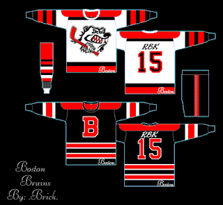
Meanwhile, I've got some completely new takes on a couple of team logos and uniforms. Imagine the Boston Bruins swapping out the yellow for red. Then imagine a cartoon bruin the likes of which might be owed money by Yogi Bear.

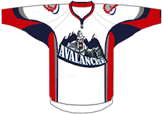
He's come to collect. Then imagine the Colorado Avalanche adopting a yeti for their primary mark. Might it frighteningly go a little something like this?

We should hope not. Lest ye bear the brunt of the abominable snowman's ever-clenched fist. And what's up with the upside-down feet on the shoulders?

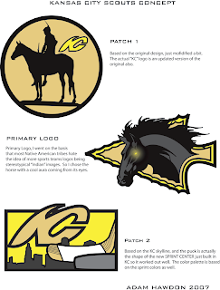
Speaking of what-ifs, let's say the Kansas City Scouts were to make their glorious return to the NHL. Let's also say their return was marked by the uprooting of the Pittsburgh Penguins. Yes, this design was made in the days when the Pens' future was uncertain. I point that out merely to explain its color usage.

If you enlarge the image, you can read the designer's explanations of the three logos, so I'll spare you the details here. What I will say is that I like Patch 2. I'm a big fan of city skylines in logos, though you don't see that a whole lot. What's cool about this one is the new Sprint Center being placed to look like a puck. Clever.

The horse's eyes are freaking me out, by the way.

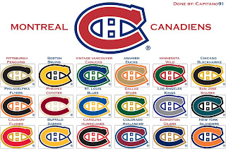
This next image is probably best viewed while high. I don't condone drug use, but chances of one having an "experience" are rather great. See for yourself.

Someone with a good deal of free time and an inability (or not) to cure boredom came up with this. He basically recolored the Montreal Canadiens' logo in the colors of various teams around the league. Conspicuous is the absence of the Tampa Bay Lightning's colors. But I guess not everything is about the Lightning.

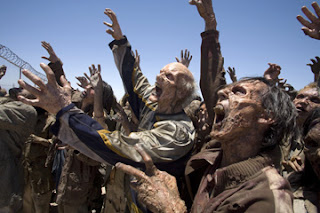
Now I want to show you some of the scariest things of all — because they're real! Okay zombies aren't real, but movies are real. A reader emailed me a production still from the new Resident Evil movie. One of the zombies appears to be wearing an old Nashville Predators sweater.

Talk about foreshadowing. That's not even right.

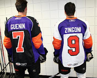
And finally, a reason for all those NHL fans out there bemoaning the arrival of the new Rbk EDGE jerseys to quiet themselves. It could have been so much worse. A fact proven by the AHL's Philadelphia Phantoms.

AHL fans, continue your bemoaning. It's perfectly warranted.

Freak.

Out.

Friday
Sep072007

Just To Freak You Out... Some More!

Yes, you read that title right. Back by popular demand, I'm going to get your weekend off to a kicking start. I have the weird and crazy; a whole slew of new and wacky concept designs just meant to freak you out. So buckle in, it's going to be a long one.

I'm going to have a theme of red and black tonight. You'll see what I mean, but first I need to show you this.
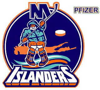
From the brilliant creator of the Sabres and Canucks mish-mash logos comes this gem. True art in its rawest form. I dare anyone to attempt to improve upon that.

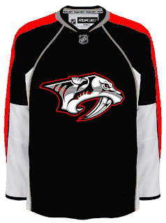
But since you can't, we'll move along. Do you like the color combination of red and black? Sure, if you're a Devils, Hurricanes, Senators or Coyotes fan. But what about Sabres, Predators and Canadiens fans? What about Leafs fans? Look on if you're brave enough.
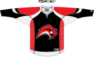
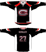
It's a little blinding, isn't it? You might be surprised to discover that these designs all came from different people. Bad enough to have one disturbed mind out there Devil-ifying all these jerseys. There are at least four.

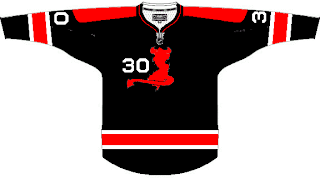
This Canadiens concept just scares me so I want to stop looking at it. The Sabres one just looks like a bloody slug (I knew that comment was coming so I wanted to head it off). And the Predators... well that doesn't look half bad if you ask me.

But imagine what kind of disturbed mind I must be to posting this stuff.
Wait. You need to catch your breath before you see this. Maple Leafs fans, ready your eyeballs for this one.
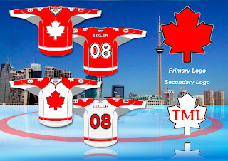
Wow, you're still here. I'm impressed.

All right, now I'm going to ease off a little bit. These designs are not so much horrifying as funny.
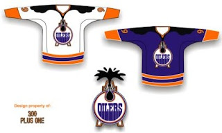
Dude, you spilled some oil on your— oh, wait... I see... yikes. Yeah. Oilers fans, I'm genuinely interested to know how you feel about this particular concept. I know it's been floating around a little, but it's just so... out there.

So what if the Rangers did this?
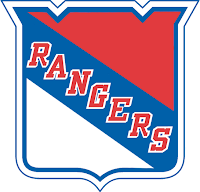
We probably ought not think about it.

Someone spent at least 30 seconds making this.
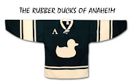
A missed opportunity, I say.

As a tribute (or not so much) to what I'm going to start calling the "VANCOUVER Incident," someone had some fun with other jerseys.
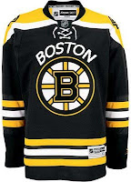
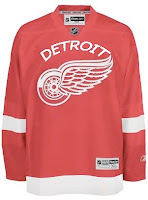
Similar work on the Sens, Isles and Jackets can be found in the Concepts Gallery. Now I'm going to wrap up where I began — Long Island. Imagine if Reebok decided the NHL should go the way of basketball.
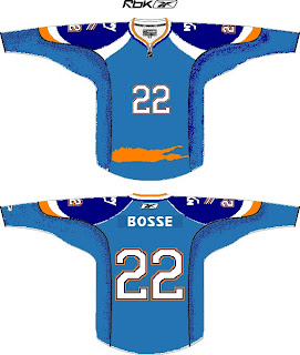
Check out that outline of the island in place of a horizontal stripe. All is well.

Just remember, you guys asked for this. Let this be an object lesson in the notion of being careful what you wish for. Actually, if this keeps up, we'll make it into a weekly feature. So if you've made or found crazy crap like this, feel free to send it my way at nhllogos@gmail.com and who knows, you just might freak somebody out.

Sunday
Aug262007

Result: Predators vs Blues

St. Louis
BLUES

56% 5,398 votes

Nashville
PREDATORS

44% 4,316 votes

9,714 total votes

St. Louis Blues
Advancing to Quarterfinals to face Stars or Coyotes

Nashville Predators
Eliminated


Poll opening date
Aug 19 @ 7:38 AM
Poll closing date
Aug 26 @ 11:59 PM

07CHTRN | #W1D | NSHvSTL

Sunday
Aug192007

Poll: Predators vs Blues


vs
Nashville
PREDATORS
St. Louis
BLUES


Place your vote and then feel free to leave a comment as to how you came to your decision. Tell all your friends to drop in and vote! The more voices heard, the more accurate the results!

Poll opening date
Aug 19 @ 7:38 AM
Poll closing date
Aug 26 @ 11:59 PM

07CHTRN | #W1D | NSHvSTL

Wednesday
Aug082007

Predators vs Coyotes


vs
PREDATORS
COYOTES
7-6
5-6

The Aesthetics
Both of these logos are wild animals with wide open mouths. Because of that, there are a lot of similar elements. The biggest difference, aside from color, is the fact that the there's so much more detail in the Predators logo. Normally that wouldn't be a plus, but here it is. The Coyotes logo is just awkward looking to me.
Predators

The Nickname
We've got cats and dogs here. And normally you'd think the dog would beat the cat, but check out the teeth on the Predator. That Coyote never had a chance.
Predators

The Analysis
As a desert icon, the Coyotes couldn't have chosen a better name for the team — not that the Predators didn't. The Coyotes even have great colors, but I liked the original logo better. The Predators logo kind of has a lot of colors. All things considered, I think it wouldn't hurt to simplify it a little. But overall, I find it to be a little better of a logo. The Preds close out their schedule with the sweep.
Predators


WINNER
3-0