AHL Third Jersey Update
 21 Comments
  Sunday · Oct 12 · 2008 | 5:02 PM PDT
 I've been meaning to update you guys on the AHL's new crop of third jerseys. But like I've said, the AHL really isn't my thing, so my coverage isn't exactly comprehensive. However, I have news on a handful of teams.
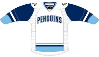
 We got our first look at the third jersey for the Wilkes-Barre/Scranton Penguins via their official web site a couple months ago. I've since been provided with this graphic — which more clearly shows just how dull it is.
Interesting how this club has abandoned its own colors, adopting its NHL affiliate's. The AHL Penguins are black, gold and red. Why the blue? A rumor out there suggests that when the Pittsburgh Penguins move into their new arena in 2010, they'll abandon the gold completely for a new blue-based look — a throwback perhaps to their original sweater colors when they joined the NHL in 1967. Will the Wilkes-Barre/Scranton franchise join them?
 The Worcester Sharks will don a new third jersey this year. (By the way, this is an update to the previous incarnation of this post where in the information I had was wrong.)
The Sharks have a description of the jersey on their official web site.
The Worcester Sharks will sport a special third jersey this season! The third jersey is grey in color with “SHARKS” written diagonally across the front of the jersey. The jersey has laces on the neck line to secure. The Sharks will debut these special third jerseys when they host the Bridgeport Sound Tigers on Saturday, October 25th. Make sure to check back at SharksAHL.com for more information and a preview of the new jersey!
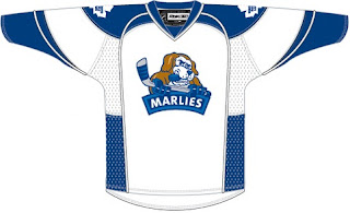
 I really don't think this one is even worth dignifying with a mention, but it's my job. The Toronto Marlies are doing exactly what Todd McFarlane said not to!
Sure, maybe it isn't the cutest puppy you've ever seen, but it sure isn't menacing either.
And you guys know how hard it is to find something I don't like. Poor Marlies fans. I just hope they don't wear it too often this season.
 The Philadelphia Phantoms are next on my list. I got any email from a fan saying a sweater he recently bought will be the club's third jersey.
He even sent along a picture of the new purple uniform.
See, Los Angeles Kings, it doesn't look so bad. Maybe without the orange. It's always Halloween if you're a Phantoms fan, I guess.
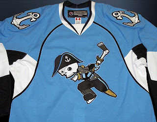
 The Milwaukee Admirals will join the ranks of AHL teams with a third jersey for 2008-09 — going with the fashionable powder blue. Not that it matters, but I like this jersey a lot.
It's got the whole pirate — peg leg and all — instead of the skull alone.
Hmm... is he using his amputated foot as a hockey stick? That is one hardcore pirate.
 We'll finish up tonight with the Hartford Wolf Pack. Back in March, they held a contest to have fans design the 2008-09 third jersey. Unfortunately, that page of their official web site no longer exists — but Google saves everything.
I got an email from a fan saying the Wolf Pack was supposed to unveil that third jersey yesterday but still have yet to do so. Sadly, I can't help. I didn't even know there was an unveiling planned so I'm not sure why it didn't happen. I'll keep my eyes peeled though.
If there are any other AHL third jerseys out there, send me pictures and I'll be sure to make note of them here on Icethetics.


Reader Comments (21)
whoa whoa whoa whoa whoa whoa whoa
Chris,
the Penguins will abandon black and gold in 2010?!
i need to see your source on this, i don't believe for a second that they'd ruin the city unity just because the winter classic jerseys are doing so well.
seriously, we need something more substantial on that rumor.
...unless you meant the baby pens...that's slightly more believable
Chris, that Sharks jersey is NOT the alternate. That's the away jersey (same one as last year). The alternate is grey with "Sharks" written diagonally on the front. Also, the Milwaukee Admirals have a light blue alternate, and the Lake Erie Monsters have a black alt. Unfortunately, I have yet to see any pictures of Lake Erie or Worchester's thirds, just descriptions.
Milwaukee picture:
http://www.milwaukeeadmirals.com/docroot/admirals/images/fans/jerseyBlue.jpg
Thanks for the info guys. I've updated the post.
Trust me, if the Pens did get rid of the gold in their uniforms, Pittsburgh fans would revolt. This is a town that hangs on dearly to its traditions, especially the sports traditions. I mean, there was nearly a city-wide outbreak of heart-attacks when the Steelers altered the numbers on their uniforms a few years back; I'd hate to think of the reaction to the Pens getting rid of their gold. In fact, there are people who hate the new 'Vegas gold' color and want the team to go back to the standard yellow-gold they used to have... just my two cents.
i agree with the other 2 pittsburgh comments.
i dont think they would ever ditch the black and gold. i think they will go for a new design come new arena time, but i think it will include the current uniforms and the blue as a 3rd.
there are rumors though about maybe going back to the pittsburgh gold for the final year in mellon to pay tribute to the 2 cups they won in those uniforms.
its gonna be a good day in pittsburgh when we see sir sidney sporting the cup winning jerseys on mellon ice.
woo.
Man, it'd be great to see those old Cup uniforms back in action for a last go-around on the Civic Arena ice. That would take me back... and I hear Lemieux is in the best shape of his life too - ha.
So Milwaukee is actual sticking with that jersey as a third.
http://www.gameworns.com/gallery/_team.php?g_city=Milwaukee&g_team=Admirals
http://i168.photobucket.com/albums/u162/moseslawn/MilwAdmStPats07.jpg
some special ones there
Saw the Ads jersey last night on a couple of ladies last night. Thought they were custom made jerseys but they looked sharp.
*saw them at the Preds game
That admrials logo is AWESOME, great spot on the leg for the leg for the hockey stick chris
Y'know, until I saw this post I was still under the assumption that the black jersey was still Worcester's third. I really like that jersey because they use the W-fin logo instead of the San Jose copy. I gotta check their store at the Centrum (whoops, DCU Center) next time I'm out there...I might have to pick one up.
Milwaukee's whole logo set absolutely kills anything else out there. Talk about running with a theme. Check out the anchors - they're also made of bone. Totally awesome and with great artwork. It's just a shame that the whole thing is diluted with the shared nickname deal.
I gotta wonder if the Wolf Pack might not have quietly dropped the third jersey idea when every fan made one came in as a Whalers jersey.
The Admirals have had that logo on various merchandise since they changed from the old admiral. It was always good for a chuckle to see him lining up a shot with his own leg. Great to see it on a jersey.
BTW, would all of his goals be disallowed? ;)
I think Norfolk should have to change their name. Milwaukee was the admirals way before the team in Norfolk was!
The Admirals jersey is steller.....I love the logo(s)...seriously...a skull pirate shooting with his own leg...talk about origional.....good job Ads
I heard that the Wolf Pack will ofiicially unveil there third in January.
lol Admirals Third jersey is amazing, compared to the one i sent chris haha
Is there somewhere / someone we can complain to about the Penguins having thoughts about eliminating the gold / black and returning to their vintage blue color? Seriously, I know I can't be the only Pens fan that thinks this would majorly suck!! I say stay with black and gold -- it's the "city's colors" and all the team should don these colors. Sure, the Buc-o's have that jersey that includes red but #1 - they STINK and (b) - it doesn't totally eliminate the black/gold and it's not their main uniform!! I really hope this is a rumor!!
If I can game action pictures of the Phantoms alternate when they finally wear them, I'll pass them along to you Chris.
Chris also the B-Sens have changed the Big chin logo to that logo you talked about that was there 3rd one about a year ago. at the home game this past friday against the Marlies that logo was on there normal Jersey design. You can check my Dukes Dogpound News blog for a Photo.
The Manchester Monarchs unveiled their new third jersey this past Sunday against Springfield... MUCH better than the abomination of their first attempt (light gray with Manchester in purple letters diagonally across the front)...
http://monarchs.prosportsmall.com/images/monarchs/products/large/1425Blackthird1.jpg?1224446865