Pens, Leafs Fan Art
 13 Comments
  Sunday · Jul 13 · 2008 | 3:19 PM PDT
 One new artist I've been receiving concept designs from signs his work Ivall. His first submission was a Blackhawks logo that was met with a lot of praise. His followup was a Sabres logo that landed in a Freak Out Friday post.
In the last few days he's been hard at work on new logos for the Penguins and Maple Leafs. We'll start in Pittsburgh.
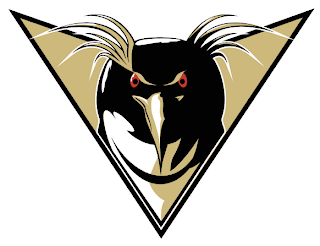
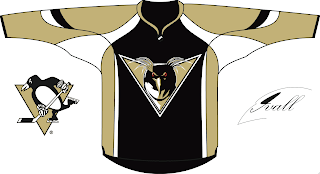
You know, of all the Pens artwork I've been sent, I think this is the first time I've seen a forward-facing penguin. Despite its intricacies, it's a pretty well-drawn logo. Check it out on a jersey.
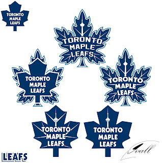
He also made five attempts at a new Leafs logo.
It's hard to say which is my favorite but I think I'd have to go with either the one on top or middle-right. Thoughts?
By the way, we've got new sweater designs from Paul (aka capn89). He's made Philly, Columbus, Washington and one other team — got to leave something to the imagination. Check back tomorrow for that!


Reader Comments (13)
I certainly agree that the top and middle right logos are the best. I'm still not crazy about the wordmark, I'd love to see those designs without them. I think the veins/CN tower help to make the Leaf less bland, thus eliminating the need for the wordmark.
If Leafs would ever change their logo, i'd pick the one on top. It's got something from the past (veins), present (wordmark) and future (CN Tower).
That Penguins logo is great artwork...but really, really creepy. Staring into your soul. The eyyyyes...the EYYYYYYYES!!!
Re: the Leafs, I like center right as well, although bottom left is an interesting take, IMO.
im thinkin the pens thing with the macaroni/rockhopper penguin should be on the freak out friday thing.
i like the leafs logo in the middle-right for a new third jersey logo, and the bottom right logo for a primary.
i LOVE those top and right leafs logos... theyre awesome... but ya id also like to see them without the words since the cn tower would be 'toronto' ... but theyre great
I'm still a little confused by his desire to put the CN Tower into the logo. The CN Tower is hardly any Lady Liberty - I'm thinking about the old NYR logo, which was one of the best designs going around the NHL for a time.
Do other torontonians identify with the CN tower? Seriously guys, I'd rather see a silhouette of old MLG instead!
Is there a reason that Pens logo isn't part of a Freak Out Friday post?
Wow. is the Pens Logo that Bad? or just somthing that you all didn't think of? Just wondering. I mean i want to try my best at all the stuff that i do here and i want to know what you all think and maybe it will help me in other works here.
Yeah, that Pens logo just isn't good at all. I really see no problems with their current logo, though, so why mess with it? Same with the Leafs - though the concepts aren't bad, I just can't see them on the front of a uniform. I really loved that Ivall Blackhawks logo, though - slap that on the current jerseys and you've got the best uniform in the league.
I am pretty sure no Maple Leaf team can use the tower as it is owned by a company (CN). Unless they paid some sort of rights fee. The Toronto Rock Lacrosse team had to change their logo from a guitar playing tower. Decent logo if you search the web for it.
The Penguins logo isn't bad imo. It just doesn't fit the PITTSBURGH Penguins.
Thanks for the comments. But i wonder why some people always say why? Why mess with a good logo. I think some people fail to see what this site is about now. The pens logo was just my take on it. I know that it will never change. This is fun for me. But in the end to each there own!
The Pens logo is really well done, but it makes me think of one of the Penguins movies, which makes me laugh. I have no problem with coming up with alternative logos for some of the real classics, though I might have a problem if those teams actually started to consider such a change. Of course, that's what third jerseys are for. I could see a lot of Mike's designs (e.g., the Blackhawks) ending up as third jersey logos.