Four New Sweater Designs
 26 Comments
  Monday · Jul 14 · 2008 | 4:09 PM PDT
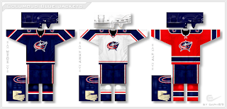
 Icethetics reader Paul (aka capn89) has been redesigning NHL uniforms league wide and he's sent in another batch for your enjoyment. Most recently you saw him take a stab at the Senators. Today we've got four new teams — beginning with Columbus.
I'm not sure how well a red third jersey works in theory for a team named the Blue Jackets, but looking at it, you can't help but like it.
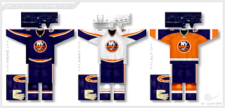
His Islanders jerseys are sharp!
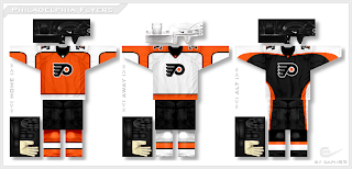
He's used a Liberty Bell logo on the shoulders of the Flyers jerseys.
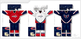
Notice how the home sweater is orange. I think most Philly fans tend to prefer that to black. And finally, we have the Capitals.
That secondary logo just looks killer on the front of the third jersey. Let's hope the team's smart enough to actually make one for this season.
By the way, tomorrow I'll have more details on the new logo design contest I'm launching. Imagine a league with 30 teams — each team has a name and color scheme — but none of them have logos! Designers, this one's for you. You'll be able to brand a team from the ground up!


Reader Comments (26)
All four sets are excellent, and that Capitals 3rd is just awesome!
Flyers set looks great...very traditional and the addition of the Liberty Bell logo looks like it belongs there - although I'd still rather see something "Flyer" or flight related rather than the bell. Great work.
WOW! this is kind of what i was talking about in the lightning post... you create fictional teams and have the designers create logos for those teams!
i like these, but i think the caps jerseys now are amazing, and shouldnt change but a blue alt with the weagle is a good idea(not on the primary
and i LOVE the competition idea, im in
awesome caps concept
How do you sign up for the competition?
How do you sign up for the competition?
I'll explain tomorrow.
excellent concepts expecially the caps
I think the Flyers concepts should be switched... the striping of the Alternate should be on the home and the striping of the home should be on the alternate.
In order...
Win, win, win and win.
Superb.
that 3rd caps jersey is awsome. that is possibly the greatest jersey I have ever seen.
also, for the concept thing, how about including vintage teams like Hartford, Winnipeg, and Quebec?
Great Islander jerseys, but I'd prefer a new logo for them with the secondary lighthouse logo.
flyersk27...shut it, youre not an islanders fan. the islanders logo is perfect as is and any redesign is unnecessary.
on another note...im normally extremely critical on all of these horrid jersey concepts that non-islander fans put together claiming that its "better". no they dont need a change of color and no they dont need a new logo. both of those are fine as is, the colors have a symbolic meaning and the logo is classic and easily recognizable.
as for these jerseys...fantastic! all they truly need is a simple rework of their striping pattern which ill admit is a little screwed up at the moment, and those jerseys hit the spot. i would buy one any day :)
Not bad.. not bad at all! By far, this is the best collection of concepts I've ever seen. Looking at these really makes me wish the league could go to jerseys like that.
Are you serious the islanders are my second favorite team and my brother and dads favorite team, so I am a fan of theirs.
Now, coming from a fan, their logo looks like crap. It may be a classic, but it doesn't take away from the fact that it looks like an emoticon made by a preschooler. I mean just look at it, NY are the eyes, long island is a disgusting orange mustache, a white puck as a birth mark, and it has a smile that spells ISLANDERS as teeth. Their colors are fine they just need more of an identity other than an island, and a lighthouse is perfect since the fisherman never worked out with fans. Classic can still suck, I just want people to know that.
I really like the Columbus and Washington sets.
I am loving the Flyers jerseys, especially the orange home jersey. Great striping.
I absolutely love that Caps 3rd. They won't be getting 3rds this year for sure, they want to wait a bit since they just got the new jerseys last year, but they should be getting them in the future and a blue WEagle is the most logical choice, hopefully it looks as good as some of the concepts shown here.
I really, really hope the Caps eventually created a third jersey like that. The Weagle logo on a dark blue jersey...or even on a red one, would look awesome.
I know it's not coming this year, but I can hope for next year!
flyersk27 you can't be a true flyers fan and be a fan of another team in our division
I like all of them, especially the Flyers orange. Too bad the Flyers organization didn't see these jerseys before making the new jerseys last year. For some reason, I really like the red Blue Jackets jersey, not that they would ever do that.
What are you talking about, in NJ most people have 1 favorite team in the division and then a second favorite.
hahaha wow...flyersk27 is a flyers AND islanders fan that LIVES IN JERSEY.
no wonder everyone in ny hates driving over there, you guys are weird people lol.
oh no, like jersey is such a terrible place to live being that I can drive less than an hour to get to 4 different nhl rinks and easily be a fan of any of them. The only devils fans in nj are usually the ones that know nothing about hockey, just like most the fans of any other nhl team outside of the atlantic division. Being in nj is perfect for a hockey fan since we live so close to so many nhl arenas that we have such a variety of teams to like and hate.
But anyway, this still doesn't take away from the fact that the islanders logo looks like the smilie face of a NYer.
I really like this artist's jerseys. Very nice artwork.
I'll keep fighting against the Weagle as a primary. Please, please no. We've had the disaster of an awesome secondary becoming a terrible primary in Washington already.