Icethetics

via Blogger

Entries in chops (6)

Thursday
Sep182008

NHL 09 Had Chops Jerseys Right

Time for me to eat my words. Looks like NHL 09 did have the Iowa Chops' jerseys right after all.

For some reason, I completely missed the press conference where the Chops announced their logos and jerseys. Apparently their web site has a whole gallery — which features the following picture.

The jersey mockups on those boards look an awful lot like what the Ducks wear. Thanks to everybody who pointed out my failure on this. I really should pay more attention to the minor leagues, you know.

In fact, I should mention that this jersey looks an awful lot like the Augusta Lynx — with one color swapped. Right down to the numbers on the sleeves.

Yeah, now I'm starting to question everything.

Wednesday
Sep172008

Around The AHL

I don't plan to make a habit out of it, but I was just catching up on some news around the AHL. I'm more of an NHL guy but I figured there might be some stuff out there of general interest. Came across a couple of things.

A reader recently pointed out an unusual logo currently appearing on the Binghamton Senators' official web site. He noticed it in NHL 09 and wondered if it was a new logo the team plans to use.

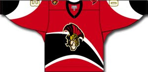
Did some quick research and found that this is a specialty logo designed by a local artist for the B-Sens for an Ottawa-themed jersey almost two years ago. The jerseys were worn on February 23 and 24, 2007. It looked like this.

As far as I know, there are no plans to recycle the logo this season, but then I don't really have my finger on the pulse of the AHL. If any Binghamton fans have heard anything, let us know.

...

The Norfolk Admirals — affiliate of my Tampa Bay Lightning — unveiled a 20th anniversary logo a few weeks ago. It incorporates blue into the logo which the primary lacks despite being on a blue jersey. The blue was added to the team's color scheme when they hooked up with the Bolts.

I don't know how or if the Admirals plan to make the logo part of their uniforms this season. I would assume there will be a shoulder patch. But for sure, folks in Norfolk (ha) will see it on a lot of promotional materials.

...

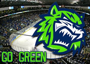
The Bridgeport Sound Tigers are going green! No, they aren't changing their colors despite what the image below might suggest. That's just a Bridgeport PR guy having some fun. Everybody wishes they had Photoshop skills.

No, they mean "going green" in the sense that they're saving the environment. Anyone who works in media or has been in the media box of any hockey arena knows about the stacks of stats sheets you get handed when you walk in. You've easily wasted an entire ream of paper after a few days worth of games.

To help curb the tree-killing, the Sound Tigers will begin offering all of that information on reusable USB drives.

Sounds cool to me. Makes you wonder whether the NHL will join up.

...

I know the season hasn't begun yet and these may just be preseason jerseys, but it seems NHL 09 had the jersey designs wrong for the AHL's newest team — the Iowa Chops. The image below, a still from the game, shows sweaters based off the design of the Anaheim Ducks, with some colors changed.

On the Chops' official web site is the following image which shows a jersey that looks nothing like Anaheim's. It also lacks the obnoxious CHOPS text beneath the logo.

Now this may or may not be the actual jersey. The story it's attached to is talking about a rookie tournament. But this is why I don't inherently trust video games for accurate jersey depictions.

Anyway, that's all for this afternoon. If there's anything I missed, feel free to email me.

Friday
Aug082008

Freak Out Friday XLI

Another Friday is upon us and it's time to freak you out. I'm starting with a rather frightening rendition of a Senators third jersey concept.

Just look at those eyes staring back at you. Scary stuff.

We've been talking a lot about the Dallas Stars lately. Anybody want a real Old West theme for the uniforms?

If you did, I'm sure you don't anymore.

Stripes for the Sharks?

You know you'd buy that jersey. Don't try to deny it.

Here's a somewhat less freaky Wild concept sweater.

A new series within a series I started to FOFs ago showcased the infamous Mighty Ducks third jersey with the logos of other teams from around the league. We've done the Atlantic Pacific Divisions and today we've got the Southeast.


And while we're on this topic, under the heading of Other Things That Just Won't Die, the Iowa Chops are back for another round of mockery.

I don't think I need to say anything more. Just try to enjoy your weekend now that you've been freaked out.

Friday
Jul252008

Freak Out Friday XL

This is the 40th installment of the Freak Out Friday series. And the Roman numeral for 40 suggests I'd better have an extra-large helping of freaky hockey artwork this week. Let's hope I can deliver.

The biggest real-life freak out of the last couple weeks has been the public unveiling of the Iowa Chops along with their new logo. But someone's made an improvement.

(Apologies for the low image quality, but this is what was sent to me.)

It seems that with the Buffalo Sabres, when it comes to fan made concept art, you either love it or hate it. I wonder what you guys will think of these.

But wait, there's more.

There have even been jerseys designed for them.

And more along the lines of Matt's recent rebrand of the Stars, check this out.

Something else I got this week that made me chuckle were concepts for the Vancouver Canucks.

Don't get me wrong, I appreciate the effort someone put into this but wow, you can't help but shake your head in amazement.

Here's a concept jersey for the Chicago Blackhawks.

Don't shoot the messenger.

Sometimes folks send in team-branding concepts that miss the mark a little.

I can only imagine the nightmares the children of Cleveland would have to endure.

Speaking of nightmares, if you recall about a month ago I started a series within a series for the Freak Out Friday. One reader created 30 logos based around the Mighty Ducks' third jerseys from the mid-90s — one for every NHL team. Last week I posted the Atlantic Division and the week before was the Ducks' own Pacific. Today we're going to the Northwest.


Be sure to notice the half-stripes on the Oilers logo. Yes, all of these are based on last year's new Rbk EDGE jerseys.

And that's all folks. We're back with another Freak Out Friday in two weeks — assuming you get all your ridiculous artwork sent in! My big thanks to everyone who's submitted work — good and bad alike!

Thursday
Jul242008

Improving On The Chops

Two weeks ago I posted the new name and logo for the AHL's Iowa franchise — the Iowa Chops. While the name remains an abomination, someone actually came up with a decent concept logo.


This is a great example of how you can create a great logo even when saddled with a crummy name and overused colors. Too bad it will never see the front of a jersey.

For reference, this is what the Chops are actually using.

Thanks to Charlie for the tip!

Thursday
Jul102008

Iowa Chops? No, I'm Not Kidding

So the American Hockey League will have a new team this fall based out of Iowa which will serve as the Anaheim Ducks' minor league affiliate. And they're called the Chops.

Yes, the Iowa Chops. I'm not even making a joke here. And if I was, it would be a bad one. What is a Chop? See below for the logo.

All right, now that you've peeled yourself off the floor, wiped away the tears of laughter and stumbled helplessly back to the computer, take another look at it.

Still bad, isn't it? I'm surprised because nowadays I think we've come to expect more from new expansion clubs. Better names, better logos. I mean, consider the Ontario Reign of the ECHL. Great name, great logo — though I'm embarrassed to admit I didn't initially realize Ontario was a city in California. Despite living in an ECHL town, I pay almost no attention to that league.

Anyway, I'm eager to hear what you guys think of the Iowa Chops and their new logo. I'll be putting together new logo tournaments for the AHL and ECHL some time this year, by the way.