New Logos For Windy City & Big D
 50 Comments
  Tuesday · Jul 8 · 2008 | 3:35 PM PDT
 You know I had another Sabres concept logo to post today but considering the reaction in the comments to yesterday's post, I think I'll hold off.
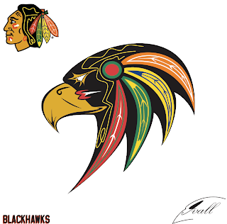
Instead, I've got concept logos for other teams out west. Well, I don't know, Chicago's west of something, right? We're starting with the Blackhawks and you know I'm always up for a good 'Hawks logo. Take in this one.
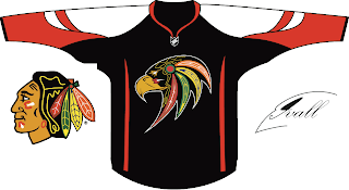
Here's how it looks on a jersey.
It's really quite something. It might be a little too intricate to make a good hockey logo, but then you could say that about the current Blackhawks logo. Anyway I enjoyed it and I figured you guys might too.
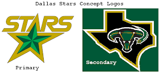
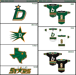
But moving on now to Dallas. I have a few Stars concept designs.
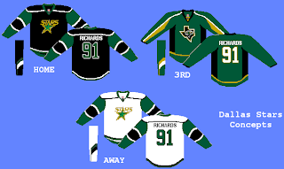
And on a jersey, it may look something like this.
These designs are of a lesser quality, but you get the idea.
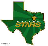
And finally, one more logo from the same artist as above — I think an alternate incarnation of the tertiary from that logo set.
I know I didn't have much to say today but it was another one of those long days. Started work at 3:30 AM. Finished at 5 PM. Not exactly my idea of fun, but I'll live. Enjoy your night. Wallpapers tomorrow!
UPDATE (7/15 2:15 AM): As has been mentioned in the comments, the Stars logo above is actually the logo of the Texas Stars, a new AHL franchise set to begin play in 2009 as a Dallas affiliate — and not original concept art.



Reader Comments (50)
I really, really like the B'Hawk logo. That would make a cool third jersey logo. I'm not wild about the jersey design itself, though.
As for the Stars logo, none of them really impress me. I still think going old west style with a Sheriff's star would work so well for Dallas.
That Blackhawks logo is really.. something. Like how it combines the current logo with an actual black hawk. Not sure if it'll look great on the ice, but a great attempt.
As for the Stars, they have a logo right now that, like several others, is really hard to improve upon. There are only so many ways to symbolize "stars". Perhaps my favorite of these is the first primary: the same idea as right now, but with more of a 3-D feel. But I still hold the opinion that all they have to do is put the logo on a green jersey.
Yeah i didnt really put to much thought into the Jersey i admit. If you can come up with a better look that would be great.
ya i made the last 2 stars stuff, and i made the bottom, before the top, and i just used it in the logo set, also i changed the gold to the sharks orange.
i like the blackhawks one too
Looks like the new hawks logo is headed in the right direction, but of course it could be better. I'm a big proponent of leaving the original six logos alone though.
The stars doesn't look bad, although I really liked that badge design from a couple days ago.
love the hawks logo but the jersey could be better.
Dam Mykl and Kevin. You got the idea before i could make it. i had the same thought in my head today.
I'd love for the Stars alternate logo in the shape of Texas to just BE IN THE SHAPE OF TEXAS. Man, that's bugged me for years. It's all squat and distorted. Grr.
i really like that blackhawks logo...
btw chris what do you do for a living lol that makes you start work that early???
That Blackhawks logo is awesome! Exactly what that team needs. Although, in the effort of full disclosure, I do think it resembles
http://sonic.sega.jp/chara/knuckles/images/chara_knuckles.gif" REL="nofollow">a certain video game character.
Awww yes. Thats what i was thinking whan i made it but hoped no one would Put the 2 together. Blast. Maybe i can rework that part. My girlfriend wanted me to make it in the style i always make my Birds. Should have listened to her. lol
You just happened to run into someone with his Genesis still plugged in, lol. Like I said, I love it...and I'm not sure how much of the populous would get the reference without it being pointed out directly to them.
the hawks logo is awesome, and if not for a jersey would be sweet on a mask. it'd be almost like a cool abstract type of graphic like Miller's buffalo or even Potvin's cat. really great idea though!
Wow, that Hawks logo is... I'm not sure. But it definitely draws attention! Not sure about it as a logo, but it's really well done for what it is.
That one Stars logo is in the stylr of Star Trek...
That 1980's font on the first Stars rebranding screamed "USFL" to me.
http://www.chriscreamer.com/logo.php?id=5673" REL="nofollow">Sure enough ....
.....also, I really like the Blackhawks design. It took me a second to get over the "what the heck", but after literally one second, I got over it. It's great.
On the right jersey the Blackhawks logo would be an awesome third jersey. Tha Dallas stuff leaves something to be desired.
That Chicago logo is by far the best original 6 redesign I've seen...possibly ever. It maintains the feel of the current logo while taking it in a different direction. It would make a great third jersey. Just slap it one of their red or black jersies.
WOW! that Blackhawks logo is AMAZING! I think the jersey should be a completely original design but I love that logo.
I understand why it's there but I wonder what it would look like without the yellow design in the middle part of the head (it would at least make it a little less complicated for those who complain about that).
Well done and I look forward to future designs from this artist.
That first Stars logo... The one on the left hand side. That's not an original idea or concept.
It is in fact the logo the future Stars AHL team will use when they start up play in 09-10 in Cedar Park, Texas.
http://cdn.nhl.com/stars/images/upload/2008/06/txstarslogo200.gif
Gotta say none of them do it for me. As far as the Chicago logo is concerned, I say that if you're going to switch from an Indian to a hawk, then you should switch from an Indian to a hawk. Don't go halfway, which is what that logo does.
As for the Dallas logos, none of them are anything special, or anything original. As ksy92003 said, there are so many ways to symbolize stars, and the current logo is hard to improve on. The "sheriff's badge" logo from a few days ago was kind of neat, although I think it should have been a six-pointed star given the effect they were going for.
liontamr is right about that 80's looking stars logo.
this designer simply ripped off the new Texas Stars logo.
très original, mister Designer :|
Wow.
That Blackhawk logo...magnificent!
I vote to start a petition for Chicago to use that design for their third jersey.
That Blackhawks logo is one of the most creative designs that I've seen in a while. I don't believe that original six teams should mess with their primary logos, but it would be a great third jersey logo.
I like the current Blackhawks logo, but if they ever changed it I would vote for this updated version. The Stars tertiary logo was good, but I wouldn't use any of the rest...specially the incorporation of their former alternate logo hich still looks like a woman's reproductive system.
I think that if the Blackhawks changed their logo, which I would be open to, it would definitely work as something like the first logo today. I agree with Chris that it is a little to intricate, but it could be simplified to include the feathers similar to the current logo but be a black hawk bird similar to the concept presented. Update the C with tomahawks a little bit for the secondary logo and that is a solid set.
Not a huge fan of the Stars concepts, definitely need to keep that constellation logo away forever, and the one with the state of texas is lifted from the Coyotes' Arizona state logo in my opinion.
i like that blackhawks logo. it would make a really great third. the jersey design is a little...unique. the stars ones are kinda weird.
that hawks logo is fucking awesome.
The Blackhawks logo is fantastic.
That is the best blackhawks logo ever! Forget about putting it on the third jersey, it should be their primary logo. I am a big fan of changing all of the original six logos because they ALL suck and are dated (vintage my ass).
And actually dallas already had a secondary logo in the shape of texas before phoenix had one of arizona, so they originally copied dallas, but phoenixes looks better.
To who ever the creator of the Blackhawks logo please please please take a crack at the Pittsburgh Penguins logo. I want to see some type of rebrand and with the talent floating around someone has to have something. An don't make him look like sonic j/k lol but seriously.
that b'hawks logo is really neat, it needs some cleaning up but it's definitely a cool start that i would like to see on a 3rd jersey. The jersey it's on in this thread i'm not so fond of though. None of the stars really work either i don't think.
The Blackhawks one would be a cool secondary/shoulder logo, but too busy for a jersey. Keep up the great work!
The Hawk head logo is great. Really unique.
The Japanese Rising Sun flag effect in the state of Texas is interesting. As for the Buffalo rebranding, is that a prehistoric Woolly Bison? The word mark looks good.
That Hawks logo is not very good. WHy the hate for the Hawks current logo here? Personally, it is undoubtedly the best logo in all of sport.
Second, to all those with the mean comments to Matt and his design, shut the f*** up. Not one of you could do 1/10th as good a job at designing anything.
Dreadnought I was not Hating the logo. I like it. this is just my take on it. Beeing Native my self im not offended like most about the Orginal Hawks logo. but thought it would be a nice 3rd Jersey logo. and put some meaning into it. I dont know the reason behind the choice of the Native Head on the logo unless the guys name was Black Hawk. it just dont hit the word the teams is named after for me.
The Hawks logo is very nice!!!
Who did that!?
For the first time... I don't hate that 'hawks logo. I don't love it, but I don't hate it.
Somethings should be left well enough alone. The Blackhawks logo is one of those. From an artistic stand point, it is very creative. It ends there.
The Stars logo isn't quite a concept, since it's sorta stolen.
http://cdn.nhl.com/stars/images/upload/2008/06/txstarslogo200.gif
http://stars.nhl.com/team/app/?service=page&page=NewsPage&articleid=365567
Sorry didn't see it was mentioned earlier.
What about using a lowercase d for the Dallas logo with the vertical line leading into the star? That would look less odd, as it now looks somewhat like a lowercase b.
Anyway, I like the idea to bring back the brilliant North Stars logo. Or here's another idea: Have the Wild and Stars trade names.
the stars logo lettering looks way too space age for me. i would say to leave the font and star as it is and change that outline of texas with the uterus bull in it. that bull was terrible when they wore it and will be terrible if they bring it back. i wish i had the skill to design some stuff because i've thought of some pretty good ideas since i've been watching them over the years
I would also say that the N from the old minnesota north stars jerseys should be incorporated into a new jersey.
Wow. did not think that anyone could destroy the greatest jersey in all of sports but guess what...congrats youve done it
I think that logo is the bomb. It really is sharp! I would definitely go for that logo.
i dont understand why we need to change the logo of the hawks..they are an origonal six team and we should leave the logo on the jerseys alone. it is however something i could see on a mask for the goalie. as far as for the jerseys, i'd say its a no go and we should just leave it how it is.
hey who came up/ created the chicago blackhawks concept logo?
The Hawks logo is done by a guy named Mike Ivall, and his website is here:
http://mikeivall.carbonmade.com/
It is used by a AAA developmental group who refer to themselves as the Maplesoft Hawks:
http://maplesofthawks.com/
I think it would make a great alternate jersey for the Hawks, if they got permission to use it. The indian head is iconic and should be retained, but nothing wrong with this on the 3rd jersey. It seems the NHL puts out a new 3rd jersey every year, and one year the Blackhawks went with a retro indian head design that looked like it was drawn by a 4th grader. This logo would be a HUGE upgrade and worthy of every stitch.