Friday
Aug012008
IHA Poll: Washington Stars
 34 Comments
  Friday · Aug 1 · 2008 | 5:08 AM PDT
Cast your vote and leave a comment about your decision. If you chose a non-finalist, tell us which one. Then tell all your friends to drop in and vote! The more voices heard, the more accurate the results!
Starts Fri Aug 1
Ends Mon Aug 4
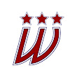
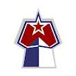
As promised, below are a handful of the logos that were submitted but not selected as a finalist. If you think one of these should be the Washington Stars logo, select "non-finalist" in the poll and tell us your pick in the comments.







Reader Comments (34)
All three finalists are pretty solid, but I'm going with #3.
The non-finalist at top-middle would be a good secondary too.
Bottom-Right of the non-finalists gets my vote.
I'll have to pass on voting for this round...that first logo feels too similar to what the Caps are currently using. The idea of the Capitol and the W doesn't seem original and that third option is something Captain Kirk wears.
OK, I know I have seen Option #3 before. Just not sure where. Plus it reminds me of the Dallas Star's Mooterus.
I had a tough time deciding but, i chose finalist 2. I like how the stars create a silhouette of the Capital Building. The bottom right finalist is very good too, taking 2 major monuments of the area. They're all good, the best batch overall yet; but they aren't suitable for a primary logo in my opinion. They would make great secondary logos or shoulder patches. Also, i think finalist 3 looks too much like a Star Trek communication device.
None of these move me, but I like the W of the middle bottom row of non-finalists. I'd just do something different with the stars so it doesn't look like a mini-menorah or something.
Bottom left non-finalist for me. The red star with the red W
Non-finalist #6 (bottom-right) for me.
I have picked a Non-finalist for every one of these polls except for the Miners logo. This is getting annoying.
i like that bottom-right non finalist as well, but after looking at it for a bit, the shape of it reminds me of a mrs. buttersworth bottle, anyone else see it???
non-finalist bottom right, logo #6
I voted non finalist.
The W with the 2 stars.
Couldn't cast a vote as I don't think any of them are good enough to be a primary mark.
The first one I think is the best, but its so off centered...
Jason New Era said...
I have picked a Non-finalist for every one of these polls except for the Miners logo. This is getting annoying.
^^^Ditto
None of these are very impressive actually. I do actually like the design of #2 but I don't see it looking good on a jersey. I guess I will go with non-finalist #1
non-finalist bottom right #6.
after the Caps introduced the "Weagle", logos with the capitol building silhouette are unoriginal.
I voted for #2, the circle with a bunch of stars slightly resembling the capital dome. I wasn't really thrilled with any of the choices. I can see why designers don't like teams with the name Stars - it's hard to make something original.
I appreciated the way non-finalist #5 worked in the stars of the DC flag, much like the current caps logo does and how #6 used the Washington monument and Pentagon. They were more original than the slightly overused capital dome.
All this got me wondering what the big statue of Lincoln from the Lincoln monument would look like on a hockey jersey.
I'm not even voting. I don't like any of the logos at all. Great idea though, Chris, with the IHA.
Not sure i'm extremely fond of any of them, however, i went with logo number 3.
Vince: i've seen you repeatedly spam that comment about your logo. Take everything past blows out of the sentence and that's about my opinion on it. hah.
I'm not a big fan of any of these, but I do appreciate the incorporation of the Capitol Building in the logo of the first finalist- so I went with that one.
Non Finalist -- bottom row on the right side
Option #1 looked the best,but they were all pretty horrible in my opinion.
id never buy a jersey,hat,tee shirt,etc with any of those type logos on it.
If any of these were the logo of the Washington Stars, this DC native would be rooting for the Hartford Bears.
Voting for the first non-finalist. That would look amazing going all the way across the front of a jersey...
Voted non-finalist middle, bottom row. I don't feel any others are really primary logo material. I do however think non-finalist middle, top row would be a real nice secondary logo and non-finalist top left would make a nice helmet and pant-patch logo.
That bottom right non-finalist looks like a phallic symbol. I'm not voting at all for this team. Don't particularly care for any of the options.
I thought that this was about the worst batch so far; as one person said, its really hard to do something original with "stars" in red, white and blue. Bottom-right is probably the best; it does remind me of a phallic symbol; then again the Wash. monument is a giant phallic symbol. I also like top middle as a shoulder patch or pant-patch logo.
None of these logos are all that great, but since I should vote for one, I chose the first option.
"Stars" in general isn't a great nickname.
Voted for the bottom right Non-Finalist. Very clever, combining the Washington Monument, the Pentagon and a star to form a "W". With a little polishing, the bottom left Non-Finalist would be a very sharp crest on a sweater, but bottom right gets my vote.
Non-finalist #2 (top-middle), please.
I voted with Kus....
I think its the least "cluttered" one there. Very easy on the eyes.
I honestly don't think any of these are half professional-worthy, no offense to anyone.
Where are the ones that i sent in ? are you keeping them?
I vote for non-finalist bottom-right. I love the use of the washington monument. Brings some city-specific identity to a rather generic name.